Sheffield Children’s NHS Foundation Trust identity refresh
Sheffield Children’s NHS Foundation Trust is one of the only NHS Trusts providing integrated healthcare for children and young people across acute, mental health and community services.

The challenge
Despite its national leadership, pioneering innovation and 150-year legacy, the brand was still widely perceived as a single, hospital-centric service. The existing identity was warm and familiar, but skewed young, struggled to flex for older children and professional audiences, and did not reflect the Trust’s growing ambition, research leadership or whole-child model of care.
The challenge was to create a brand that could sit confidently within the NHS landscape while clearly expressing what makes Sheffield Children’s unique: its integrated structure, its values-led culture, and its commitment to listening to children and young people. The identity needed to unify a complex organisation, resolve brand hierarchy issues, and work across everything from patient communications to national innovation partnerships.
The process
We began with extensive consultation, gathering insight from over 1,600 people including staff, patients, families, young people, partners and the public. Using a mix of quantitative polling and qualitative depth interviews, we identified 17 key findings across brand proposition and visual identity. These revealed exceptionally positive experiences of care, alongside a clear opportunity to shift perceptions from “children’s hospital” to “whole-child healthcare organisation” and to match clinical leadership with greater brand confidence and visibility.
Young people played a meaningful role throughout, helping shape how the brand listens, speaks and represents emotion. The resulting creative brief set a clear direction: a cohesive masterbrand system that is accessible, inclusive and flexible, grounded in place and people, and capable of flexing across audiences, services and future growth without fragmentation.
The requirements
- Development of a cohesive masterbrand system to unite services, sites and partnerships under one identity
- Extensive stakeholder consultation with staff, patients, families, young people, partners and the public
- Brand repositioning from “children’s hospital” to “whole-child healthcare organisation”
- Alignment with NHS identity standards while retaining warmth, trust and local recognisability
- A flexible visual system that works across audiences from toddlers to professors
- A simplified brand hierarchy reducing reliance on multiple sub-brands and competing identities
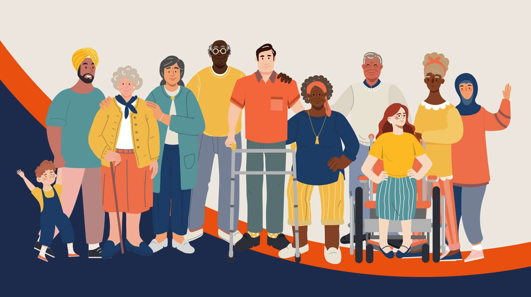
- Accessibility and inclusivity embedded from the start, including dignity-led representation
- Creation of a modular pattern and asset library adaptable from playful to professional contexts
- Development of illustration and storytelling tools, co-created with young people
- Delivery of a practical toolkit and guidance for consistent use across print, digital and service communications
The solution
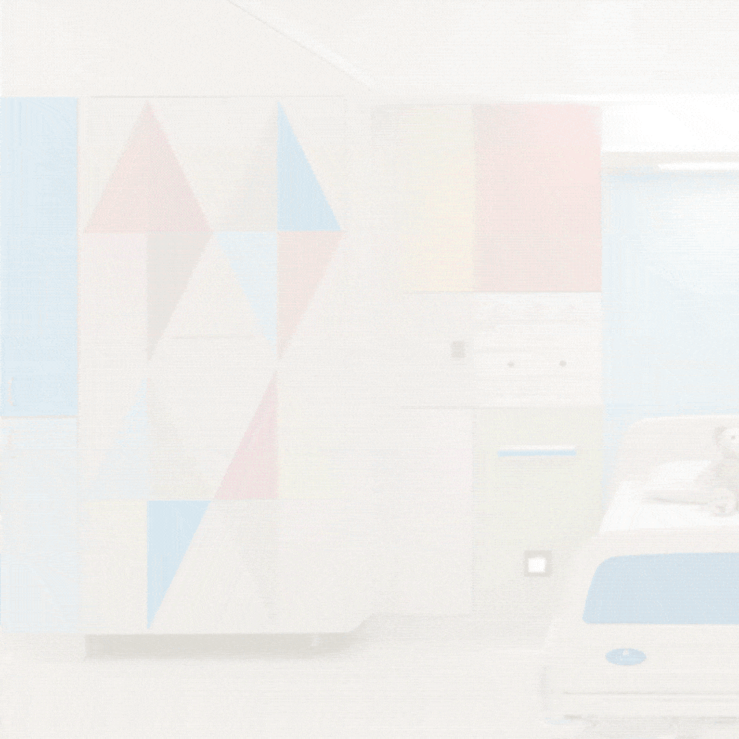
The final brand is rooted in Sheffield Children’s lived environment and the experiences of the people who move through it every day. The Trust’s hospitals themselves became a primary source of inspiration: bright, welcoming spaces designed to feel positive and human, many created in collaboration with artist Morag Myerscough via Art Plus. Rather than introducing a new visual language, the identity draws directly from colours, motifs and shapes already present across wards, clinics and signage, bringing consistency and clarity to what people already recognise and trust. This approach ensures the brand feels owned and familiar, not imposed, while creating a unified look across a complex estate.

At the heart of the system is a flexible, pattern-led toolkit. A modular pattern library allows the identity to stretch across a wide tonal range, from playful and expressive communications for children and families, to confident, restrained applications for research, innovation and professional audiences. Alongside this, a refined colour palette built from core and secondary NHS colours introduces softer tints for everyday use, as well as dedicated combinations for neurodiverse audiences and more sensitive contexts such as bereavement services. Accessibility and inclusion are designed in from the outset, ensuring the brand can respond to different emotional, cognitive and sensory needs without fragmenting.

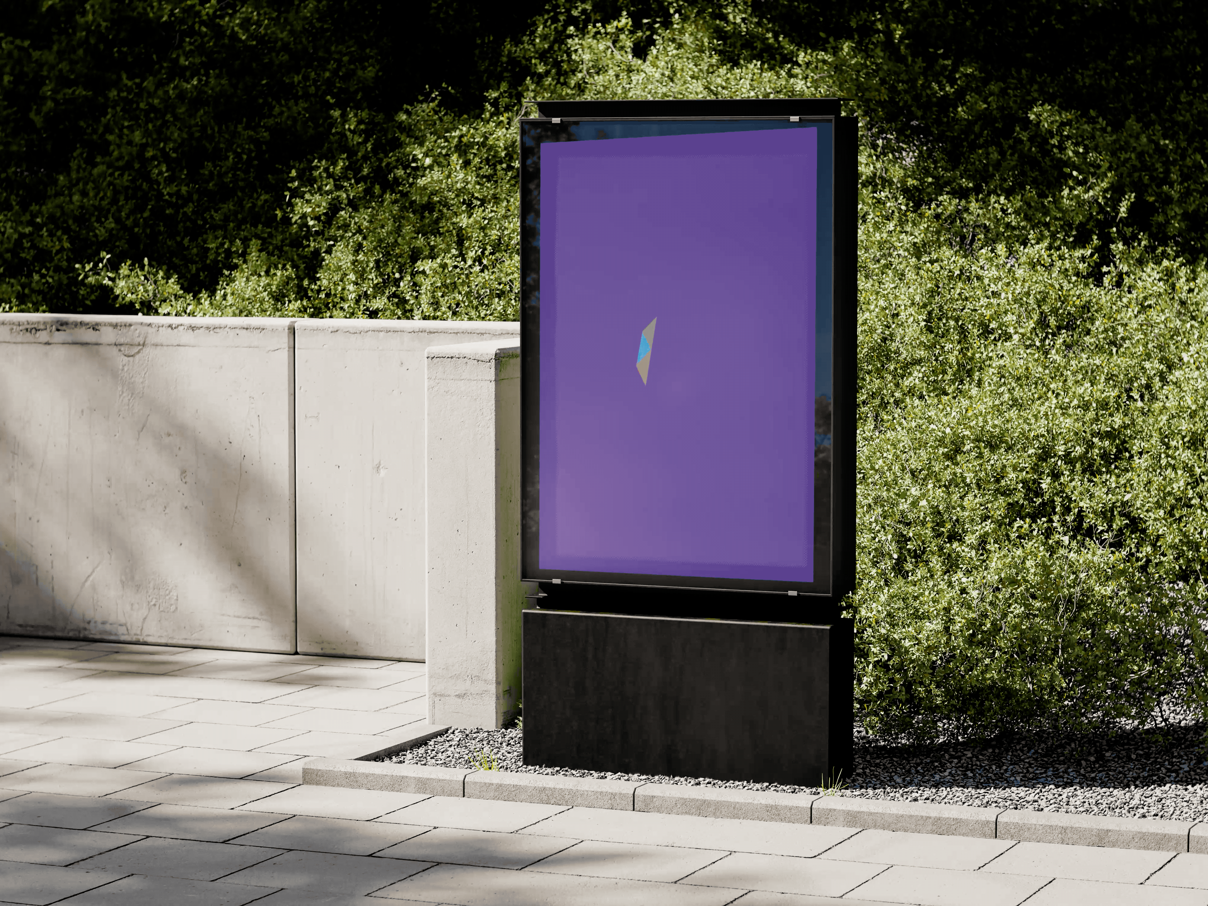
To address longstanding complexity, we developed a new strapline, Creating healthier futures, supported by a secondary badge that sits alongside the NHS organisational logo. The badge is a heart formed from tessellated triangles, symbolising care, hope and the strong strategic foundations behind Sheffield Children’s integrated model of care. The triangular geometry is echoed throughout the wider visual system, strengthening recognition and coherence. Crucially, this badge helps simplify brand hierarchy, reducing reliance on sub-brands and allowing services, sites and initiatives to sit clearly under one shared identity.
So many rebrands chase novelty. This one did the opposite. It started with what children already experience in the spaces, the colour, the energy, the sense of welcome, and formalised that into a brand. The result is an identity that leaves room for play, imagination and expression, without ever feeling chaotic or childish.
Amy Bouchier
Communications and Marketing Director for the Trust
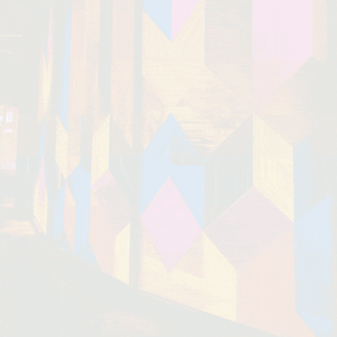

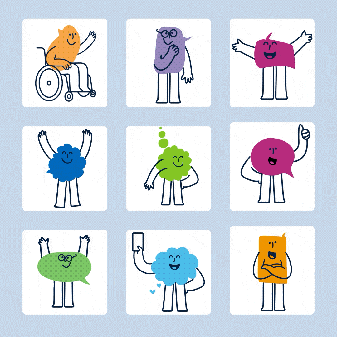
Illustration and photography were developed as core storytelling tools. A contemporary illustration style, supported by a library of people and Sheffield landscapes, allows the brand to flex in tone without becoming infantilising. Young people from the Sheffield Children’s Youth Forum co-created hand-drawn speech bubbles that represent communication, collaboration and the centrality of children’s voices. These are used to hold quotes, tell real stories and, when appropriate, form a set of expressive characters that bring warmth and personality to campaigns such as the Quality Promise. Photography guidance ensures authentic, dignified representation across hospital and community settings, prioritising real moments of care, connection and collaboration. Together, these elements create a confident, human and future-facing brand that reflects Sheffield Children’s role as a national leader in whole-child healthcare.
Would you like to see results like these for your organisation?
If you’re interested in finding out more about how we could work together, send us a message and we’ll get back to you.
You may also find these interesting
Here’s a look at some of our most recent and relevant work, projects that show what we do, how we think, and the impact we’ve helped create for our clients.
-
Sheffield Children’s NHS Foundation Trust identity refresh
Built from lived hospital environments, the refreshed identity unifies a complex NHS Trust, shifting perception from hospital-centric to whole-child healthcare while flexing confidently across audiences.
-

Council of Deans of Health brand identity and website
A strategic identity and website designed to elevate the professional profile, strengthening clarity, cohesion and sector recognition.
-
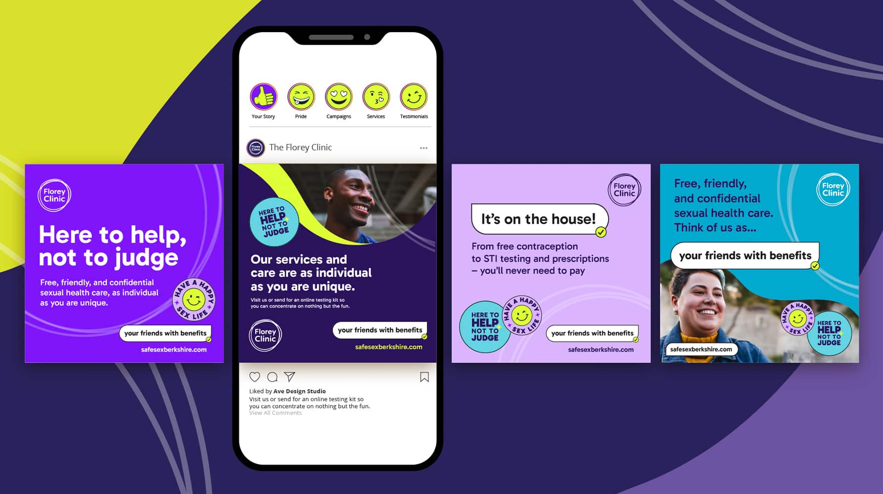
The Florey Clinic sexual health campaign
Turning sexual health stigma into confidence — say hello to “your friends with benefits” for The Florey Clinic.
-
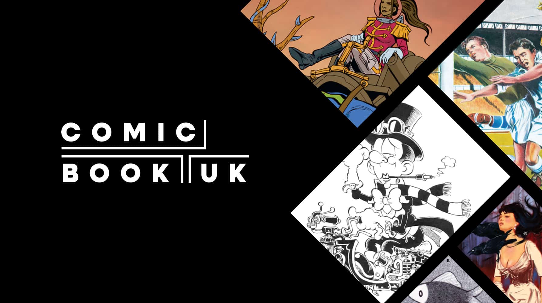
Comic Book UK brand identity and website
A cool and confident brand that is set to engage investors and policymakers, while staying true to the creativity of the comic book world.
-
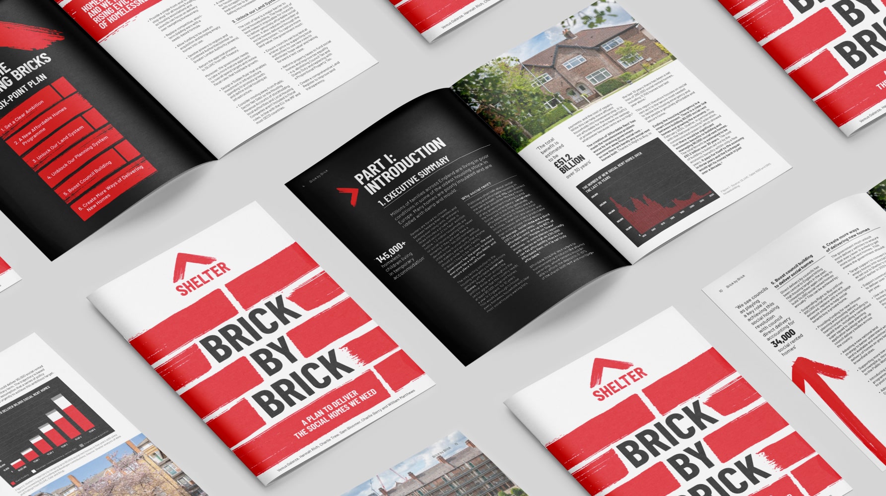
Shelter report on social housing – Brick by Brick
Brick by brick, calling for change: designing Shelter’s flagship report to confront the social rent crisis and demand urgent action
-
The MS International Federation (MSIF) information resource
Turning complex MS wellness into clarity, a resource that empowers with evidence, not confusion.
-
Frimley Health NHS Foundation Trust strategy and rebrand
Bringing clarity, connection and confidence to a trusted NHS identity – a rebrand for Frimley Health that unites services and strengthens public trust
-
Surrey & Sussex Healthcare Charity rebrand
A local charity with a big heart: rebranding Surrey and Sussex Healthcare Charity to connect communities and champion NHS care
-
The Leasehold Advisory Service rebrand
Future-proofing a trusted government-funded advice service with a bold new brand that brings clarity, credibility and digital confidence.
-
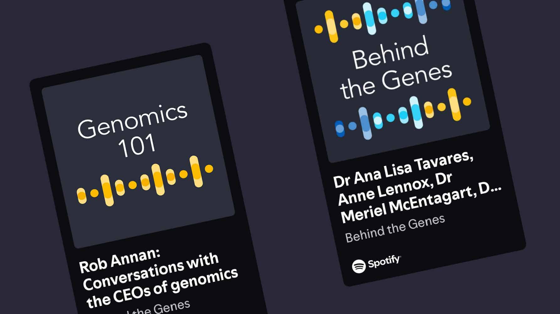
Genomics England podcast visual identity
Designing for discovery: helping Genomics England explain the future of healthcare through bold, accessible digital storytelling
-
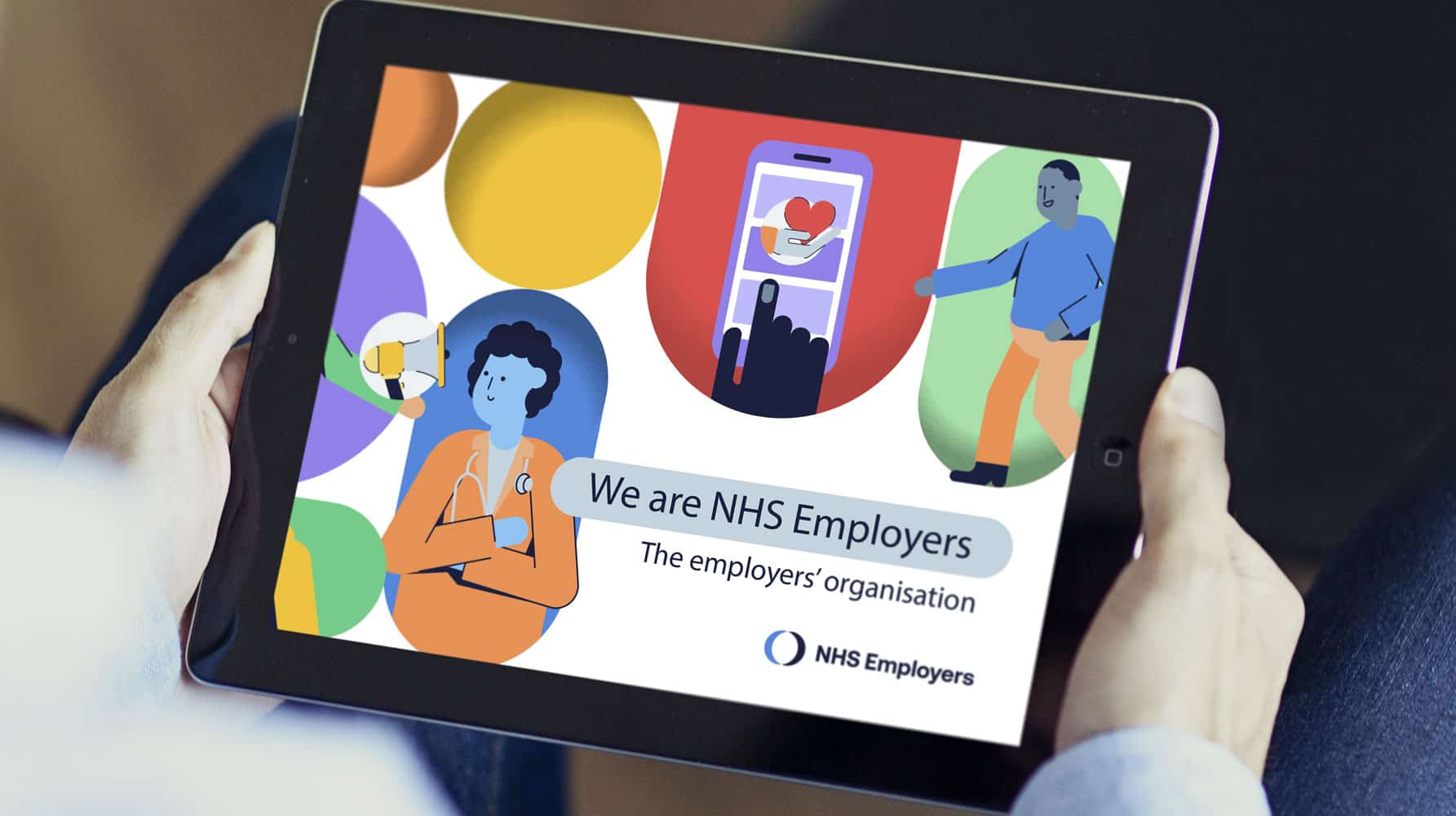
NHS Employers explainer animation
Bringing clarity to complexity: a bold explainer animation to help NHS Employers support the people who power the NHS
-
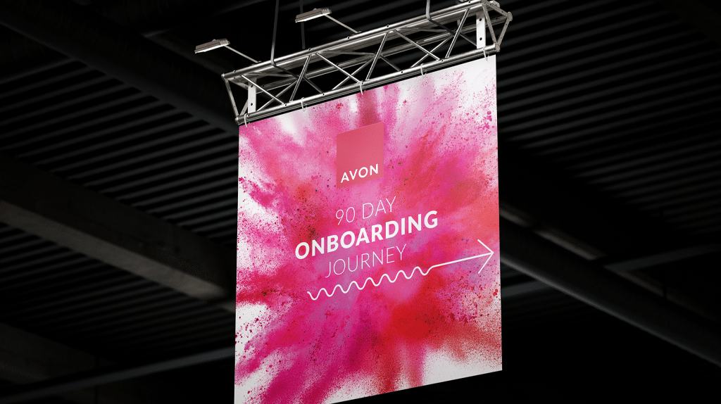
Avon ‘Pulse’ global onboarding experience
A confident first step: designing ‘Pulse’, Avon’s global onboarding experience to connect, inspire and empower every new recruit in their first 90 days
-
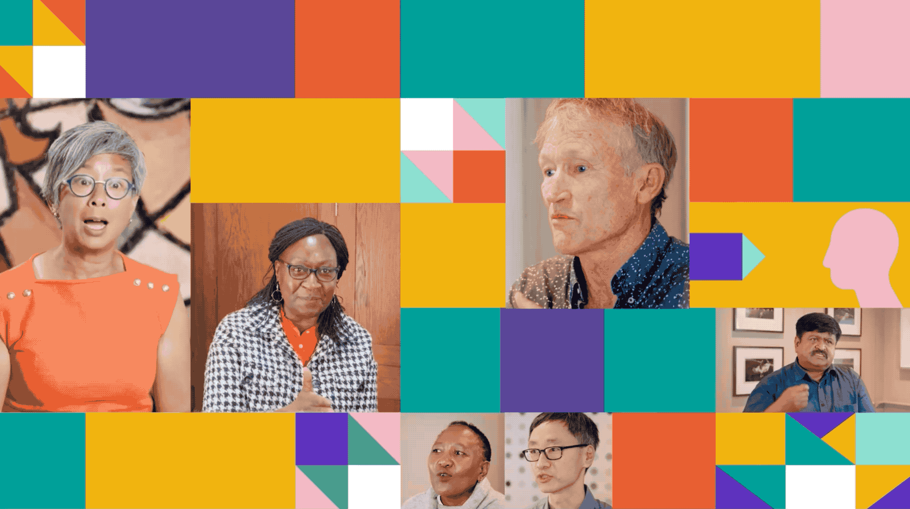
Spring Impact ‘scaling mindsets’ video series
Shifting perspectives at scale: a speaker-led video series for Spring Impact that brings powerful mindset shifts to life through real-world storytelling
-
Royal College of Radiologists: iRefer brand identity and website
Designing with precision: transforming iRefer into a trusted, intuitive digital tool for clinicians making imaging decisions
-
WWF Earth Hour campaign
A record-breaking campaign that turned personal promises into global action, building emotional connection and momentum for the planet.
-
Queens Theatre rebrand and website
A stage for everyone: rebranding Queen’s Theatre Hornchurch to reflect its bold personality, local pride and inclusive spirit
-

Cancer Research UK fundraising event identities
Creating standout identities for Cancer Research UK’s flagship events
-

Campaign Against Living Miserably (CALM) summer campaign
Cutting through the noise: bold, human-centred design for CALM’s suicide prevention campaigns that speak directly to those who need it most
-

Kings Theatre rebrand and website redesign
A rich and characterful rebrand for a historic south coast playhouse, honouring its Edwardian heritage while bringing a modern theatre experience to life online.
-

NHS Confederation values animation
Bringing values to life: an engaging animation for NHS Confederation that connects staff to purpose, pride and what matters most
-
Tall Stories brand identity and website
A brand with imagination: refreshing Tall Stories for the next generation of theatre-goers
-
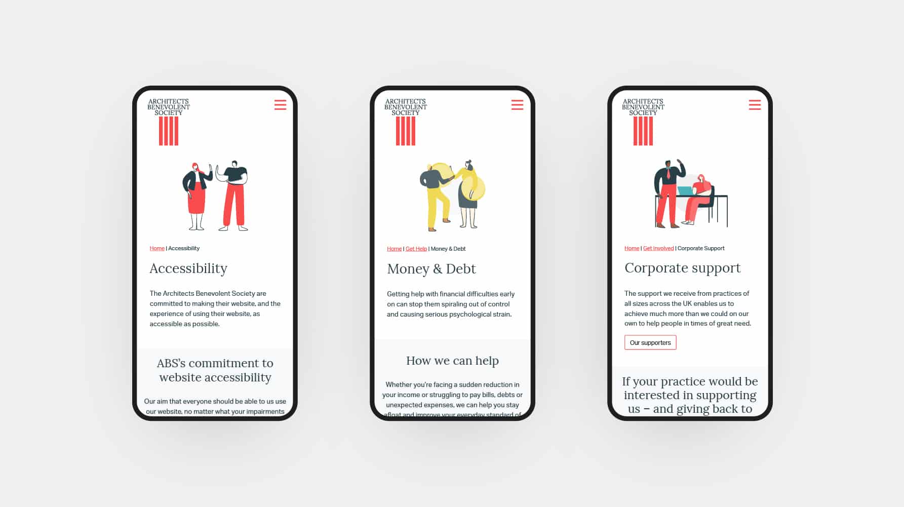
Architects Benevolent Society brand identity and website
A new brand and digital presence for a professional membership charity, combining bold illustration, accessible storytelling and a clear case for support.
-

London Football Awards brand identity
A vibrant and eye-catching identity for one of football’s most prestigious charity events, celebrating the game and raising vital funds for the Willow Foundation.
-
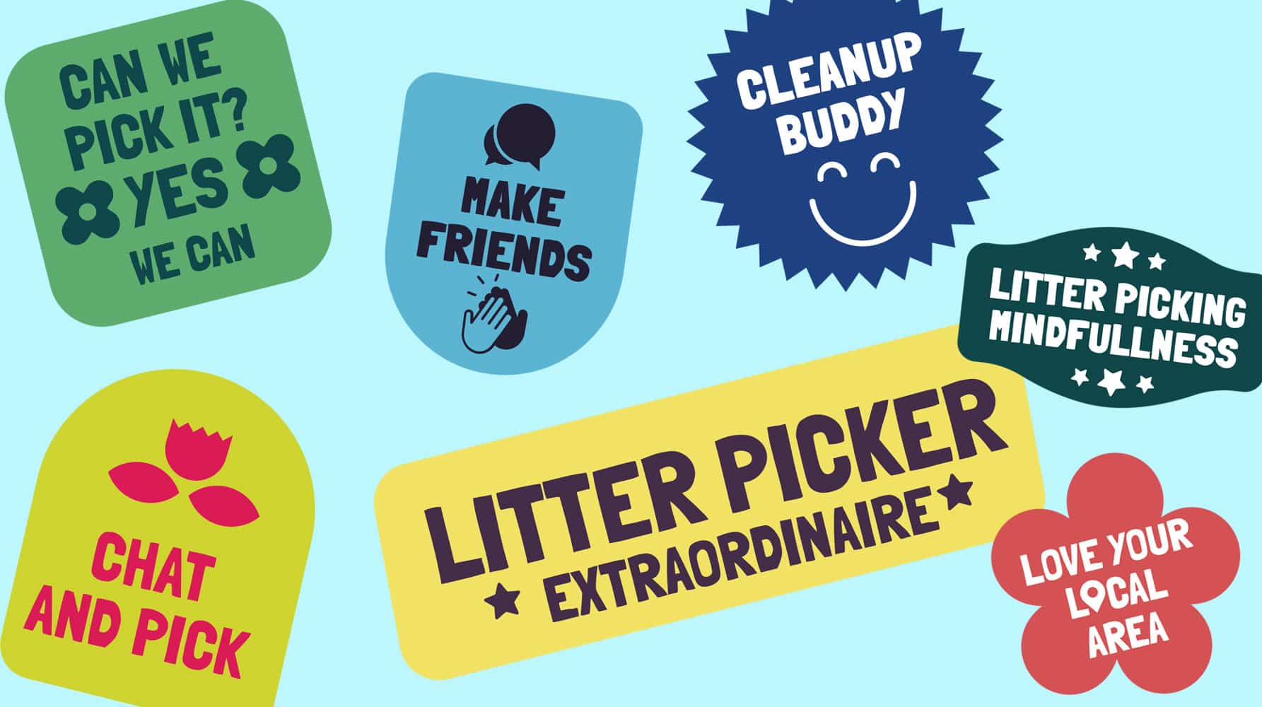
CleanupUK rebrand and website
Bringing communities together through a striking, accessible digital identity for CleanupUK
-
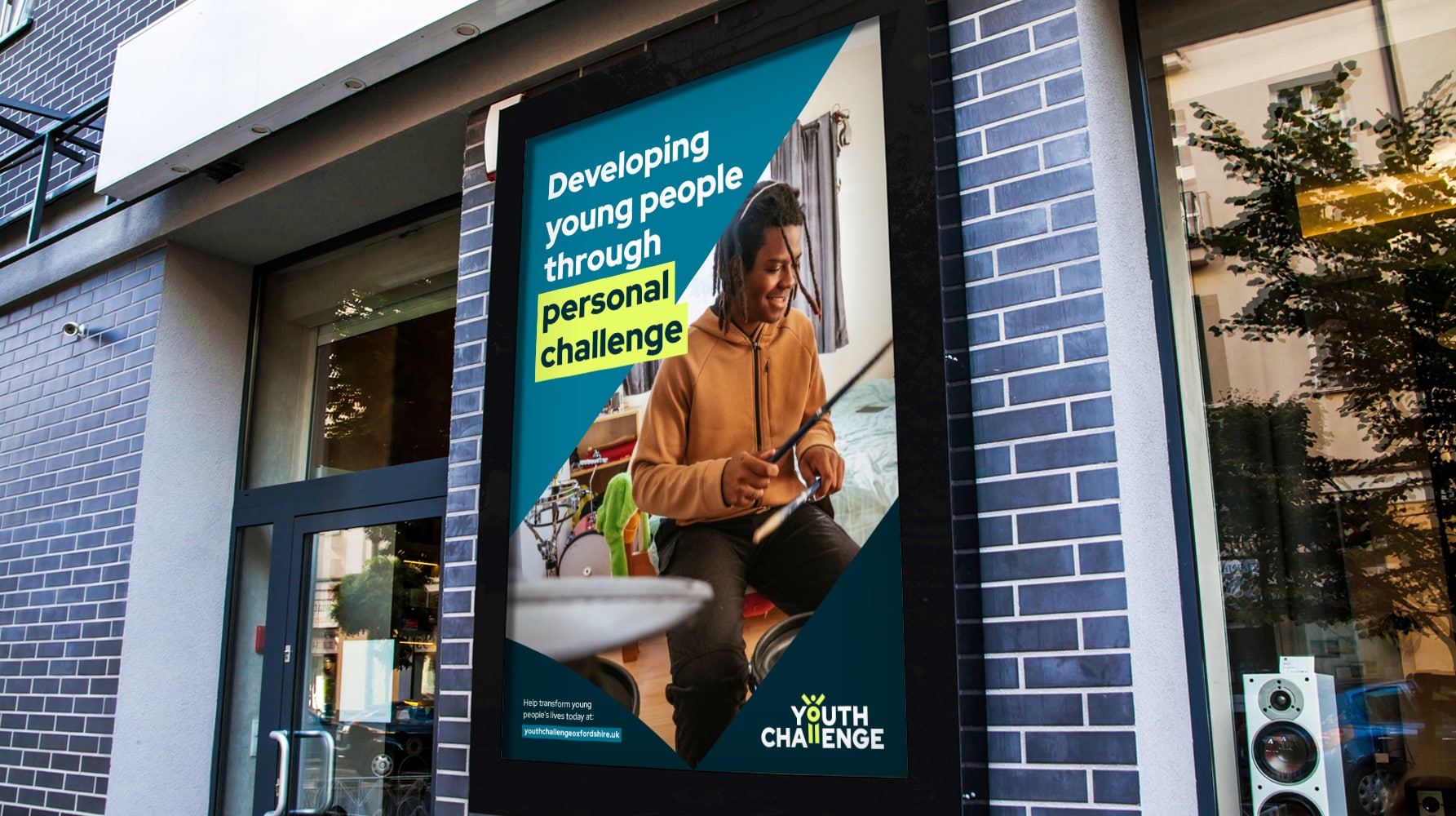
Youth Challenge brand identity
A bold new brand for a youth development charity, built to grow confidence, spark recognition and stand up to the sector’s expectations.
-
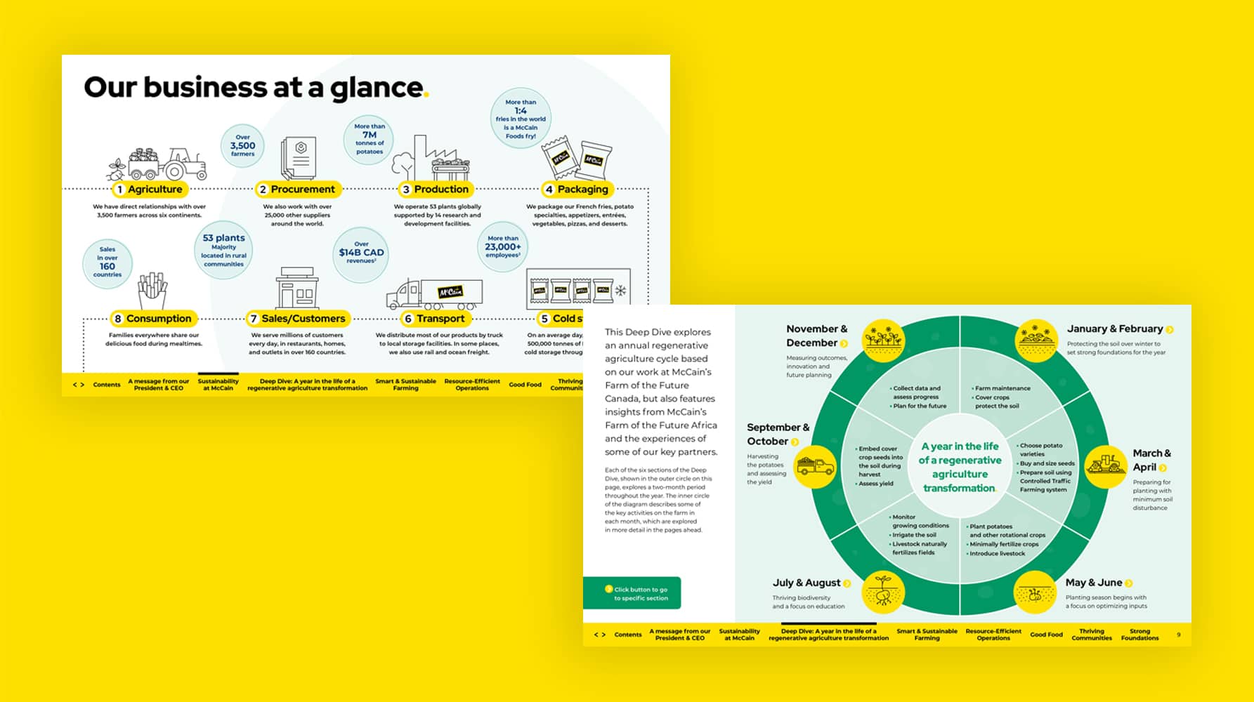
McCain sustainability report
A fresh take on ESG reporting: combining regenerative storytelling, brand-led design and digital-first functionality for McCain’s latest sustainability publication.
-

Camden Council Family Hubs brand identity
Putting families first: creating an accessible, welcoming brand for Camden’s Family Hubs to support parents, carers and children in their local community
-
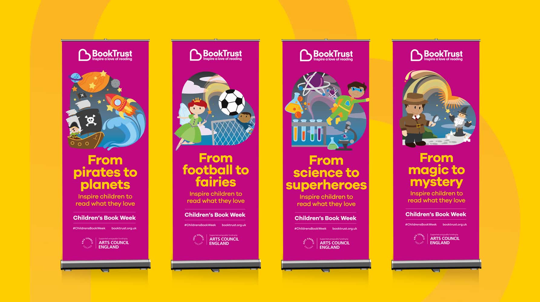
BookTrust campaign and comms collateral
A trusted creative partner for reading and early years development
-
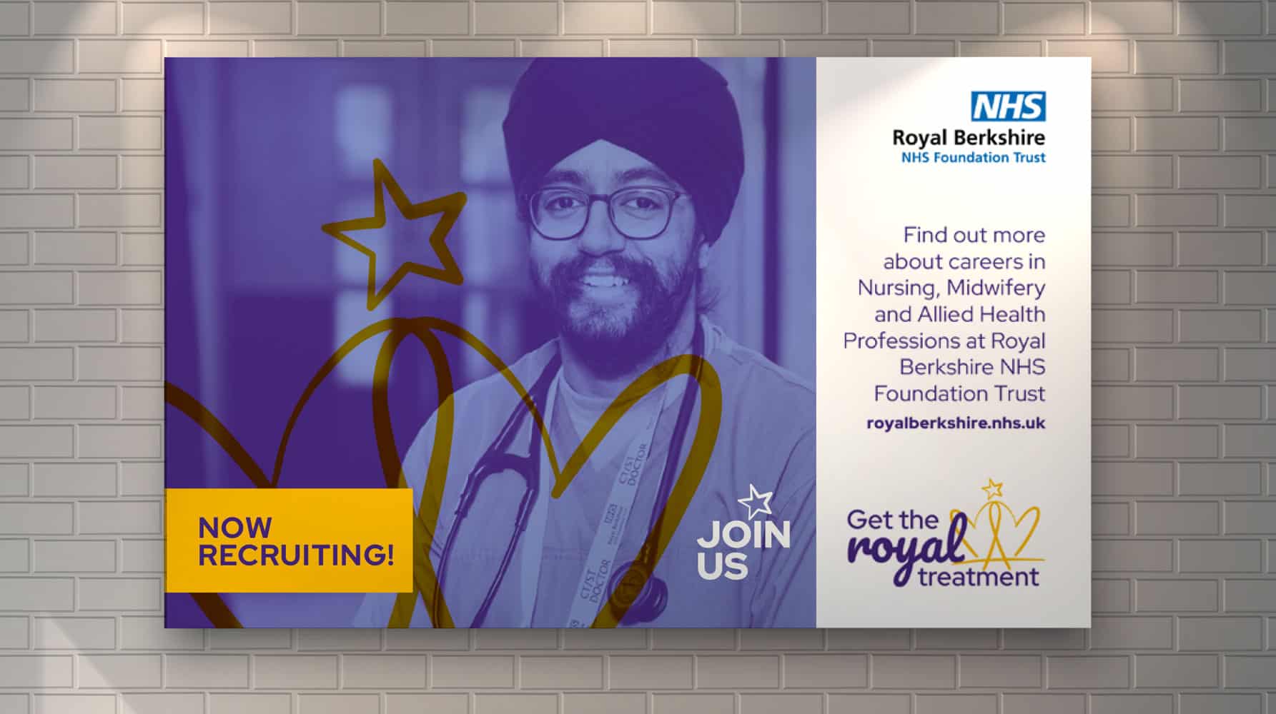
Royal Berkshire NHS Foundation Trust staff recruitment campaign
A bold recruitment campaign for a leading NHS Trust, combining care, culture and local pride to attract top talent from across the UK.
-
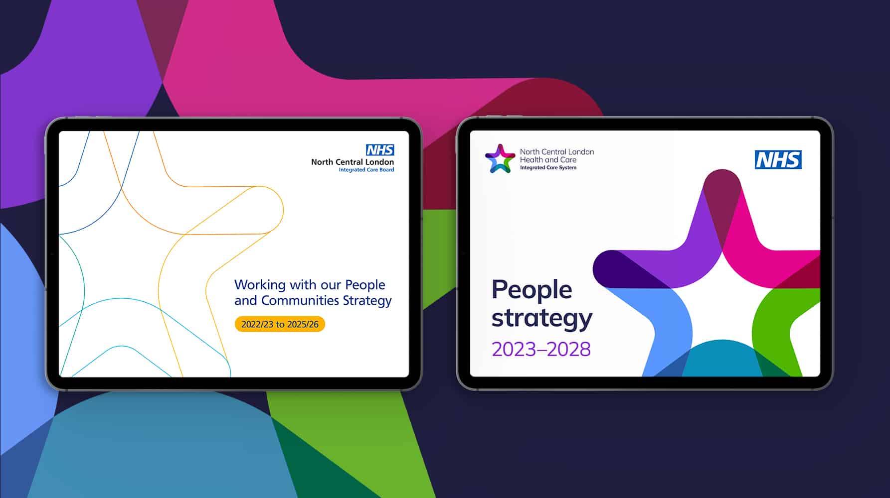
North Central London Integrated Care Board and Integrated Care System rebrand
A twin-brand refresh for NHS North Central London, uniting clarity, warmth and accessibility across two distinct but connected healthcare identities.


