
London Football Awards brand identity
A vibrant and eye-catching identity for one of football’s most prestigious charity events, celebrating the game and raising vital funds for the Willow Foundation.
The challenge
The London Football Awards is a major annual event that recognises the best of football in the capital, while raising money for the Willow Foundation. Ave was brought in to deliver a bold new identity for the event, one that felt premium, energetic and modern, but without favouring any of the 13 London clubs involved.
The brief was to create a visual brand that could hold its own among high-profile sporting and entertainment events, and translate confidently across digital, print and on-the-night experiences. It needed to communicate prestige and celebration, while staying rooted in the sport’s energy and dynamism.
The main challenges
- A striking and versatile logo for the London Football Awards
- A premium event identity with no direct colour association to any London clubs
- A visual language that balances luxury with the energy of the sport
- A bespoke event website that reflects the high-calibre nature of the awards
- Assets suitable for screen, stage, signage and digital marketing


The process
We began by researching luxury event design and visual cues from within and beyond football. The creative needed to appeal to players, coaches, VIP guests and fans alike, and balance classic style with contemporary energy.
Working closely with the client, we explored shape, symbolism and colour systems that would reflect the collective nature of the awards while standing out in a busy calendar of sports events. The final concept had to feel elevated, dynamic and unmistakably London.
The solution
The final logo features a pentagon made from 13 lines – a nod to both the 13 London clubs and one of the classic stitched patches on a leather football. It’s a shape that subtly references the sport without relying on clichés or specific club iconography.
To add vibrancy and visual cut-through, we used a neon green – inspired by stadium laces, pitchside panels and player boots, paired with a refined black backdrop and a custom light flare that adds movement and prestige. The identity bridges the worlds of sport and sophistication, creating a look that feels at home both in a stadium and under the spotlights.
The supporting website extends the brand digitally, offering ticket information, nominee updates and event details, all within a streamlined and visually rich experience. The full identity system was designed to flex across formats, from animated digital assets to print programmes and venue dressing, ensuring consistency and impact at every touchpoint.
Would you like to see results like these for your organisation?
If you’re interested in finding out more about how we could work together, send us a message and we’ll get back to you.
You may also find these interesting
Here’s a look at some of our most recent and relevant work, projects that show what we do, how we think, and the impact we’ve helped create for our clients.
-
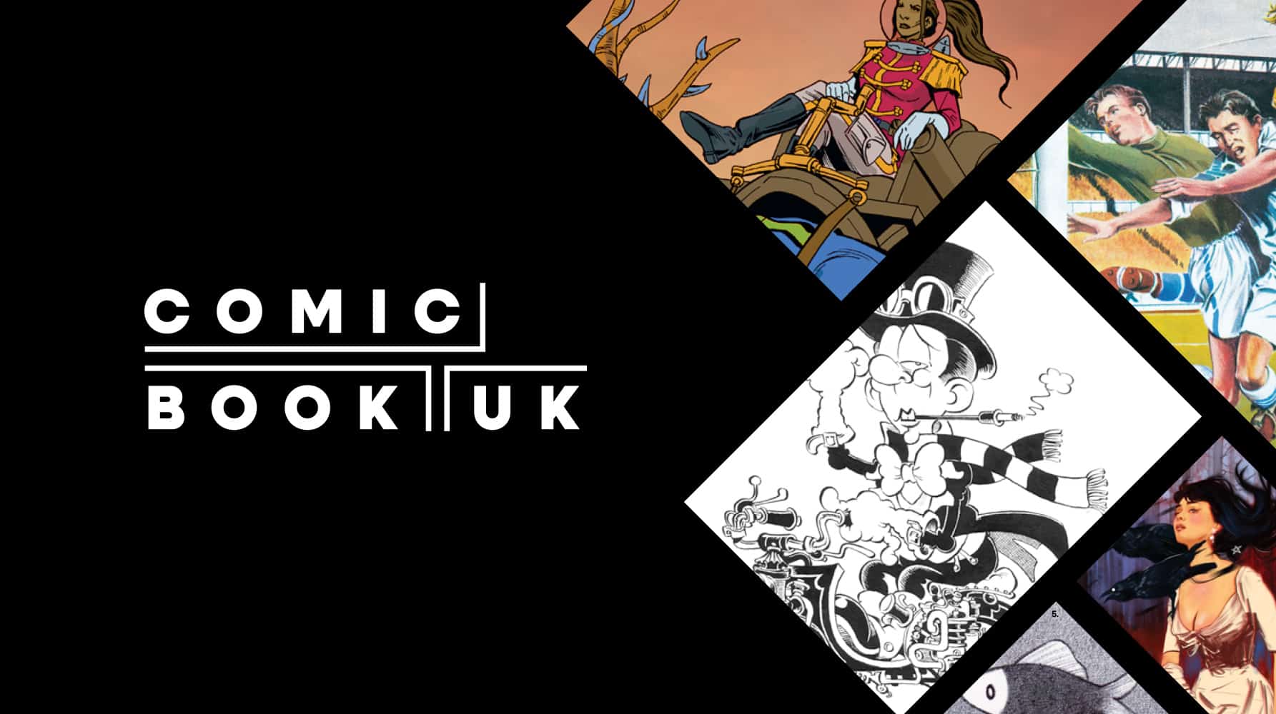
Comic Book UK brand identity and website
A cool and confident brand that is set to engage investors and policymakers, while staying true to the creativity of the comic book world.
-
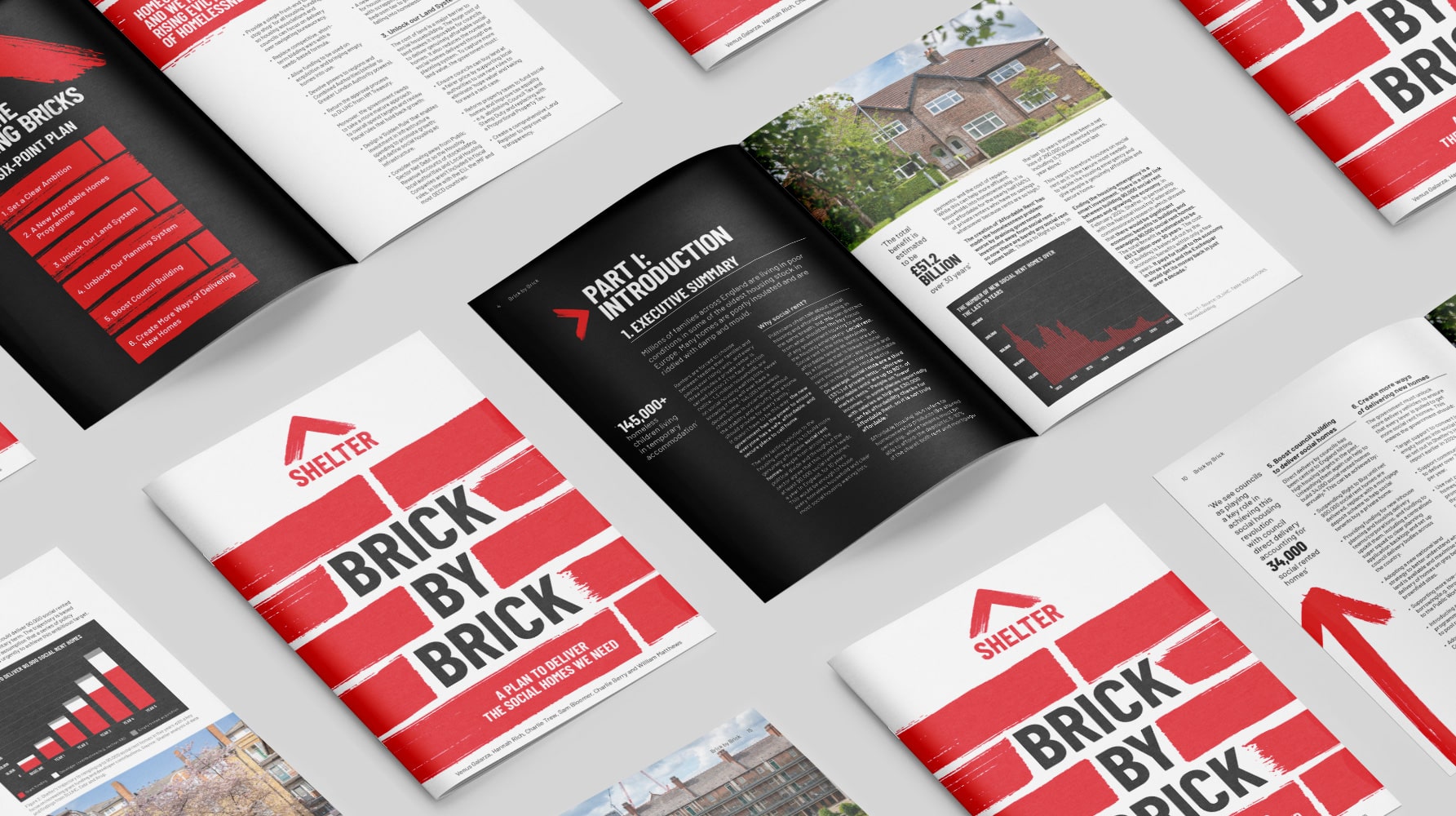
Shelter report on social housing – Brick by Brick
Brick by brick, calling for change: designing Shelter’s flagship report to confront the social rent crisis and demand urgent action
-
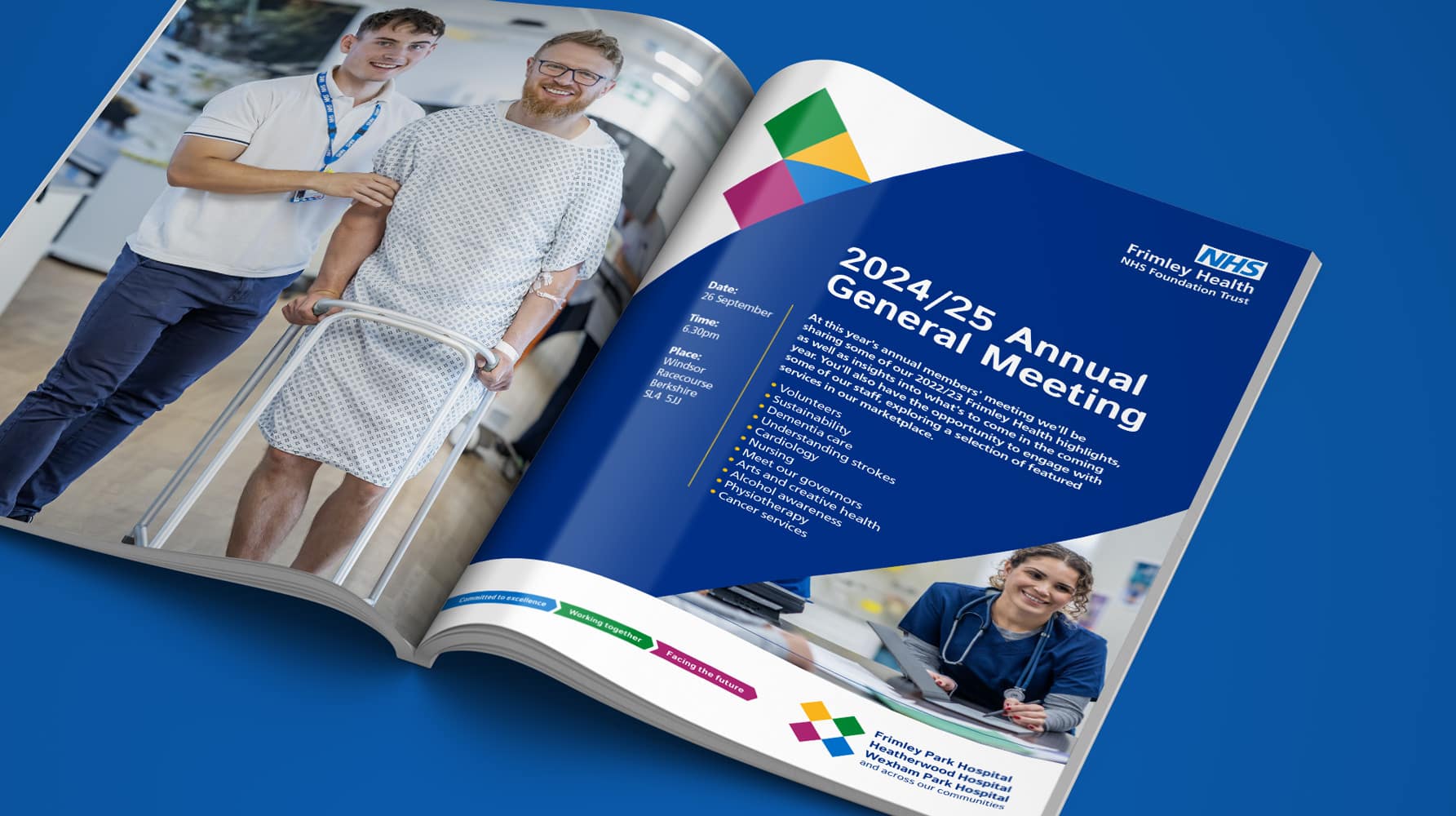
Frimley Health NHS Foundation Trust strategy and rebrand
Bringing clarity, connection and confidence to a trusted NHS identity – a rebrand for Frimley Health that unites services and strengthens public trust
-
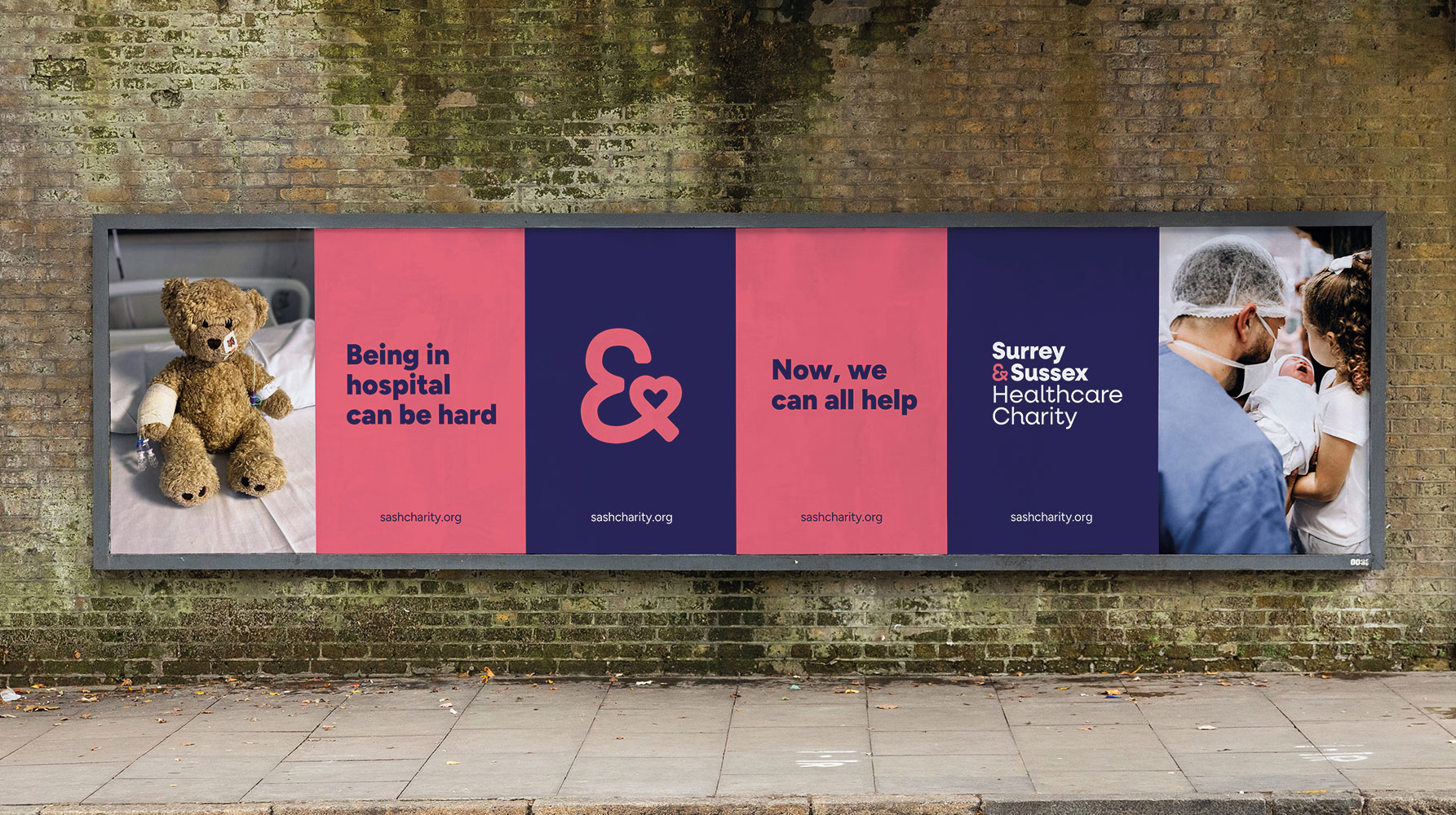
Surrey & Sussex Healthcare Charity rebrand
A local charity with a big heart: rebranding Surrey and Sussex Healthcare Charity to connect communities and champion NHS care


