
Frimley Health NHS Foundation Trust rebrand
Bringing clarity, connection and confidence to a trusted NHS identity – a rebrand for Frimley Health that unites services and strengthens public trust.

The challenge
Frimley Health NHS Foundation Trust (FHFT) reached a significant milestone with plans for the rebuild of Frimley Park Hospital. The Trust’s brand had become fragmented over time, with a proliferation of sub-brands and initiatives creating confusion and diluting impact.
Formed in 2014 through the merger of two Trusts, the retained name of only one hospital site had continued to cause unease and inconsistency across its three main sites.
With a major transformation programme underway, the Trust needed a clearer, more unified brand that would reflect its strategic direction, strengthen internal cohesion, and better engage with patients, staff, and the wider community.
The process
Audience insight formed the foundation of the work. We developed and implemented a wide-reaching consultation plan that engaged staff and local residents across all three main hospital sites. Input was gathered via online surveys and in-person conversations, using visual prompts inspired by other NHS Trusts and new hospital developments.
The requirements
- Development of a simplified, cohesive brand to unify the Trust’s communications
- Stakeholder consultation across all three hospital sites and the wider community
- Alignment with strict NHS branding guidelines, including NHS logo use, colour palette, and typography
- Creation of new sub-brands to bring existing initiatives under a consistent identity
- Expansion of visual assets to give the brand more flexibility and impact
- Delivery of a practical brand toolkit and templates for internal use
- Clear guidelines for accessibility, inclusive image use and sub-brand consistency


The solution
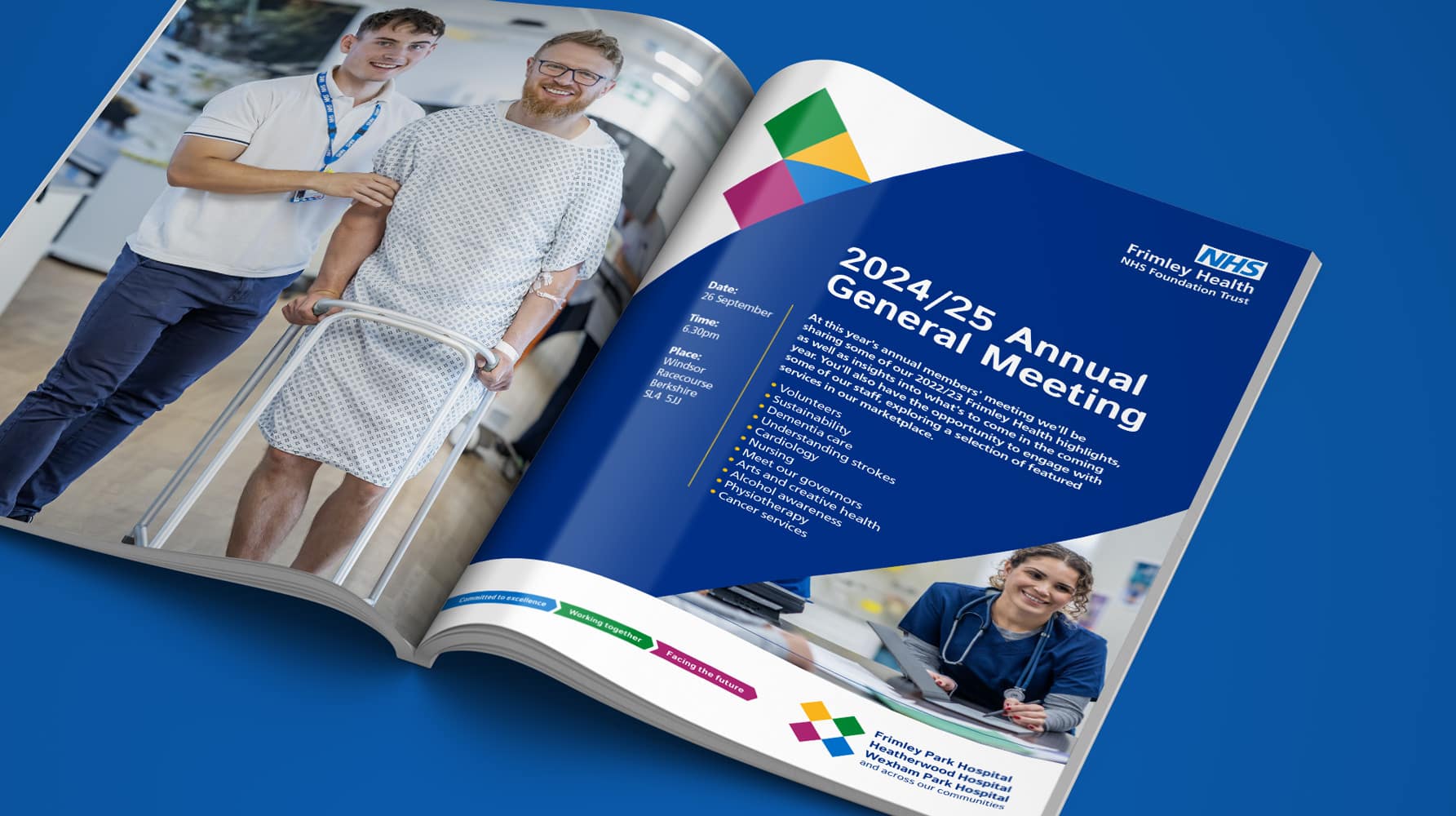
The creative direction centred around a distinctive box device, a simple, flexible graphic tool that visually supports the Trust’s communications and encapsulates its four-part strategy. Viewed from above, the device suggests both a strategic overview and a sense of unfolding possibility. When broken down, it forms an ‘X’ for excellence or transforms into an arrow to signify direction and progress.
We developed a cohesive sub-brand system, linking new and existing initiatives into one recognisable visual identity. Four colours from the NHS palette, plus a dark blue, were used to reflect the four strands of the Trust’s strategy, carried through into values and other key messaging. A guest typeface added a unique tone to headlines, sitting alongside the NHS-standard Frutiger for continuity.

A robust brand toolkit included detailed guidelines on layout hierarchies, colour contrast and accessibility, image selection and tone, as well as a system for developing new icons. Alongside this, an extensive set of templates was created to ensure internal teams could confidently roll out the brand across digital and physical touchpoints.
The result is a unified identity that reflects the Trust’s ambition, simplifies its communications, and lays a solid foundation for the transformation ahead.
Would you like to see results like these for your organisation?
If you’re interested in finding out more about how we could work together, send us a message and we’ll get back to you.
You may also find these interesting
Here’s a look at some of our most recent and relevant work, projects that show what we do, how we think, and the impact we’ve helped create for our clients.
-

Comic Book UK brand identity and website
A cool and confident brand that is set to engage investors and policymakers, while staying true to the creativity of the comic book world.
-
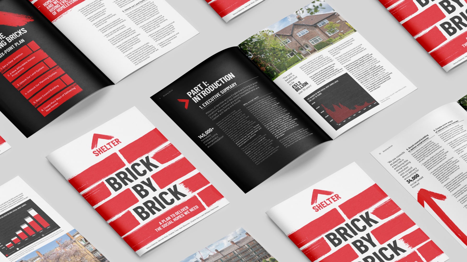
Shelter report on social housing – Brick by Brick
Brick by brick, calling for change: designing Shelter’s flagship report to confront the social rent crisis and demand urgent action
-
Frimley Health NHS Foundation Trust strategy and rebrand
Bringing clarity, connection and confidence to a trusted NHS identity – a rebrand for Frimley Health that unites services and strengthens public trust
-
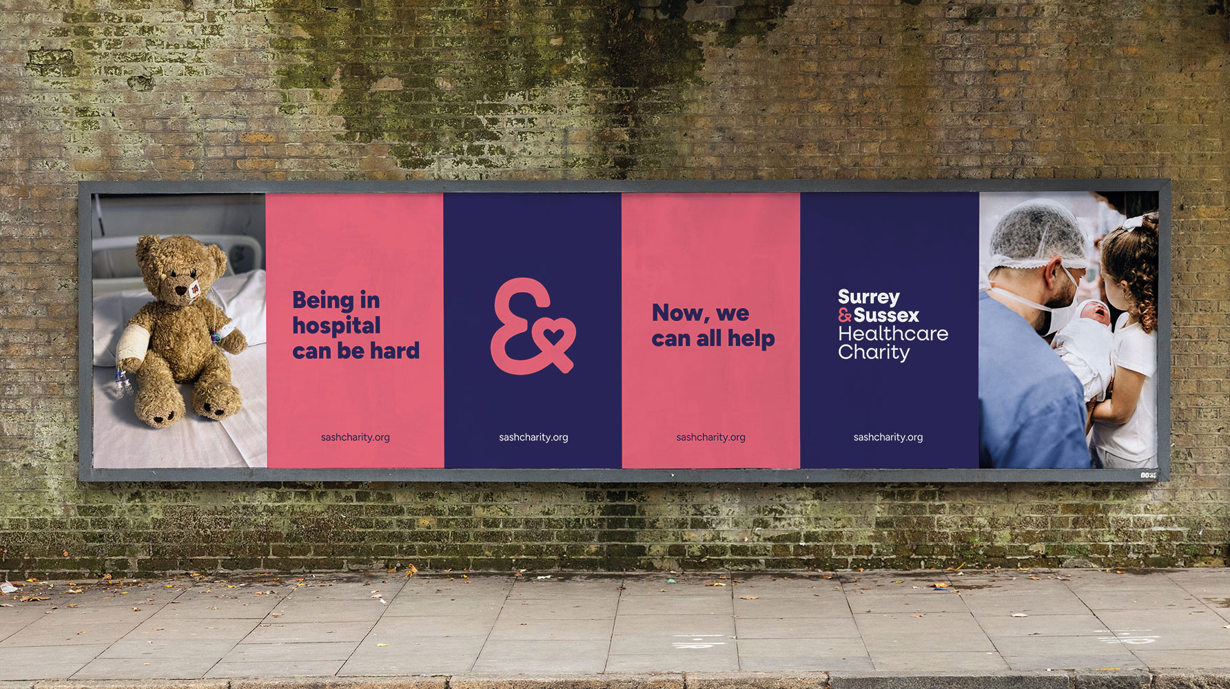
Surrey & Sussex Healthcare Charity rebrand
A local charity with a big heart: rebranding Surrey and Sussex Healthcare Charity to connect communities and champion NHS care


