
CleanupUK rebrand and website
Bringing communities together through a striking, accessible digital identity for CleanupUK

The challenge
CleanupUK is a national charity that inspires and supports local communities to tackle litter, helping them form social connections and take pride in their local areas. As they shifted to a new operating model focused on remote engagement and expanding litter-picking hubs, their existing brand and website were no longer fit for purpose.
They needed a new digital platform that reflected their strategic shift, simplified data capture, and better supported their audiences, from individuals and groups wanting to pick litter to community organisations, partners, and funders.
Alongside this, a refreshed visual identity was needed to better reflect their current work, be more accessible, and help position CleanupUK as the go-to organisation for community litter-picking in the UK.
The requirements
- Refreshed logo, colour palette and typography
- Accessible design that better represents CleanupUK today
- Visual toolkit including illustration and iconography styles
- Brand guidelines with rollout support
- New IA and user journeys tailored to CleanupUK’s six key audiences
- Website UI design mock-ups and templates


The process
We began with a discovery phase including a detailed kick-off session and an audit of the existing brand and digital landscape. From this, we created moodboards and conducted a sector audit to inform the visual brief.
For the brand, we developed three logo routes, each tested for accessibility and aligned to different brand personalities. Once a direction was selected, we rolled it out into a full visual identity system with accompanying guidelines and templates.
Website design focused on enabling a striking but simple front-end, and a flexible, design features, allowing for data collection, group registration, mapped activities, and social proof.
The solution
The final brand system brings vibrancy, clarity and community to the fore. The logo was refined into a more recognisable and scalable form, supported by a flexible toolkit of colours, shapes and icons, each designed with accessibility in mind. The photography and illustration styles were refreshed to reflect the fun, hands-on nature of community litter-picking.
On the website, we created a modular design system that guides different user types through tailored journeys, from joining a group or starting one, to exploring case studies or applying for funding.
The result is a cohesive brand and website that better tells CleanupUK’s story, supports their mission, and strengthens their connection with volunteers, partners and funders across the country.
Would you like to see results like these for your organisation?
If you’re interested in finding out more about how we could work together, send us a message and we’ll get back to you.
You may also find these interesting
Here’s a look at some of our most recent and relevant work, projects that show what we do, how we think, and the impact we’ve helped create for our clients.
-
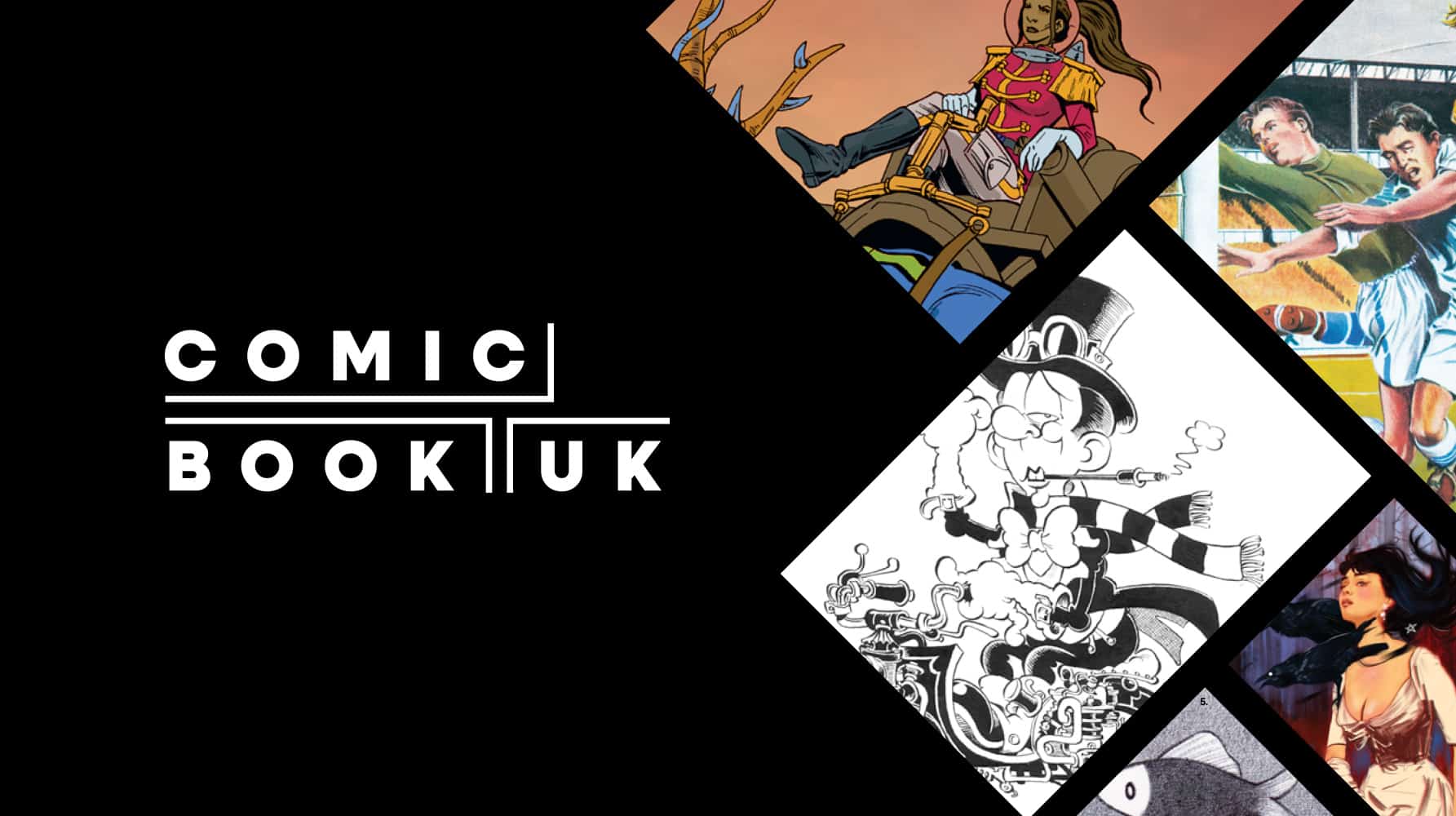
Comic Book UK brand identity and website
A cool and confident brand that is set to engage investors and policymakers, while staying true to the creativity of the comic book world.
-
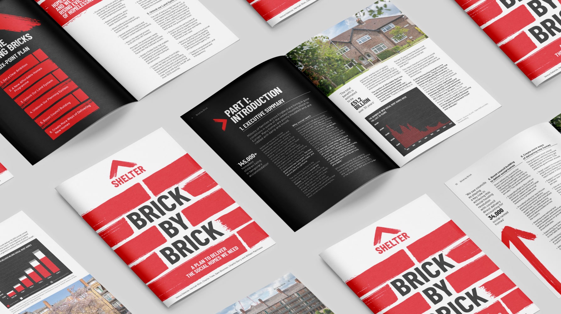
Shelter report on social housing – Brick by Brick
Brick by brick, calling for change: designing Shelter’s flagship report to confront the social rent crisis and demand urgent action
-
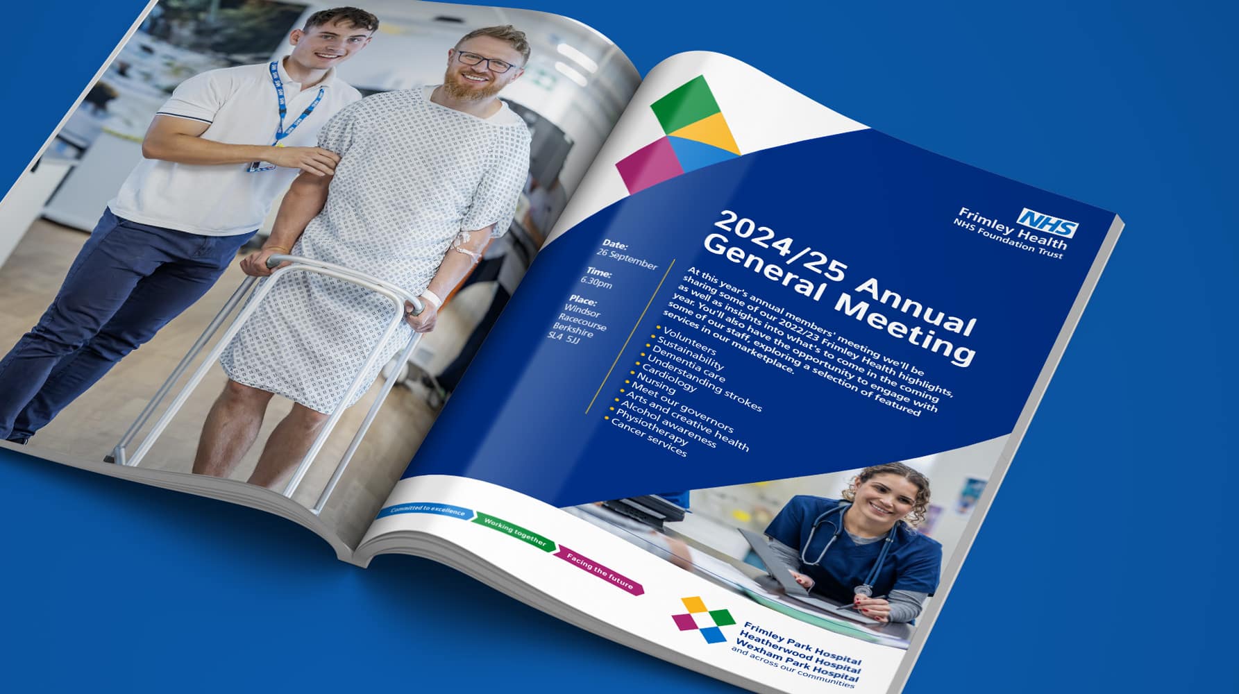
Frimley Health NHS Foundation Trust strategy and rebrand
Bringing clarity, connection and confidence to a trusted NHS identity – a rebrand for Frimley Health that unites services and strengthens public trust
-
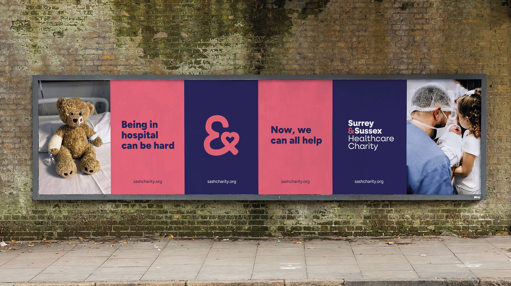
Surrey & Sussex Healthcare Charity rebrand
A local charity with a big heart: rebranding Surrey and Sussex Healthcare Charity to connect communities and champion NHS care


