
Royal College of Radiologists: iRefer brand refresh and website
Designing with precision: transforming iRefer into a trusted, intuitive digital tool for clinicians making imaging decisions.

The challenge
Since its inception in 1989, the iRefer Guidelines had a brand identity closely tied to its parent organisation, the Royal College of Radiologists.
The brand felt outdated and clinical, lacking the dynamism expected of a global healthcare leader. With plans to replace printed guidelines with a UX-led online platform, the team recognised the need for a modern brand identity that would engage both administrative decision-makers and healthcare professionals. Our task was to conduct research and create a new, flexible brand identity that resonated with these distinct audiences.
The background
- Refresh a dated, clinical brand identity
- Create a standalone brand, distinct from RCR
- Develop a clear, confident tone of voice
- Reflect iRefer’s evidence-based mission
- Help position iRefer as a global healthcare leader


The creative
We began with workshops and focus groups to refine iRefer’s tone of voice and visual identity. Insights guided the creation of the strapline, “Right test, first time,” encapsulating iRefer’s mission of ensuring evidence-based, accurate testing from the outset. The new logo features a dynamic asterisk symbol with an arrow representing progress, pointing to a green spark symbolising precision.

To humanise the brand, we introduced character illustrations highlighting the tool’s impact on people, from healthcare professionals to patients. The design toolkit includes graphic elements inspired by the logo’s angles, representing user journeys and iRefer’s dynamic nature. A contemporary colour palette, combining navy, blue, green, and a vibrant yellow, enhances clarity and engagement.

The result is a modern, human-centric brand identity that positions iRefer as a global leader in evidence-based imaging, aligned with its mission to optimise outcomes and support healthcare professionals.
Working with Ave has been fantastic right from the start for everyone that’s been involved. The entire team is very passionate about what they do and are highly knowledgeable. We found a really good cultural fit between our two organisations with our objectives well aligned. Their approach is very practical and is always done the target audience in mind. The brand refresh project was carried out very professionally; on target both cost and time wise and delivered to the highest standard of quality. We continue to work with Ave on other projects today and look forward to doing so on further more.”
Product Manager ‑ iRefer
Royal College of Radiologists
reduction in bounce rate from users on the website
increase in active engagement on the website
active engagement rate on the website
Would you like to see results like these for your organisation?
If you’re interested in finding out more about how we could work together, send us a message and we’ll get back to you.
You may also find these interesting
Here’s a look at some of our most recent and relevant work, projects that show what we do, how we think, and the impact we’ve helped create for our clients.
-
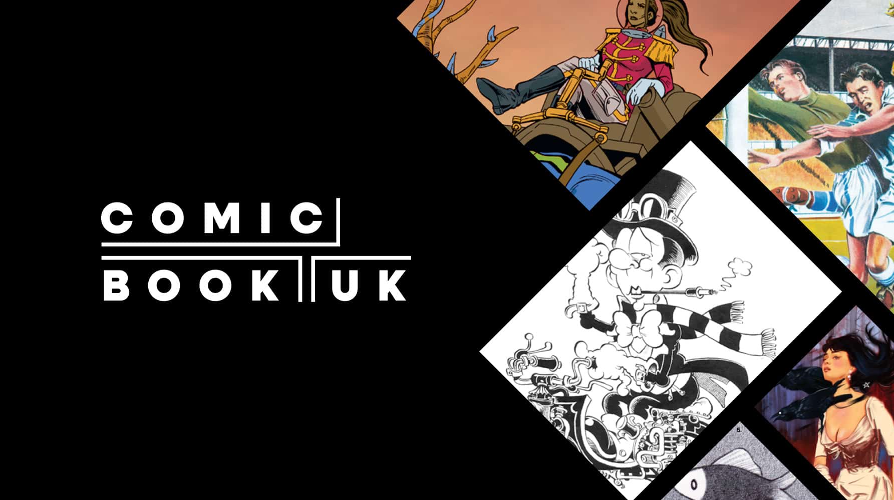
Comic Book UK brand identity and website
A cool and confident brand that is set to engage investors and policymakers, while staying true to the creativity of the comic book world.
-
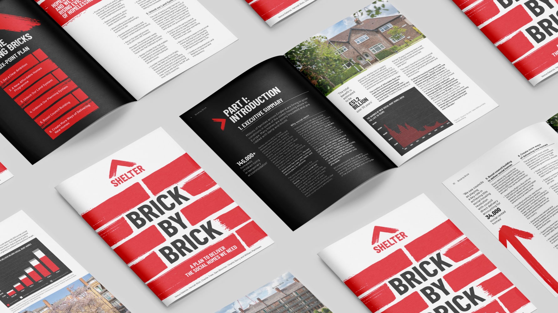
Shelter report on social housing – Brick by Brick
Brick by brick, calling for change: designing Shelter’s flagship report to confront the social rent crisis and demand urgent action
-
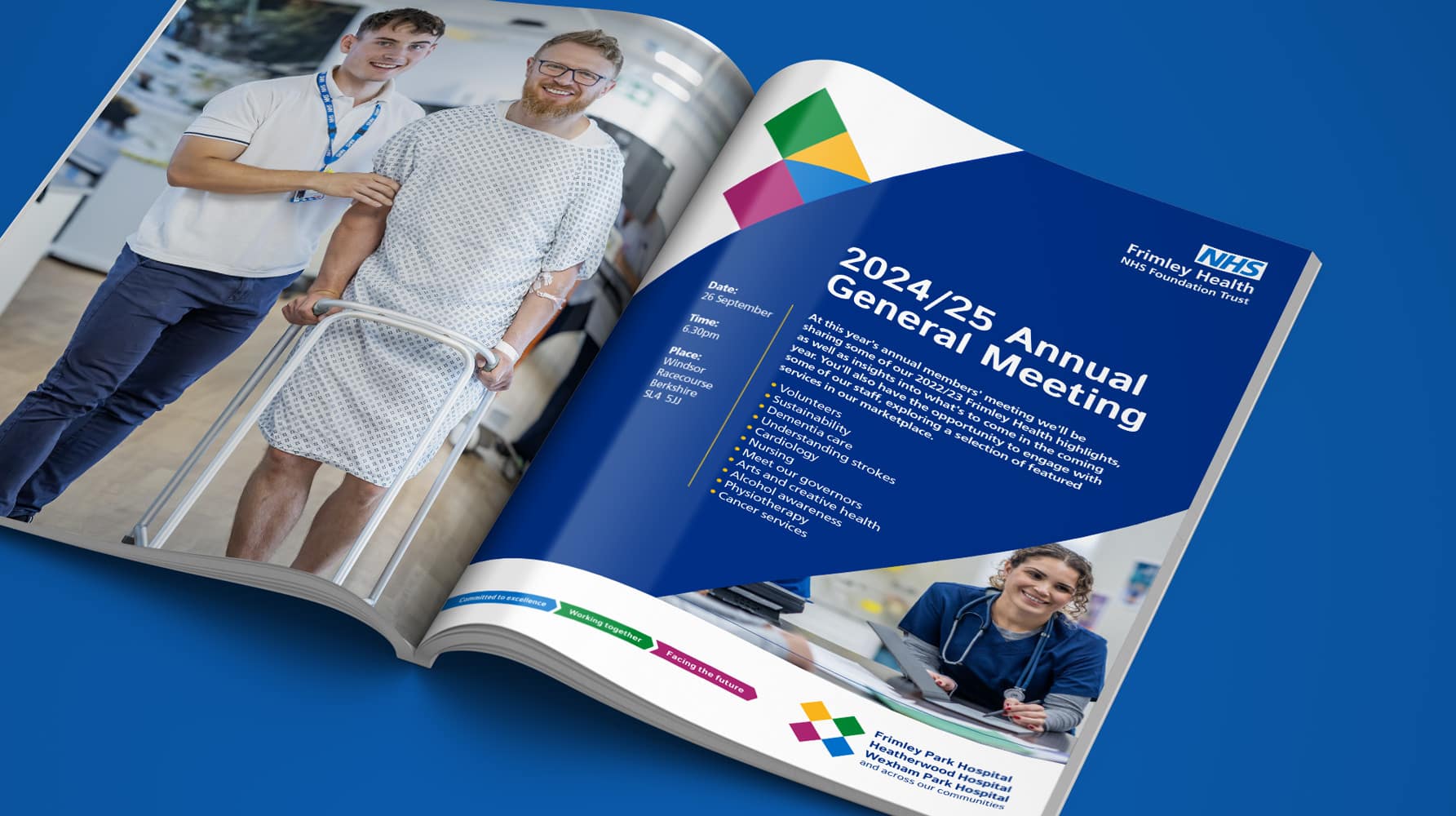
Frimley Health NHS Foundation Trust strategy and rebrand
Bringing clarity, connection and confidence to a trusted NHS identity – a rebrand for Frimley Health that unites services and strengthens public trust
-
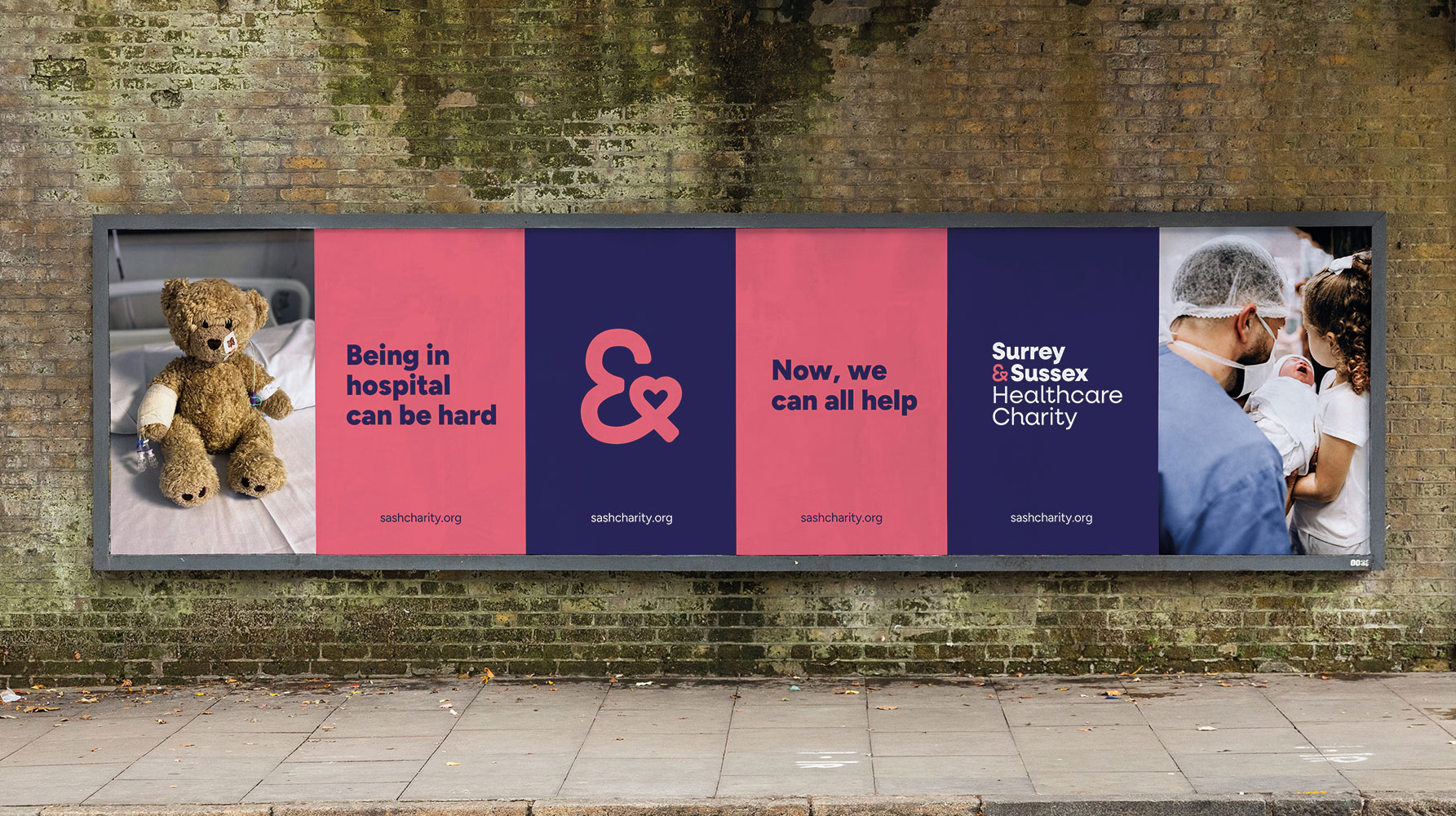
Surrey & Sussex Healthcare Charity rebrand
A local charity with a big heart: rebranding Surrey and Sussex Healthcare Charity to connect communities and champion NHS care


