
North Central London Integrated Care Board and Integrated Care System rebrand
A twin-brand refresh for NHS North Central London, uniting clarity, warmth and accessibility across two distinct but connected healthcare identities.

The challenge
North Central London Integrated Care Board (ICB) appointed Ave to lead a brand refresh for both the ICB and the North Central London Integrated Care System (ICS). The ICB is an NHS organisation responsible for strategy and budget decisions, while the ICS brings together NHS, local authority and voluntary sector partners to deliver joined-up care across five boroughs: Barnet, Camden, Enfield, Haringey and Islington.
The challenge was two-fold. ‘North Central London’ is not a widely recognised or intuitive area for residents, so the brand needed to create familiarity and coherence. The ICB brand had to remain within NHS identity guidelines while feeling less corporate and more human – a professional but people-first tone was essential. Internally, there was a desire to clearly distinguish between corporate and staff-facing communications.
The ICS, meanwhile, required a public-facing brand with more flexibility, not bound by NHS identity rules but still visually linked to the ICB. It needed to reflect the diversity and collaboration at the heart of the integrated system while being simple and accessible for a wide range of partner organisations.
The requirements
- A refreshed brand identity for the ICS, including a revised logo and visual system
- A linked visual identity for the ICB, based on NHS brand guidelines
- Clear differentiation between corporate and employee-facing communications for the ICB
- A shared visual language that could link the ICB and ICS while allowing flexibility
- Brand guidelines and templates for consistent use across multiple teams and organisations
- A shared image library with guidance for sourcing authentic, inclusive photography


The process
We began with a consultancy phase involving stakeholders from both the ICB and ICS, running collaborative workshops to explore the brand’s current perception and future direction. These sessions informed a creative brief and a series of concept routes, which we refined based on feedback.
To ensure relevance and resonance with the public, we tested the shortlisted designs with a committee of local residents as well as partner organisations. The final identities were developed into a full suite of templates and guidelines, making them easy to implement across multiple channels and user types.
The solution
The refreshed ICS identity centred around the existing star emblem. We evolved it into a single, unified shape with five pin-drop elements, each representing a borough. Brightened colours and overlapping forms added energy and cohesion. The shape itself became a flexible graphic device used throughout the brand – bold and full-bleed in some contexts, smaller and more dynamic in others. An accessible, modern typeface completed the update, designed for use at any scale.
The ICB retained its official NHS logo, but we developed a companion visual system that echoed the ICS branding. The star became a fine keyline element – symbolising the ICB’s framework role, and was recoloured using NHS secondary brand colours to move beyond the usual NHS blues. The corporate palette focused on crisp white and dark blue, while staff communications were warmer and more expressive, using purple, aqua and yellow. Colour-coded themes and custom icons helped staff easily navigate content related to wellbeing, learning, internal comms and recognition.
We also developed a shared photography library and accompanying image guidance to ensure consistent, inclusive visuals, whether sourcing from stock or commissioning original content.

Would you like to see results like these for your organisation?
If you’re interested in finding out more about how we could work together, send us a message and we’ll get back to you.
You may also find these interesting
Here’s a look at some of our most recent and relevant work, projects that show what we do, how we think, and the impact we’ve helped create for our clients.
-
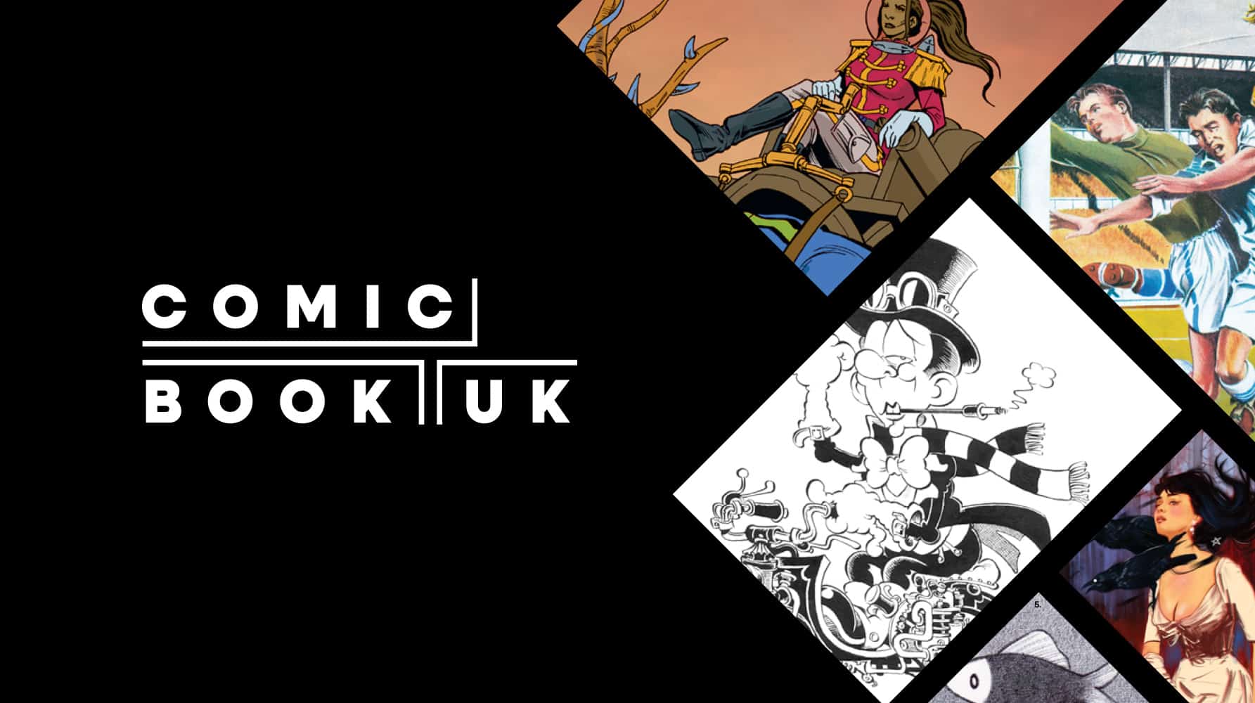
Comic Book UK brand identity and website
A cool and confident brand that is set to engage investors and policymakers, while staying true to the creativity of the comic book world.
-
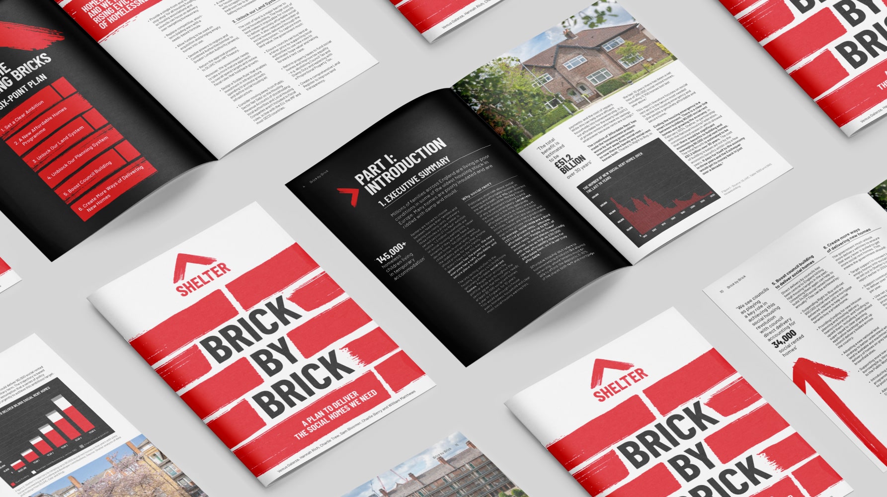
Shelter report on social housing – Brick by Brick
Brick by brick, calling for change: designing Shelter’s flagship report to confront the social rent crisis and demand urgent action
-
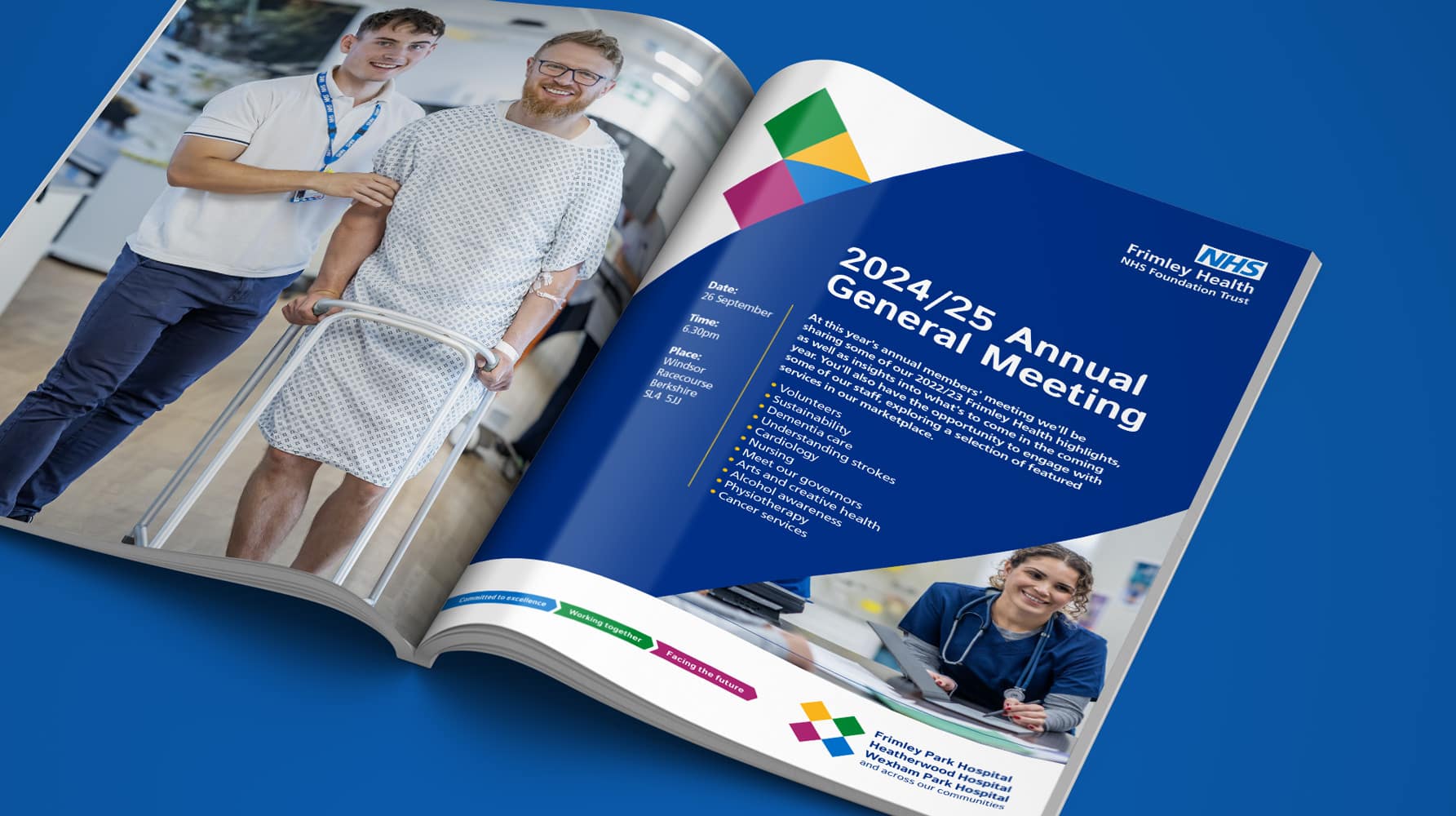
Frimley Health NHS Foundation Trust strategy and rebrand
Bringing clarity, connection and confidence to a trusted NHS identity – a rebrand for Frimley Health that unites services and strengthens public trust
-
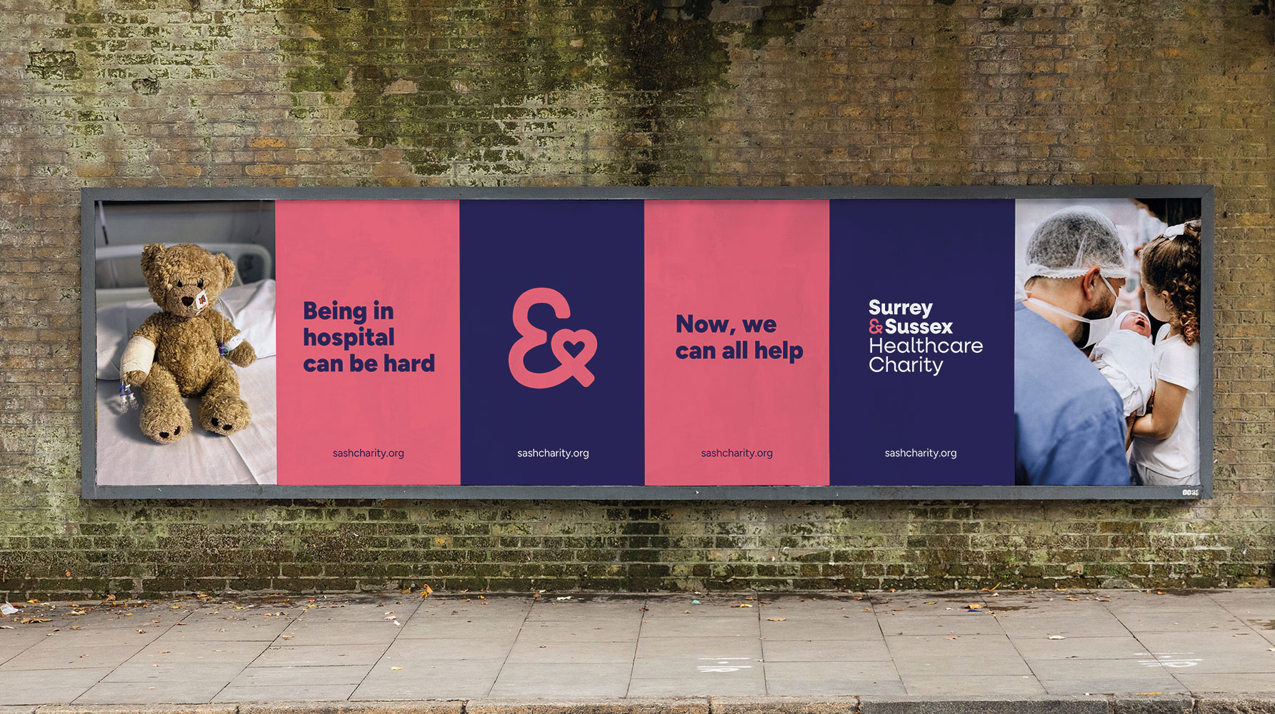
Surrey & Sussex Healthcare Charity rebrand
A local charity with a big heart: rebranding Surrey and Sussex Healthcare Charity to connect communities and champion NHS care


