
Youth Challenge brand identity
A bold new brand for a youth development charity, built to grow confidence, spark recognition and stand up to the sector’s expectations.

The challenge
Youth Challenge Oxfordshire is a charity that supports 13–21-year-olds in building confidence and resilience through a bespoke 18-month programme. When they approached Ave, they had limited brand assets, a restricted colour palette and an abbreviation ‘YoCo’ that was also associated with a cash machine provider.
The charity needed a full rebrand to reflect its purpose and personality, something confident, playful and rooted in personal growth. The concept of ‘challenge’ had to feel inclusive and supportive, acknowledging that success looks different for everyone, whether that’s delivering a presentation or holding a spider. This wasn’t about extremes, but about stretching yourself in your own way.
The requirements
- A completely new brand identity to replace ‘YoCo’
- A logo system with the ability to flex across sub-brands (e.g. regional programmes)
- A tone and look that reflected personal challenge, not physical exertion
- An energetic but warm visual language that would resonate with young people and funders
- A visual toolkit for ease-of-use in-house, covering print, digital and presentation formats
- Supporting graphics, typography and iconography with long-term flexibility


The process
We started with a research phase, reviewing the youth development and programme provider landscape to identify opportunities to differentiate. Through collaborative workshops with the Youth Challenge team, we explored visual styles, tone and perceptions of ‘challenge’.
From this, we developed early logo concepts that captured the balance of boldness and supportiveness. The need for localisation was built in from the start, with the ability to adapt the identity for regional variations like ‘Youth Challenge Oxfordshire’.
We then expanded the visual identity, building a flexible, distinctive system of graphic assets, brushstrokes, angular shapes and a vibrant colour palette, all underpinned by accessibility, clarity and a strong sense of fun.
The solution
The final identity features a dynamic typographic wordmark, where the letters ‘O’ and ‘L’ form a raised figure with arms in the air, a subtle but joyful gesture that embodies the spirit of challenge and achievement.


Supporting assets were drawn from this central logomark, creating angular bars and page splits with soft curves that energise layouts while keeping things friendly. These are complemented by a textured brushstroke device, used especially for youth-facing materials to bring warmth and humanity into the system.
The colour palette is vibrant and youth-driven, based on early research and crafted to stand out in a crowded sector. Typography is open-source and accessible – Red Hat Display – chosen for its bold, geometric personality and practical ease of use for all team members.
The result is a cohesive, future-proof identity that celebrates the charity’s mission while giving it the flexibility and confidence to grow. It’s ready for national reach, but rooted in personal journeys, just like the young people it supports.
Would you like to see results like these for your organisation?
If you’re interested in finding out more about how we could work together, send us a message and we’ll get back to you.
You may also find these interesting
Here’s a look at some of our most recent and relevant work, projects that show what we do, how we think, and the impact we’ve helped create for our clients.
-
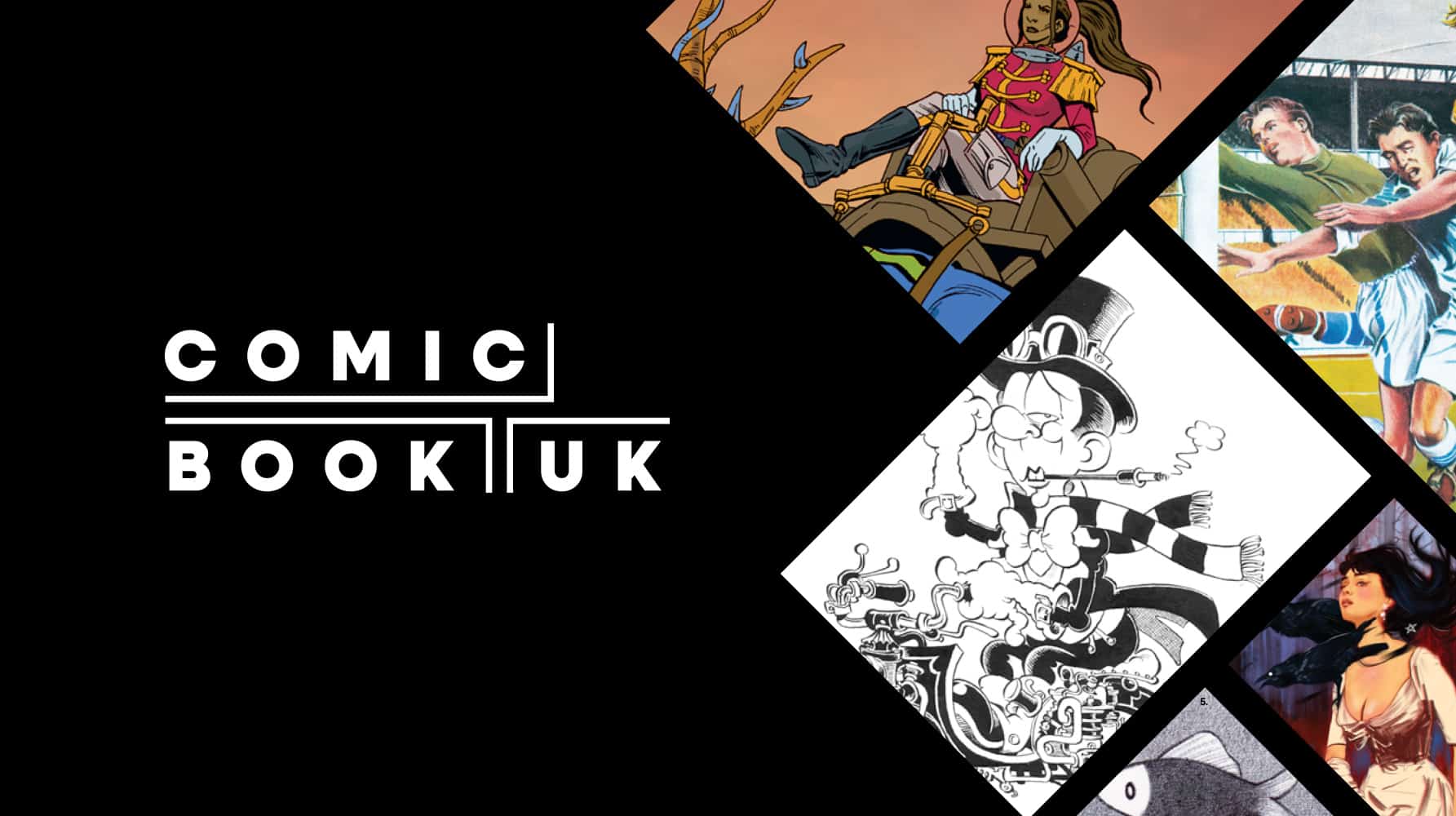
Comic Book UK brand identity and website
A cool and confident brand that is set to engage investors and policymakers, while staying true to the creativity of the comic book world.
-
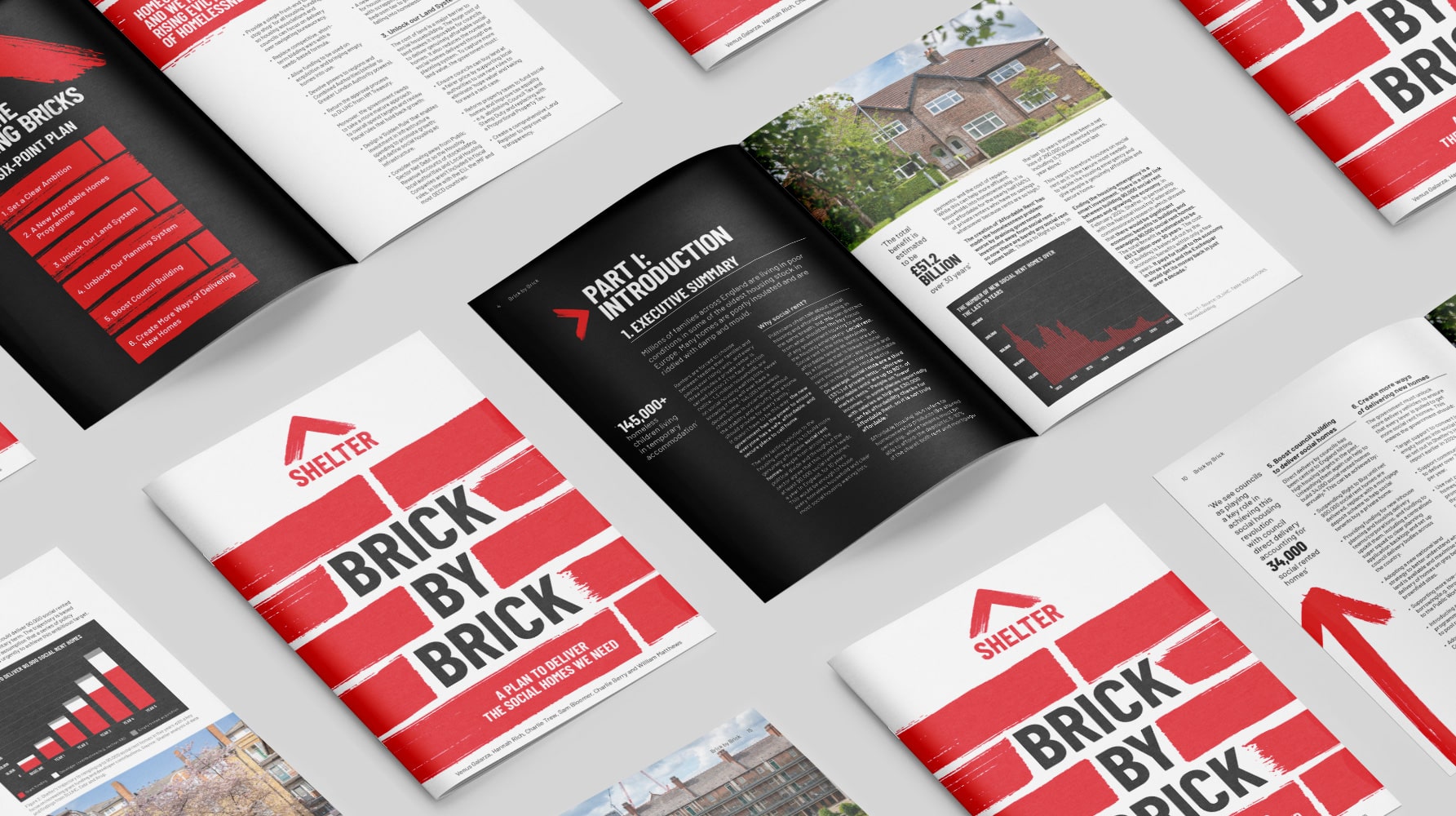
Shelter report on social housing – Brick by Brick
Brick by brick, calling for change: designing Shelter’s flagship report to confront the social rent crisis and demand urgent action
-
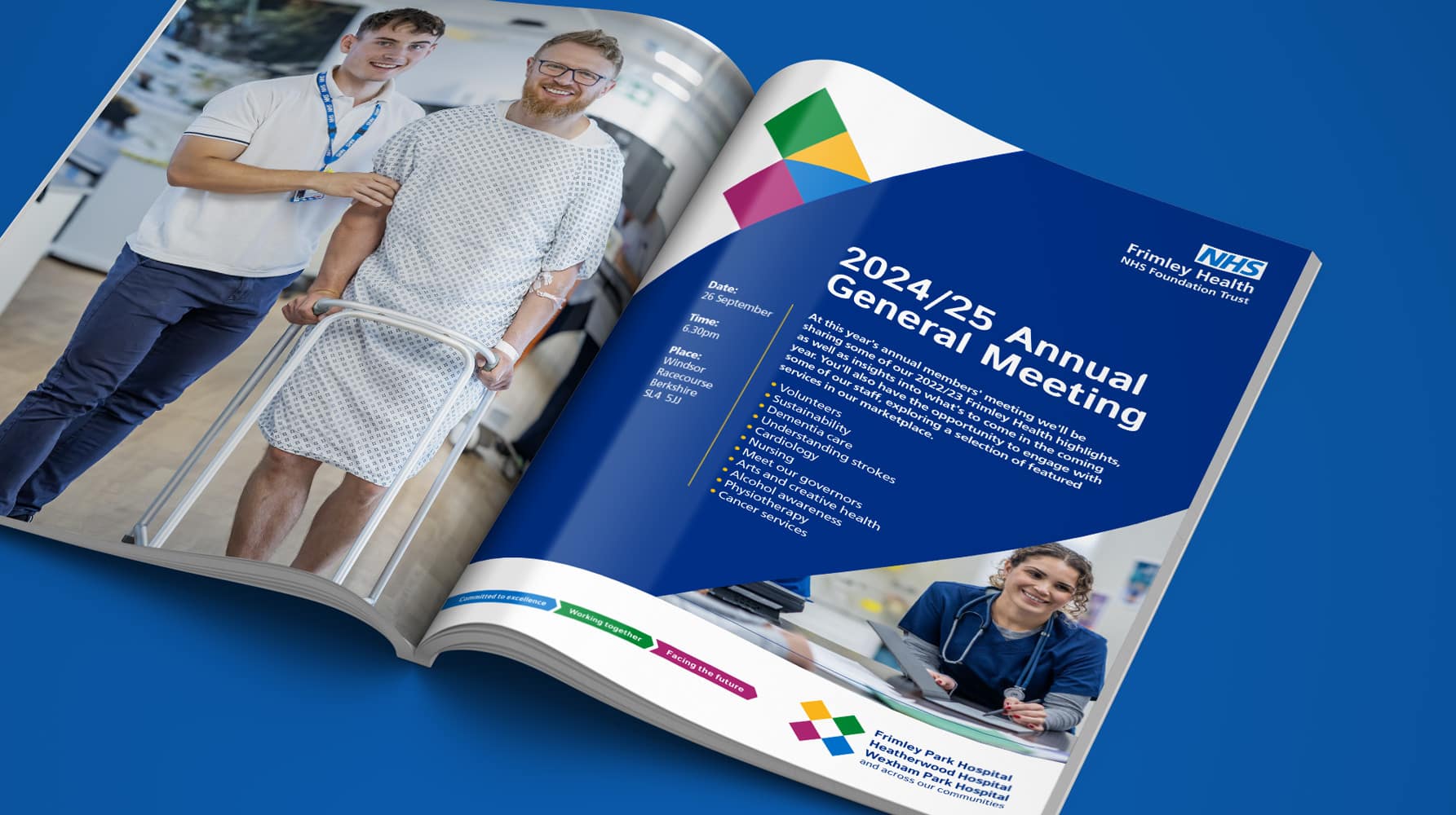
Frimley Health NHS Foundation Trust strategy and rebrand
Bringing clarity, connection and confidence to a trusted NHS identity – a rebrand for Frimley Health that unites services and strengthens public trust
-
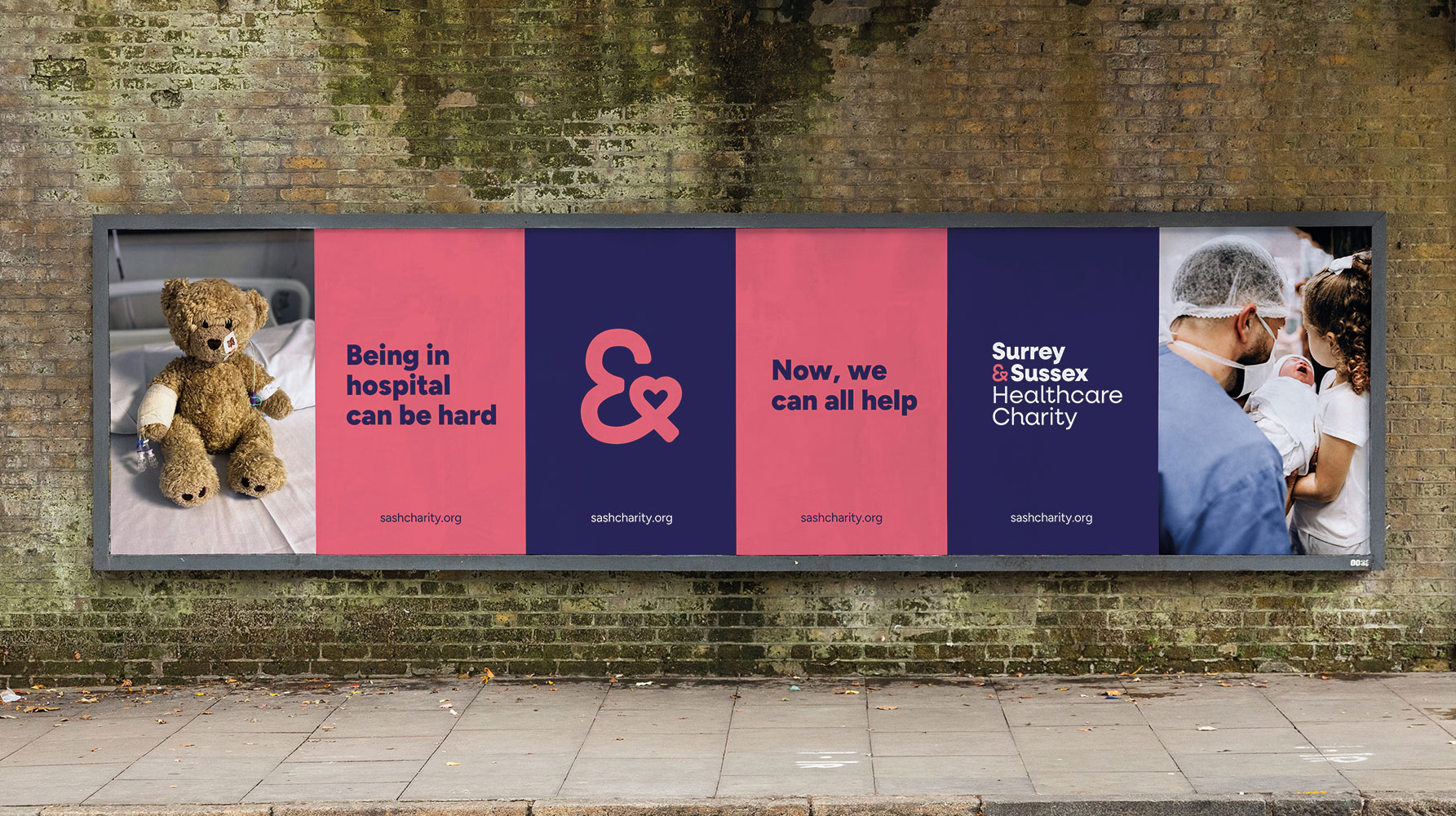
Surrey & Sussex Healthcare Charity rebrand
A local charity with a big heart: rebranding Surrey and Sussex Healthcare Charity to connect communities and champion NHS care


