
Surrey & Sussex Healthcare Charity rebrand
A local charity with a big heart: rebranding Surrey and Sussex Healthcare Charity to connect communities and champion NHS care.

The challenge
Surrey and Sussex Healthcare Charity are an NHS charity operating across several hospital and satellite sites, including East Surrey Hospital. They had little recognition within the communities they serve, people had heard of their hospitals, and cared deeply about them, but had not heard of the charity or recognised the brand.
The charity needed a brand which would instantly resonate with and inspire people to support their work. They also needed one which would equip them well over a transitionary period that would span the coming decade.
Through consultation and stakeholder engagement, it became clear that the charity needed a unifying name and brand that would clearly communicate their purpose and connection to the hospitals they support. A branded house model was identified as the right approach, with the charity as the parent brand and each hospital site represented as distinct but connected entities.
The identity also had to be accessible, adaptable and easy to implement in-house, with tools and guidance to support future growth over the coming decade.
The requirements
- Steering group management and stakeholder alignment
- Consultation with staff, supporters and wider community
- Development of a new, unifying name for the charity
- Creation of clear, compelling key messaging to articulate the charity’s purpose
- Brand architecture
- Design of a physical-first brand identity suited to hospital environments and real-world application
- Development of a flexible visual system to support appeals, funds and campaigns
- Creation of brand templates and a comprehensive guide for in-house use over a long-term transition period


The solution
We developed a bold, emotionally resonant brand that centres the charity’s mission: to make hospital experiences better. At its heart is a distinctive logo featuring the ‘heart ampersand’- a symbol of unity, care, and shared purpose. This device anchors the brand system and forms the basis of a flexible, functional toolkit.
The colour palette is led by a warm, empathetic pink, representing the emotional impact of the charity’s work. The core logo is supported by site-specific versions: East Surrey mirrors the parent closely, while Crawley, Horsham and Caterham Dene each have a distinct colour identity drawn from the wider palette.

Curved shapes and block colour headlines echo the soft forms of the ampersand throughout the brand system. A set of bespoke ‘ray’ devices, used across fundraising appeals, symbolise empowerment, hope and community effort. All of this is underpinned by a robust set of templates and a comprehensive brand guide, enabling the in-house team to use the brand with confidence and consistency.
The new identity delivers clarity, cohesion and emotional resonance, giving the charity the platform it needs to be seen, heard, and supported well into the future.
Would you like to see results like these for your organisation?
If you’re interested in finding out more about how we could work together, send us a message and we’ll get back to you.
You may also find these interesting
Here’s a look at some of our most recent and relevant work, projects that show what we do, how we think, and the impact we’ve helped create for our clients.
-

Council of Deans of Health brand identity and website
Council of Deans of Health brand identity and website The Council of Deans of Health represents the UK’s universities engaged in education and research for…
-
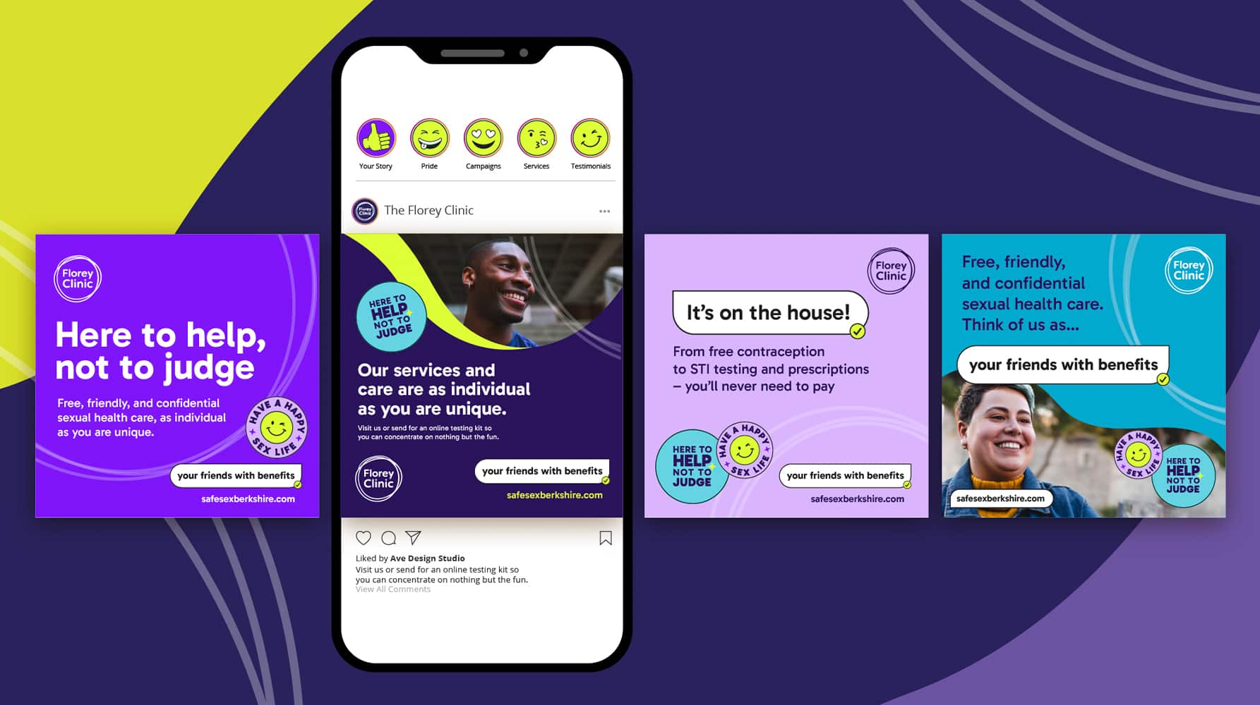
The Florey Clinic sexual health campaign
Turning sexual health stigma into confidence — say hello to “your friends with benefits” for The Florey Clinic.
-

Comic Book UK brand identity and website
A cool and confident brand that is set to engage investors and policymakers, while staying true to the creativity of the comic book world.
-
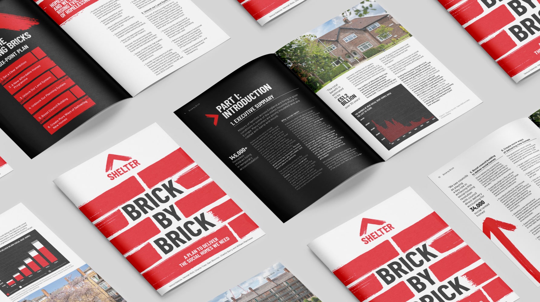
Shelter report on social housing – Brick by Brick
Brick by brick, calling for change: designing Shelter’s flagship report to confront the social rent crisis and demand urgent action


