
Camden Council Family Hubs brand identity
Putting families first: creating an accessible, welcoming brand for Camden’s Family Hubs to support parents, carers and children in their local community

The Challenge
Camden is one of 75 local authorities selected to deliver a Government-funded Family Hubs programme, designed to provide families with accessible, non-judgemental support.
These hubs offer a mix of physical and virtual spaces, alongside outreach services, to assist parents, carers, and their children in navigating challenges. Camden’s unique diversity—one of the most varied boroughs in the UK, with almost a third of children living in poverty—created a need for a brand identity that resonated across a wide range of socio-economic and cultural backgrounds. The challenge was not only to unite all family services under one cohesive brand but also to develop communications that were effective for varying levels of literacy and fluency in English.


We were appointed to run a comprehensive consultation with residents to uncover the challenges of creating a unified Family Hubs brand and to design an engaging identity and communications system. Through this process, we sought to ensure that the brand would appeal to parents and carers of all ages and backgrounds, particularly focusing on the borough’s BAME residents, who are central to its demographic makeup.

The Creative
Our consultation engaged over 15 diverse groups, including parents, carers, children, service providers, and partners. We explored their understanding of “family” and gathered insights through various stimuli, such as photography, colour palettes, and existing branding from other family hubs. These conversations shaped a creative brief that informed the next stages of the project.
In the concept phase, we developed eight initial logo designs that experimented with icons, fonts, and colour palettes. These were tested with 70 participants through focus groups and shared via a survey, garnering responses from over 400 internal and external stakeholders. Once a preferred logo emerged, we expanded on the concept with three distinct visual identity directions, incorporating colours, photography, illustration, and design samples. Another round of focus groups and surveys confirmed one clear favourite.

With the logo and visual identity finalised, we created a copy guidance matrix to ensure messaging could be tailored to different services, content types, and audience segments. We consolidated all elements into comprehensive brand guidelines, which included templates for consistent design across touchpoints. To ensure sustainability, we provided training for Camden’s internal design team, equipping them to roll out the new brand effectively.
This cohesive approach has ensured that Camden’s Family Hubs are visually unified and equipped to communicate their mission in a way that resonates with the borough’s diverse community.
Would you like to see results like these for your organisation?
If you’re interested in finding out more about how we could work together, send us a message and we’ll get back to you.
You may also find these interesting
Here’s a look at some of our most recent and relevant work, projects that show what we do, how we think, and the impact we’ve helped create for our clients.
-

Council of Deans of Health brand identity and website
Council of Deans of Health brand identity and website The Council of Deans of Health represents the UK’s universities engaged in education and research for…
-
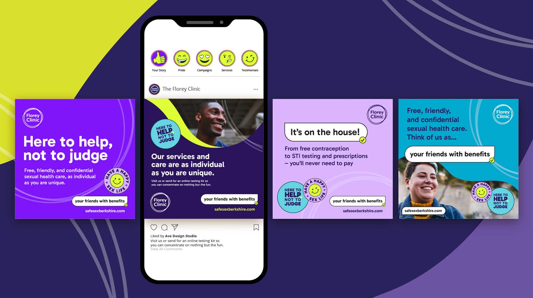
The Florey Clinic sexual health campaign
Turning sexual health stigma into confidence — say hello to “your friends with benefits” for The Florey Clinic.
-
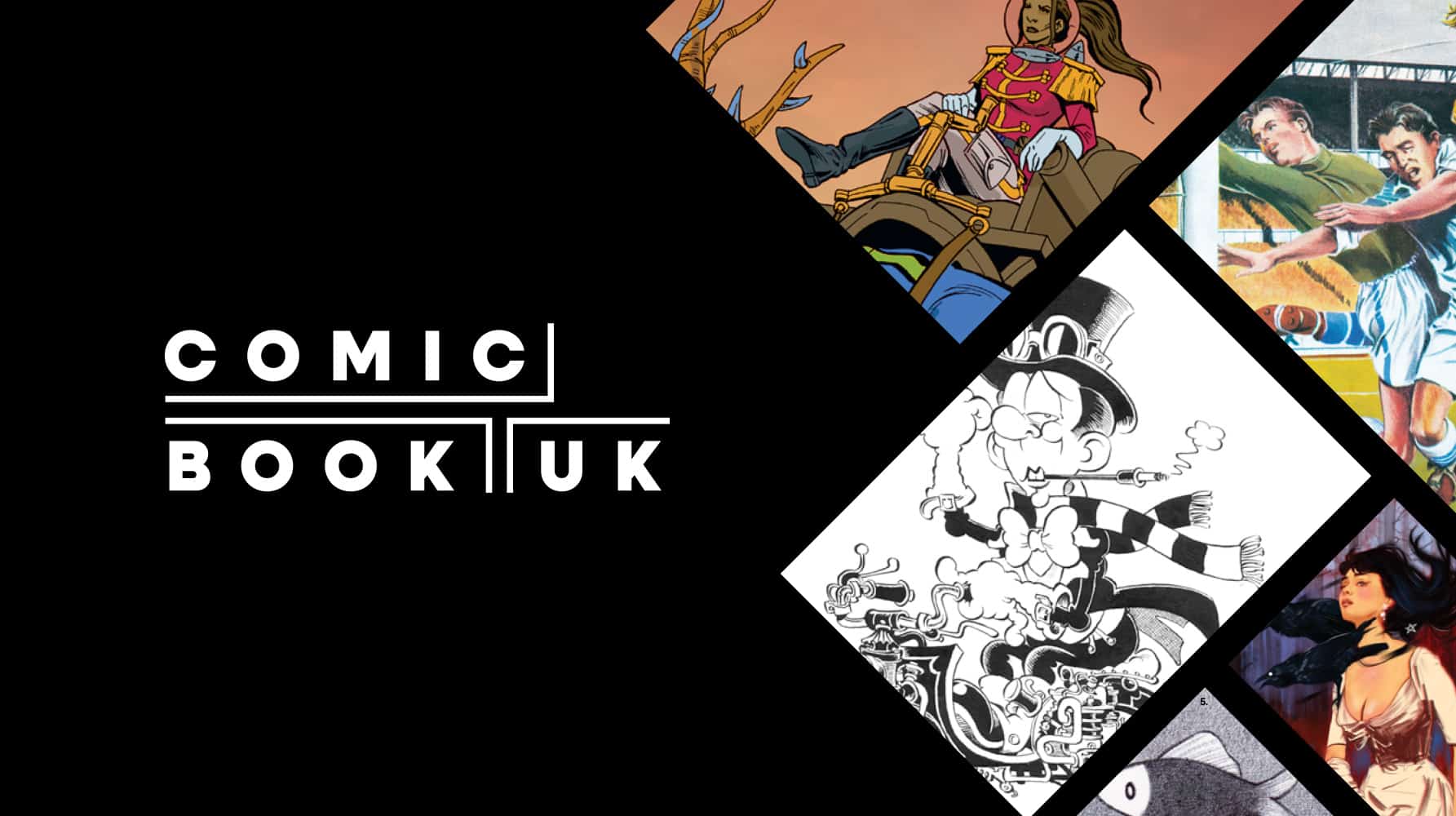
Comic Book UK brand identity and website
A cool and confident brand that is set to engage investors and policymakers, while staying true to the creativity of the comic book world.
-
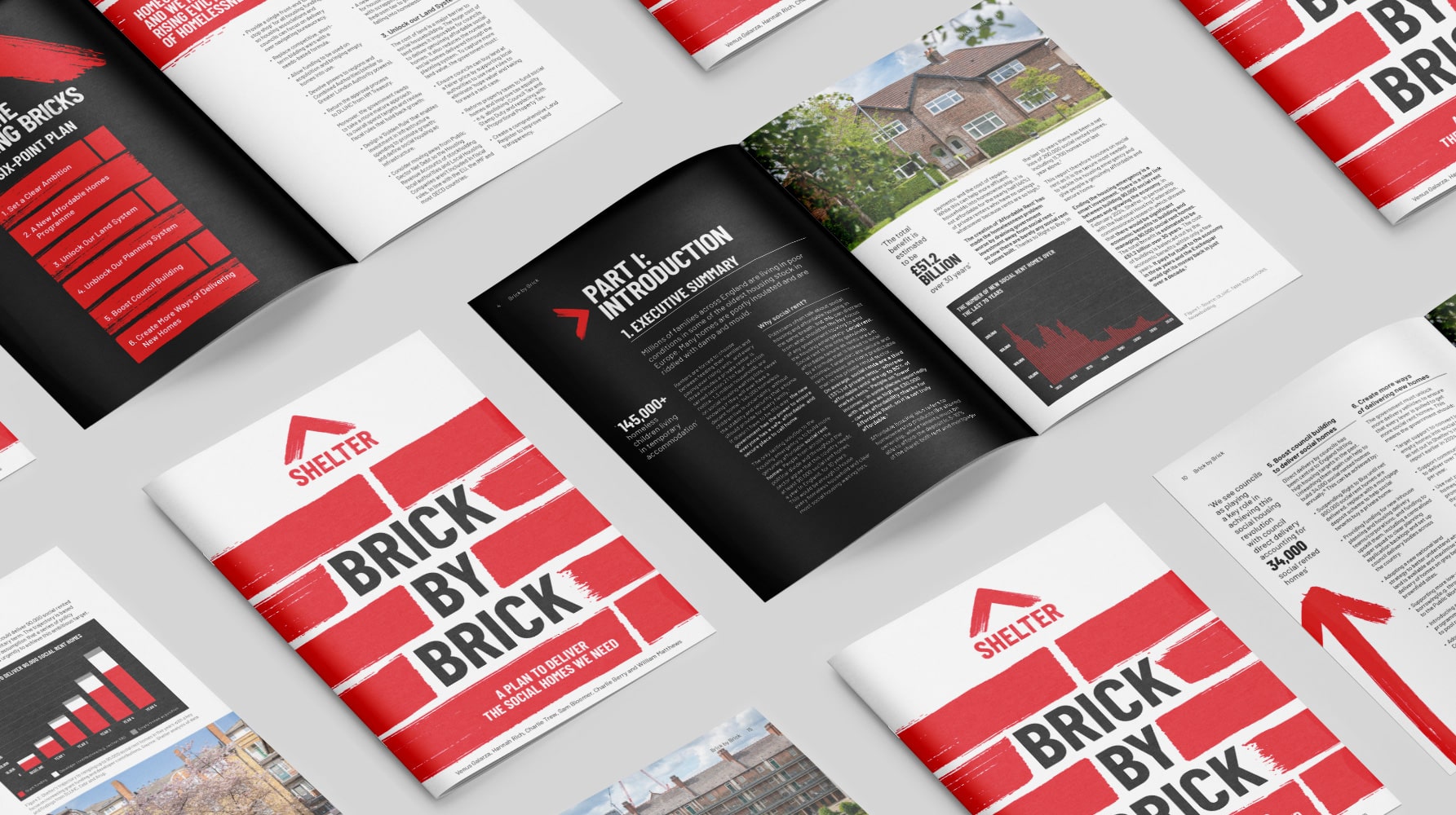
Shelter report on social housing – Brick by Brick
Brick by brick, calling for change: designing Shelter’s flagship report to confront the social rent crisis and demand urgent action


