
The Leasehold Advisory Service rebrand
Future-proofing a trusted government-funded advice service with a bold new brand that brings clarity, credibility and digital confidence.

The challenge
LEASE is a government-funded organisation providing expert legal advice to leaseholders and park home residents. With upcoming Leasehold and Commonhold reforms, the organisation needed to reposition itself as a proactive, authoritative voice in policy change, while continuing to provide clear, accessible support to its users.
The existing brand identity lacked digital versatility and visibility. It didn’t communicate LEASE’s evolving role, nor did it reflect the growing urgency of their work in shaping housing reform. The new brand needed to strike a balance between future focus and legacy recognition, becoming more iconic, digitally fluent and reflective of their advocacy role.
The requirements
- Create a modern, distinctive visual identity that translates clearly in digital and mobile environments
- Retain a subtle link to the original brand for continuity with existing users
- Ensure the new identity quickly communicates what LEASE does, placing clarity and recognisability at its heart
- Build a brand system that can flex across campaigns, advice content, and stakeholder communications
- Position LEASE as an authoritative, proactive voice in housing and legal reform without losing its accessibility or approachability


The process
We began by mapping the appetite and scope for change, running workshops, stakeholder interviews, sector audits and moodboarding exercises. This discovery phase helped us understand both internal priorities and external perceptions.
From here, we developed several logo concepts that explored different visual territories: conversational, digital, and architectural. Each concept was paired with a strapline to explore tone and positioning. Further stakeholder testing was carried out to gather feedback and insight on direction and resonance.
Two concepts were shortlisted and evolved into complete visual identity systems. We explored each across real-world scenarios, from digital platforms to print materials, to test versatility, clarity and cohesion. The final identity was formed by bringing together the strongest elements of each route into a single, streamlined system.

The solution
The result is a bold, modern identity that holds its own across both digital and offline platforms. The logo combines a building silhouette with a digital cursor, symbolising the intersection of homes and advice, accessed online. The shapes are carefully constructed to echo the structure and stability leaseholders seek, while visually reinforcing LEASE’s online-first delivery model.
To maintain continuity, the word ‘Lease’ is emphasised within the wordmark, carrying forward brand recognition from the previous identity.
A strong, geometric logomark serves as the brand’s hero asset, conveying clarity and authority. Supporting graphic devices – inspired by cursor icons, bookmarks and pointers – build out a broader system that reflects the advisory nature of the service.
The colour palette is authoritative yet approachable, using updated tones that speak to both professionalism and trust. The typeface and layout system are clean and digitally optimised, ensuring the brand performs well across screen and print.

The refreshed brand positions LEASE for the future, as a confident, credible organisation ready to shape and support housing reform. The visual identity acts as a flexible foundation, able to grow and adapt alongside LEASE’s evolving role, all while maintaining accessibility, legacy and trust at its core.
Would you like to see results like these for your organisation?
If you’re interested in finding out more about how we could work together, send us a message and we’ll get back to you.
You may also find these interesting
Here’s a look at some of our most recent and relevant work, projects that show what we do, how we think, and the impact we’ve helped create for our clients.
-

Council of Deans of Health brand identity and website
Council of Deans of Health brand identity and website The Council of Deans of Health represents the UK’s universities engaged in education and research for…
-
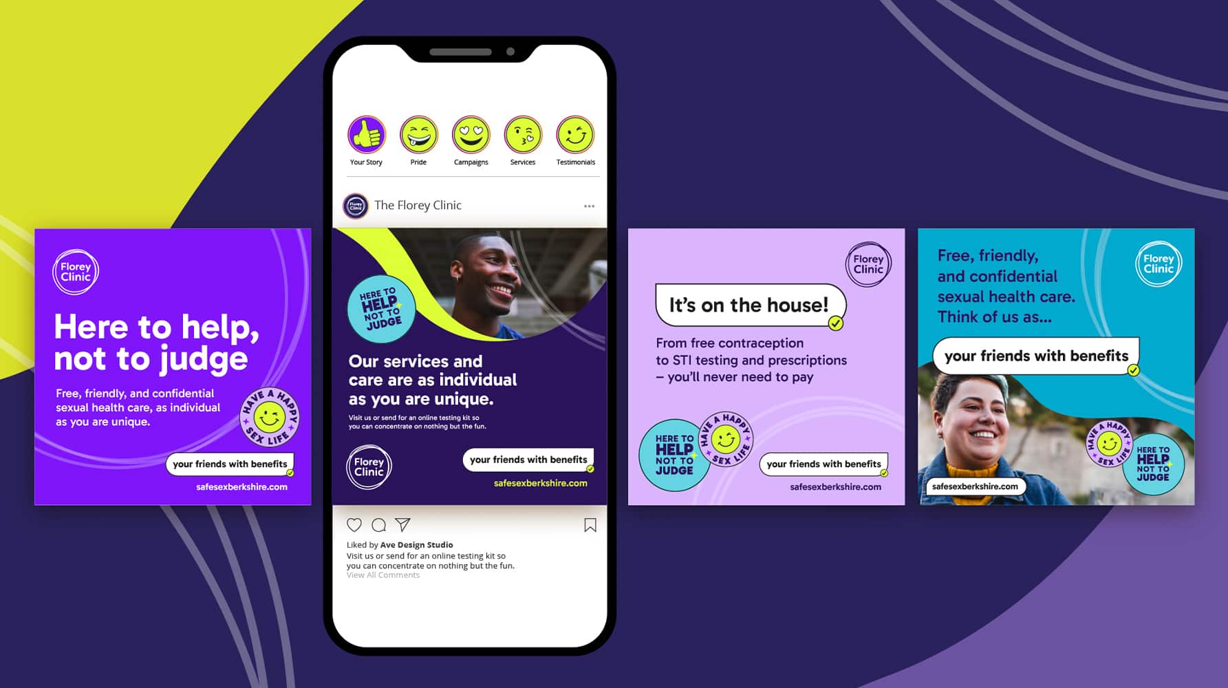
The Florey Clinic sexual health campaign
Turning sexual health stigma into confidence — say hello to “your friends with benefits” for The Florey Clinic.
-
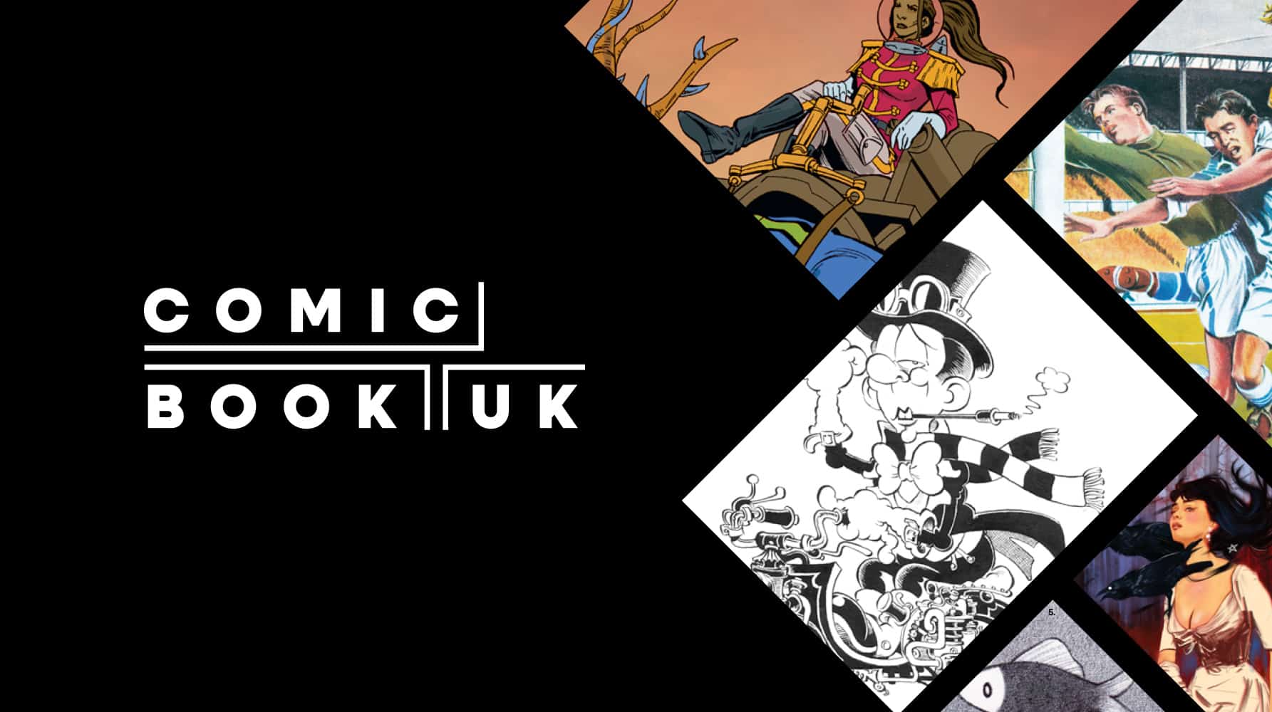
Comic Book UK brand identity and website
A cool and confident brand that is set to engage investors and policymakers, while staying true to the creativity of the comic book world.
-
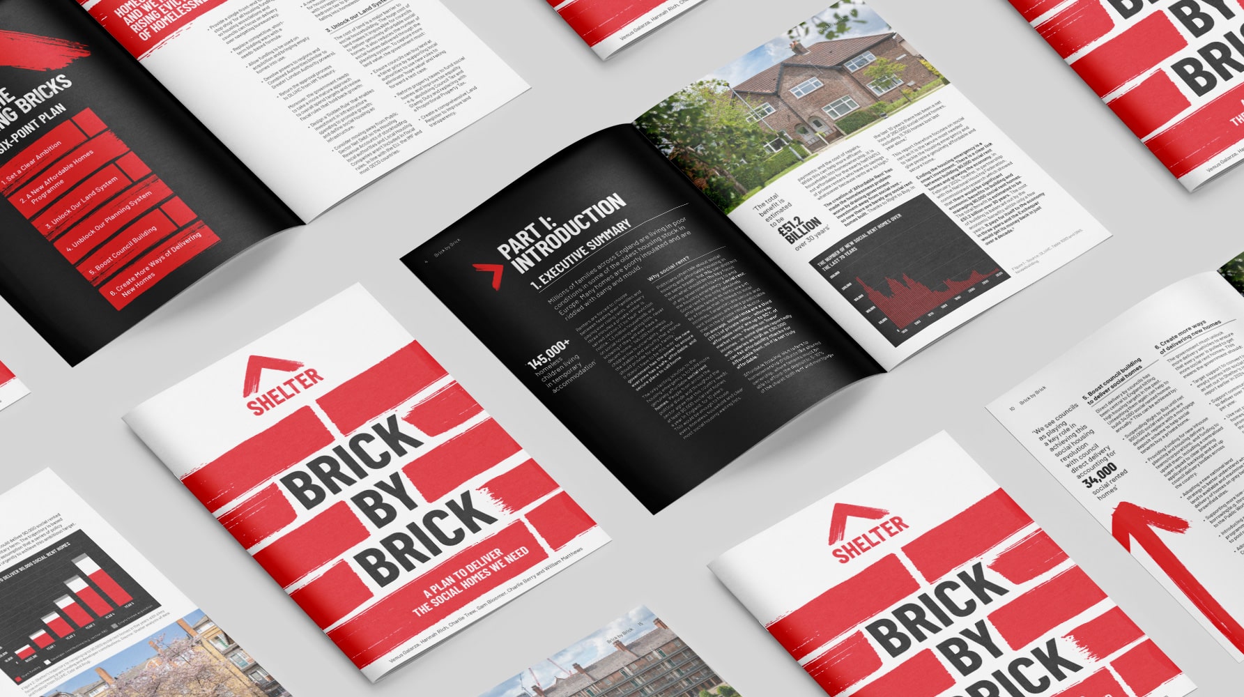
Shelter report on social housing – Brick by Brick
Brick by brick, calling for change: designing Shelter’s flagship report to confront the social rent crisis and demand urgent action


