
Ipswich Theatres rebrand and website
A dual rebrand and website project designed to honour heritage, build local pride and future-proof two beloved entertainment venues.

The challenge
In 2019, Ipswich Borough Council committed to a major “Customer Experience” development project for the town’s two flagship venues – the Regent Theatre and the Corn Exchange. This included physical refurbishments, but also an ambition to modernise the brand and digital experience across both sites.
Each venue had distinct audiences and ambitions. The Regent Theatre was known for its large-scale productions and rich history, while the Corn Exchange leaned into a more informal, contemporary offer of live music and comedy. A refreshed identity needed to celebrate these differences, while also uniting both venues under the Ipswich Theatres umbrella and driving increased ticket sales, engagement and visibility.
The requirements
- A rebrand across both theatre venues, including name, tone and identity
- A “house of brands” architecture with distinct sub-brands under Ipswich Theatres
- Values and personality traits that could guide internal and external communications
- A new website with extensive UX research and audience testing
- Seamless integration with the box office system and ticketing journeys
- A digital platform that improves usability, boosts sales and supports social media engagement


The process
We began with a research and strategy phase, engaging stakeholders and audiences through interviews, focus groups and street questionnaires. Insights revealed the differing perceptions and aspirations for each venue – and the need to communicate those clearly and confidently.
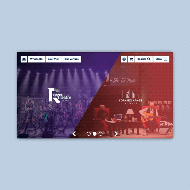
We developed a strategy that positioned the two theatres as complementary but distinct. The Regent Theatre identity is rooted in storytelling and legacy. Its new logo – a bold, serif “R” inspired by storybook drop caps – reflects its historic Art Deco interior and enduring cultural importance. The diagonal lines within the letterform nod to both sound and synergy with the sister venue.

For the Corn Exchange, the logo was inspired by the venue’s 1970s organ pipes, forming a stylised equaliser. It evokes sound, energy and people coming together – a perfect fit for a venue focused on live music, comedy and informal connection. Tonal values were tailored to each: confident, warm and classic for the Regent; personal, inclusive and down-to-earth for the Corn Exchange.
At the digital level, the website needed to do some heavy lifting. With a wide user base and varied programme, we developed a comprehensive UX strategy, rooted in accessibility, testing and feedback. The design reflects the dual identity system, allowing each venue to have its own space within a unified platform. Crucially, we integrated the box office system to create a seamless, user-friendly ticketing experience.

The solution
Ipswich Theatres now has a bold new brand system that honours the past while looking ahead. Each venue has the tools to speak to its audiences in its own voice, while sharing the same platform and reputation for great entertainment.
The new website supports this vision – intuitive, accessible and integrated with ticketing, it helps users get where they need to go, discover what’s on, and feel part of something exciting. With the rebrand and digital transformation complete, the venues are set up to grow their audience, build loyalty and continue shaping the cultural life of Ipswich for years to come.
Would you like to see results like these for your organisation?
If you’re interested in finding out more about how we could work together, send us a message and we’ll get back to you.
You may also find these interesting
Here’s a look at some of our most recent and relevant work, projects that show what we do, how we think, and the impact we’ve helped create for our clients.
-
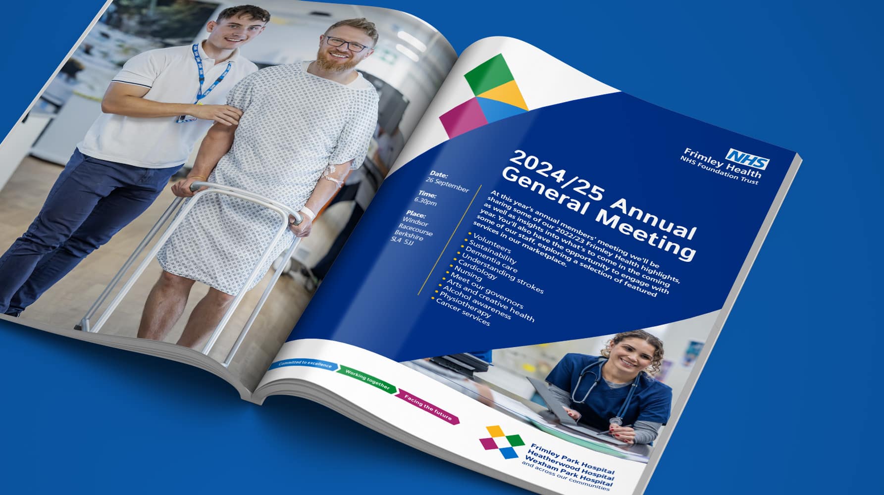
Frimley Health NHS Foundation Trust strategy and rebrand
Bringing clarity, connection and confidence to a trusted NHS identity – a rebrand for Frimley Health that unites services and strengthens public trust
-
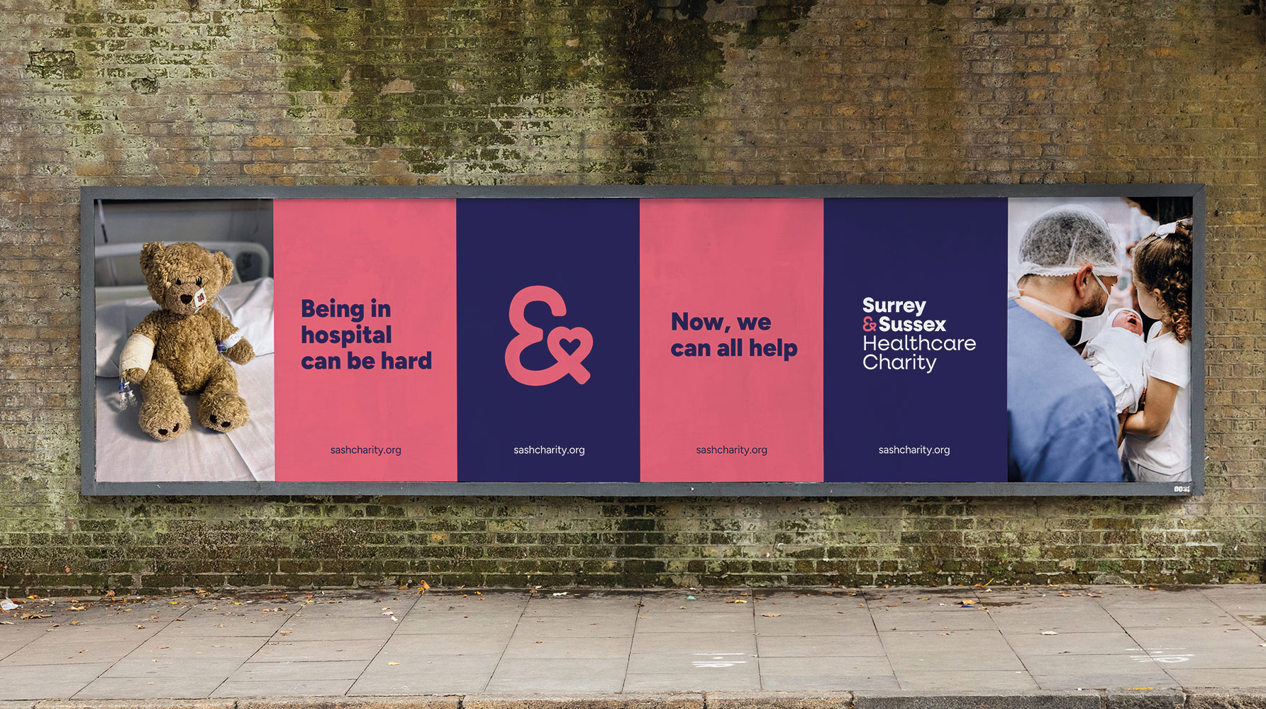
Surrey & Sussex Healthcare Charity rebrand
A local charity with a big heart: rebranding Surrey and Sussex Healthcare Charity to connect communities and champion NHS care
-
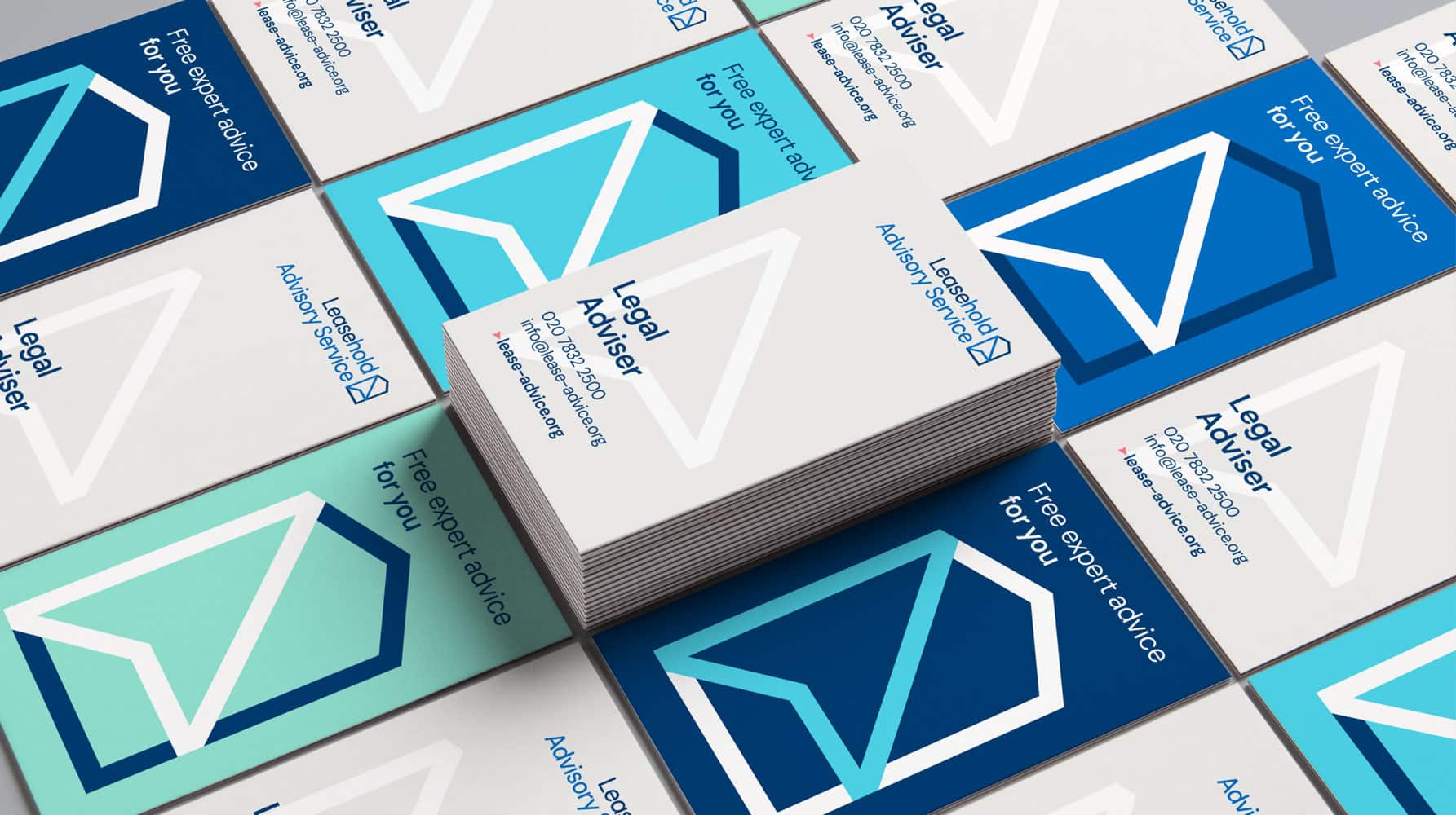
The Leasehold Advisory Service rebrand
Future-proofing a trusted government-funded advice service with a bold new brand that brings clarity, credibility and digital confidence.
-
Genomics England podcast visual identity
Designing for discovery: helping Genomics England explain the future of healthcare through bold, accessible digital storytelling


