Accessible writing isn’t about simplifying ideas, it’s about removing unnecessary barriers. Clear, direct language ensures that your message reaches the widest possible audience, including those with lower literacy, cognitive differences or for whom English is not a first language.
Government Digital Service (GDS) guidance recommends writing for a reading age of around nine. This doesn’t mean patronising your audience; it means communicating with clarity and precision. The result is copy that is inclusive, efficient and easy to act upon.


Share this post
Start with structure
Put the most important information first: what the user needs to know or do. Use active voice (‘Book your appointment online’) and short sentences (fewer than 25 words is a good benchmark). Avoid jargon and replace complex words with plain equivalents: ‘use’ not ‘utilise’, ‘help’ not ‘assist’.
Layout and design matter too. Use meaningful headings, one idea per paragraph, and generous white space. Left-align text and avoid blocks of all-caps. Online, people scan rather than read, so make your content navigable.
Test your copy for readability using tools like Hemingway, Readable or the built-in Microsoft Word readability checker. But don’t rely solely on scores, test your writing with real users.
For organisations in the public or voluntary sector, accessible writing is a democratic act. It allows everyone, patients, staff, partners, donors, to understand, trust and engage with what you do. It makes your communications not just clearer, but fairer.
When you write inclusively, you’re not reducing complexity; you’re revealing clarity.
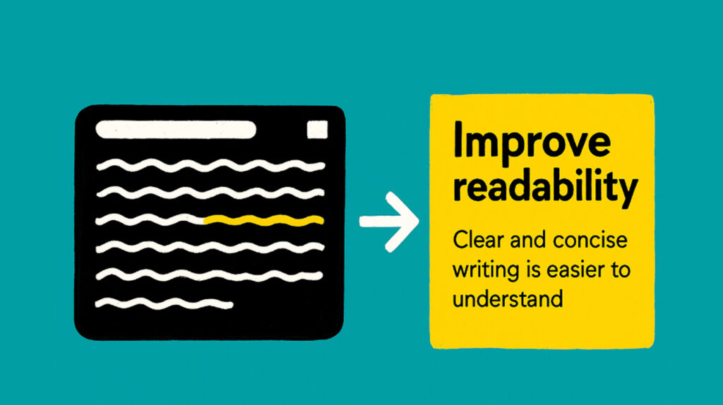
Why readability matters
Readability sits at the heart of equitable communication. In health, education and the wider charity landscape, people often come to information at moments of stress, urgency or limited capacity, and clarity becomes a matter of access. Writing at a reading age of 9–11 years (GOV.UK) is simply an acknowledgement of how people actually read. The average UK adult reads at this level, and even highly literate readers benefit from concise, well-structured copy because it reduces cognitive load. Clear writing helps people act quickly, understand their choices and feel confident they’ve interpreted information correctly.
Readable content also supports people who process information differently. Neurodivergent readers often benefit from shorter sentences and predictable structures, while people with English as a second language rely on direct sentence construction and familiar vocabulary. When information is dense or convoluted, the burden of interpretation shifts unfairly onto the reader. Readability hands that responsibility back to the writer, where it belongs.
There is also a practical dimension. Clear copy reduces enquiries, prevents misunderstandings and lowers the cost of service delivery. It strengthens trust because people understand what you mean the first time they read it. In public-facing organisations, that trust is essential. When your language is open, efficient and human, readers feel respected rather than excluded.
Readability is ultimately about dignity. It ensures that no one is shut out of information that affects their rights, health or opportunities. It treats clarity as a design decision, not a compromise. When you write in a way that everyone can follow, you signal that everyone is welcome, and that their ability to engage with your work matters.
Core writing principles
1. Write with purpose, not ornament
Every sentence should earn its place. Lead with what the reader needs to know or do, and remove anything that distracts from that action. Focus on outcomes, not word count.
2. Front-load the essentials
Put the most important point first. Busy readers skim, and in health and charity contexts they may be stressed, time-poor or anxious. Make sure they get the core message even if they read only the opening line.
3. Use short, decisive sentences.
Aim for fewer than 25 words. Break long ideas into clear, standalone statements. This reduces cognitive load and supports readers who struggle with processing or concentration.
4. Choose plain English over technical language.
Prefer everyday words that everyone understands. Swap ‘commence’ for ‘start’, ‘utilise’ for ‘use’, ‘assistance’ for ‘help’. If specialist terms are unavoidable, explain them the first time they appear.
5. Prioritise active voice.
Phrase sentences so the subject is doing the action. ‘Book your appointment online’ is clearer, faster and more engaging than ‘Appointments can be booked online’. Active voice helps readers understand who is responsible for what.
6. Use a warm, human tone.
Write as you would speak to someone respectfully and professionally. Avoid formality that creates distance or implies hierarchy. Aim for clarity, kindness and confidence.
7. Keep one idea per paragraph.
Short paragraphs help readers process information and make text approachable. Avoid packing multiple messages into a single block, separation supports scanning and comprehension.
8. Make every heading meaningful.
Headings should act as signposts, clear even when read out of context. They help screen reader users navigate and help all readers understand the structure instantly.
9. Avoid ambiguity.
Say exactly what you mean. Replace vague instructions with concrete actions. Instead of ‘You may want to consider…’, be specific: ‘Choose the option that best fits your needs’.
10. Remove filler words and qualifiers.
Words like ‘very’, ‘really’, ‘quite’, ‘in order to’ and ‘actually’ add noise but rarely meaning. Tighten the sentence until only clarity remains.
11. Use numbers and facts precisely.
Spell out numbers one to nine, then use digits. Use numerals in instructions or where precision matters. Be consistent across a document to build understanding and trust.
12. Be consistent with terminology.
Choose one term for a concept and stick with it. Interchanging labels confuses readers and disrupts flow, particularly for neurodivergent audiences who rely on predictable patterns.
13. Write for scanning, not deep reading.
Most users skim online. Use logical order, bullets where appropriate, and strong signposting to help readers find key information quickly.
14. Check the rhythm of your writing.
Varied sentence length improves flow, but clarity should always trump style. Read your content aloud, if you stumble, the reader will too.
15. Respect the reader’s time.
Avoid over-explaining, duplicating information or adding unnecessary context. Give readers exactly what they need to make a decision, complete a task or understand an idea.
16. Design and language work together.
Readable writing depends on readable presentation. Use left-aligned text, avoid all-caps, and ensure generous white space so the copy can breathe.
These principles form the backbone of accessible, inclusive and confident communication, essential for any organisation serving the public, and non-negotiable for those working in health, care, education and the voluntary sector.
Testing readability
Testing readability is the point where accessible writing stops being theory and becomes evidence. It tells you whether your content works for real people, not just for the person who wrote it. In public-facing organisations, particularly in health, care and the voluntary sector, this testing is essential. People often approach information with limited time, competing pressures, or heightened emotion. Readability testing ensures that your message lands cleanly, without assumptions about literacy, cognitive processing or subject knowledge.
Digital tools offer a useful starting point. Apps like Hemingway or Readable break down sentence length, structure and complexity, and provide an indicative reading age. These scores highlight dense sections, long sentences and unnecessary adverbs or jargon. They help you spot patterns in your writing that create barriers, but they are a guide, not a verdict. A high score doesn’t always mean inaccessible content; equally, a low score doesn’t guarantee clarity. Automated tools can’t judge nuance, tone, cultural references or whether the reader will understand the task you’re asking them to complete.
A stronger approach pairs automated assessment with user testing. Reading your copy aloud is one of the simplest and most effective checks. If you stumble over a sentence, it’s likely a reader will too. Listening for rhythm, clarity and logic helps you identify the parts that need tightening or restructuring. Running content through a screen reader goes a step further. This exposes issues that visual reading can hide, unclear headings, confusing lists, poor sequencing or wording that doesn’t make sense when heard rather than seen. Screen reader playback also highlights punctuation choices that affect flow.
The most valuable insight comes from testing with real people. Ask colleagues unfamiliar with the content to read a draft and explain it back to you. If they can’t summarise it quickly, it’s not clear enough. When possible, test with a small group from your intended audience. For NHS or charity communications, that might mean patients, parents, volunteers or frontline staff. Their interpretation reveals whether the content works in the real world, where people are busy, distracted or under pressure. Even a short 10-minute session can uncover misunderstandings that a readability score would never detect.
Testing readability also strengthens inclusivity. Neurodivergent readers may flag issues with sequencing or ambiguity. People who speak English as a second language can identify unfamiliar idioms or complex constructions. Older readers may struggle with long paragraphs or dense layouts. Each of these insights leads to improvements that benefit everyone, not just the group who raised them.
The final stage is iteration. Good readability testing feeds back into your process: edit, test again and adjust. Build readability checks into your sign-off workflow so they become a habitual part of content creation rather than an afterthought. This normalises clarity as a shared responsibility across teams, not just the domain of communications specialists.
Clear, readable writing isn’t a stylistic preference, it’s a commitment to equity. When your words are easy to understand, you widen access, strengthen trust and help people act with confidence. Clarity is a design choice, and it’s one that every organisation can make.
If you want support improving the readability of your content, building accessible tone of voice guidance or training your team, get in touch and we’ll help you create communications that everyone can use.
Ready to make design work harder for you?
If you’re tired of juggling freelancers, waiting weeks for small changes, or struggling to give your brand the attention it deserves, a design retainer might be just what you need.
Let’s talk about what a retainer could look like for your team.
Share this post
You may also find these things interesting
Beyond our client work, we create resources, articles and tools to share knowledge and strengthen the sector, supporting others to think bigger, work smarter and make even greater impact.
-

Writing accessible copy for public audiences
Accessible writing isn’t about simplifying ideas, it’s about removing unnecessary barriers. Clear, direct language ensures that your message reaches the widest possible audience, including those…
-

Writing accessible Alt Text for images
Make every image count. Learn how to write alt text that’s clear, purposeful and inclusive, so your visuals communicate meaningfully to everyone, not just those…
-

How to conduct sensitive consultations: respecting stories, people, and backgrounds
Whether you’re gathering insight for research, strategy, or design, the way you consult can shape far more than your findings. From creating safe spaces to…
-

Colour contrast checker: accessibility tool
Our free tool helps you test your colour palette against WCAG contrast standards, so you can design with inclusivity in mind. Just add your colours…


