NHS Lothian Charity
Brand strategy, naming and rebrand
Working with the official charity of NHS Lothian, Edinburgh & Lothians Health Foundation, to rename and rebrand, launching as NHS Lothian Charity.


In late 2021, Ave was appointed by NHS Lothian’s official charity, Edinburgh and Lothians Health Foundation (ELHF), to work with the charity on its brand and digital offer, helping it to move from a foundation about funds and funding to a charity about people.
Before COVID, NHS charities like Edinburgh and Lothians Health Foundation were relatively unknown, however, following the outbreak of the pandemic, fundraisers like Captain Tom helped to raise awareness of them. ELHF was aware of the need to develop the brand in order to recognise this shift in public awareness and clearly articulate the core of what it stands for, what it does and how it does it.
The charity was also aware that it needed a brand that supported its position as the official charity of
NHS Lothian and asserted it as a major Scottish health charity. The current brand was not working
hard enough to convey ELHF’s uniqueness, values or the scale and scope of what it does.
The primary area of work was focused on designing a research methodology that would enable us to understand the current perceptions of the brand, as well as the vision and aspirations of both internal and external stakeholders. A month-long consultation period was undertaken, during which focus groups, interviews and surveys were held. Alongside this, desk research and a literature review were completed and a comprehensive sector audit and analysis were carried out. ELHF was looking to build stronger emotional connections between its organisation and the populations it serves, fostering strong stakeholder engagement, mobilising key supporters and cultivating a people-centred approach to all that it does. However, the findings indicated that there was very low brand awareness of ELHF. We strongly recommended a name change in order to clarify the charity’s relationship with NHS Lothian, and to also remove the confusion that we identified with the current name using the word ‘foundation’.

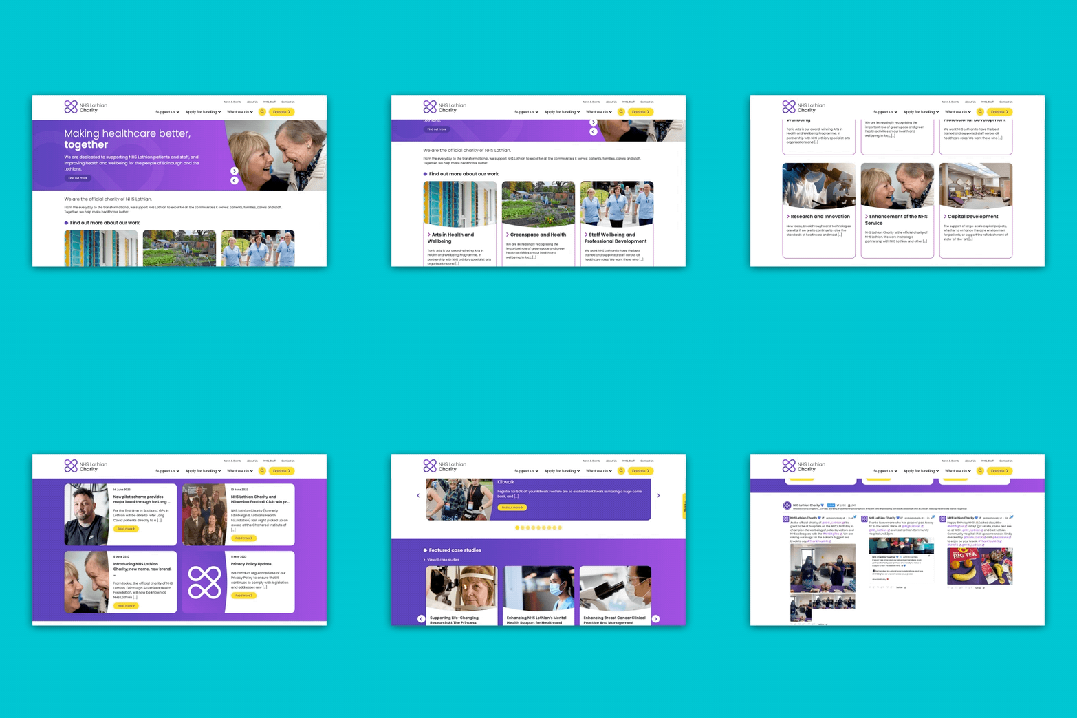
A range of names and supporting straplines were created for testing. We needed to test if the residents of Edinburgh and the Lothians identified with the term ‘NHS Lothian’ and understood this to be relevant to them. Localised cold audience testing was undertaken, as was testing with a wider body of warm audience participants. A ‘Ronseal’ approach was favoured among both sets of respondents and the name ‘NHS Lothian Charity’, with the supporting aspirational strapline ‘Making healthcare better, together’, was agreed upon. Following the confirmation of the new name, the brand promise and branding strategy were delivered. This covered setting out the values, personality and tone of voice of NHS Lothian Charity, as well as its positioning statement and brand offer.
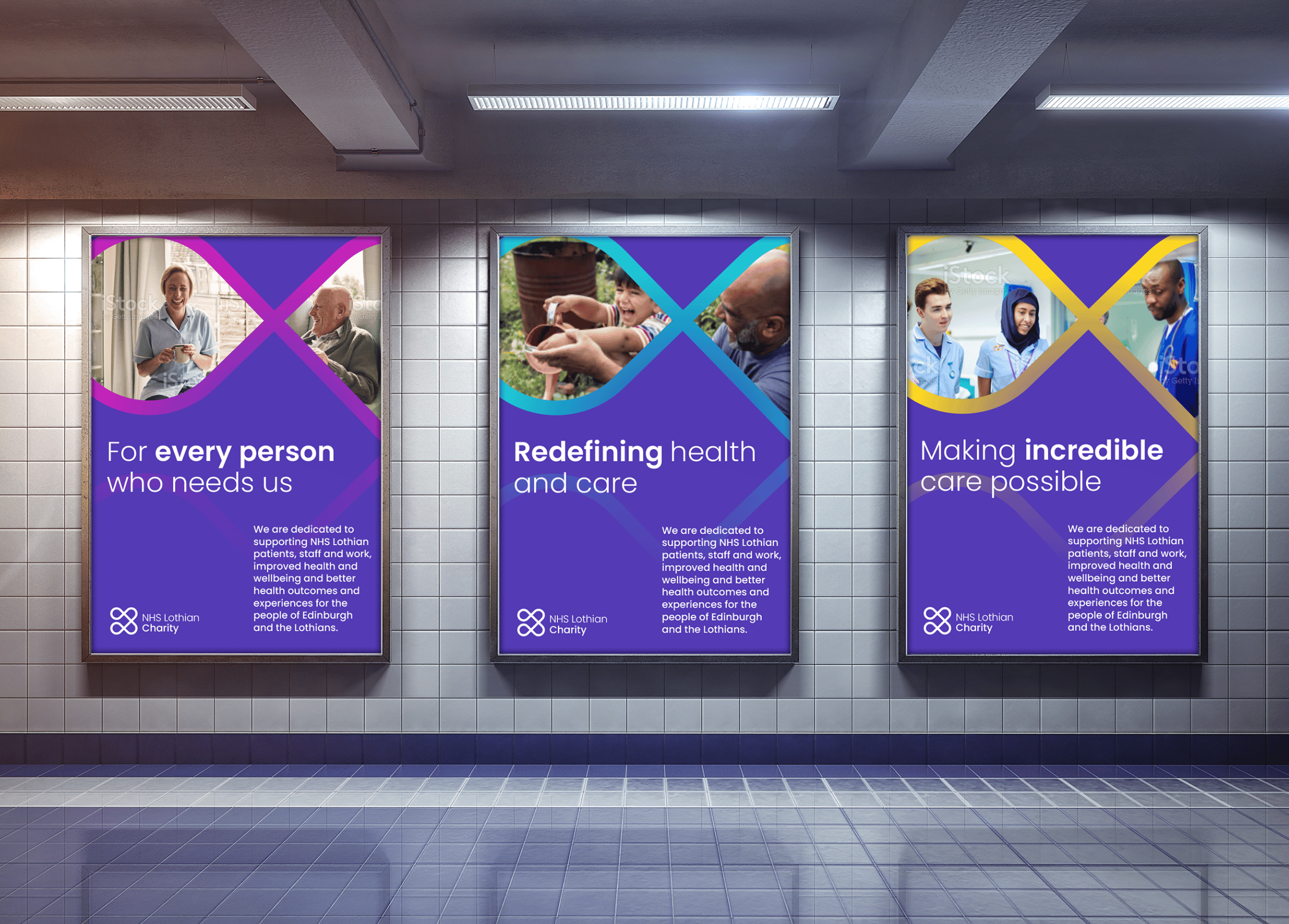
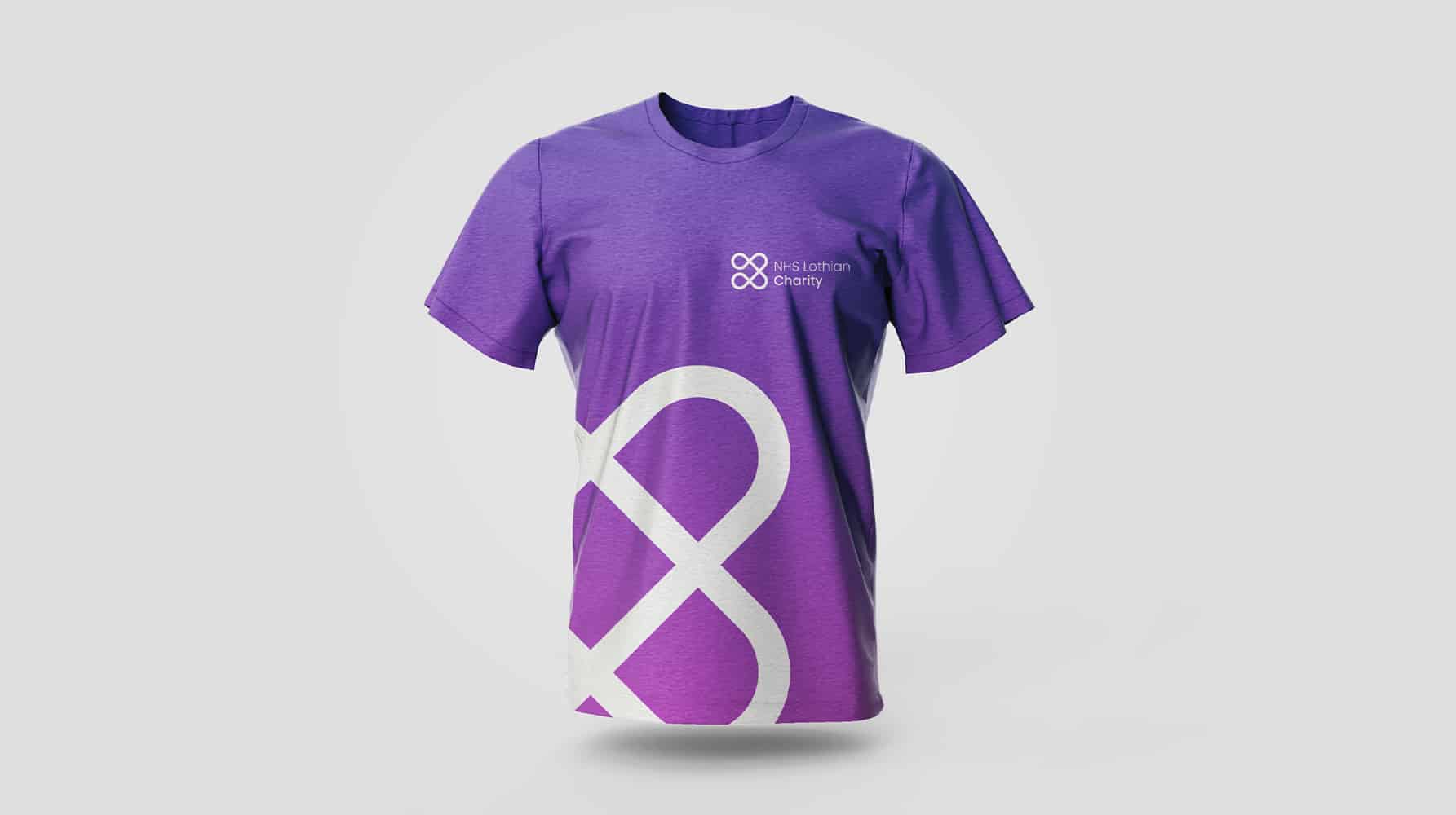
The brand identity we created has a multi-layered meaning, symbolising much of what NHS Lothian Charity stands for and represents to its community. The logo symbol is an evolution of the original Edinburgh and Lothians Health Foundation marque – a nod to the charity’s heritage, and something familiar to established audiences. However, the progression brings forward the new strategic foundations the brand is grounded in, moving forward. The icon is divided into four segments, representing NHS Lothian Charity’s four priority objectives, four acute hospitals, four geographic areas, four areas of funding and four strategic programmes. The symbol is endlessly looping, hinting at the idea of infinity – infinite support and care for those who need it most. The linked, looped shapes show connectivity, as a dedicated team internally, and with its relationship with NHS Lothian and its external audiences and stakeholders. Critical to establishing the warmth and connection between the charity and the people it serves was ensuring that the imagery used represents positive, emotive moments of engagement between staff and patients. The image guidance for the brand works to continually reinforce these relationships, capturing unique moments that span a range of situations and emotions. The graphic device from the logo has also been expanded and brought into the imagery as a tool to show the unique place of the charity and its work, further communicating that it exists to improve the health and wellbeing of those in Edinburgh and the Lothians.

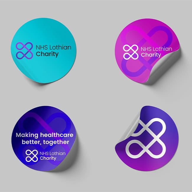
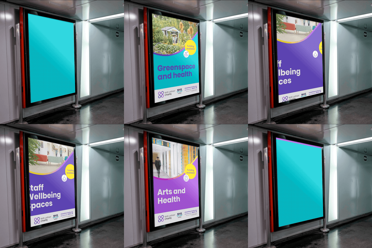
The brand has been developed in line with accessibility guidelines to ensure that it is accessible to all audiences. Due to the breadth of the charity’s offer, it was imperative that the design is considerate to those of a range of additional needs. The new visual identity had a branded-house approach to the sub-brands that sat within it that historically had their own separate identities. This alignment with the master brand ensures that each of the sub-brands and programme brands align with the strategy and experience of the primary brand.
The new look and feel, along with the strategy, allows the charity brand to deliver its distinctive standpoint, conveying its people-centred, warm approach and is easily understood, accessible and engaging. In the broader context of the general public’s awareness of health and the NHS, the new brand keeps the charity’s messages focused. It helps to tell its story effectively, building trust and credibility. The brand strategy gives the charity everything it needs to bring the brand to life; its essence, why it exists, what it does, and its position in the marketplace. It clearly articulates that NHS Lothian Chairy is dedicated to improving the healthcare journey for everyone.
The brand toolkit supports the strategy, by allowing the charity to be flexible in its visual and written tone of voice, dialling up and down to engage and communicate appropriately depending on the touchpoint and audience segment being addressed. This flexibility in the brand allows the charity’s communications to encourage trust and confidence and enable it to demonstrate the impact that the charity makes on NHS Lothian staff and patients, both in hospitals and in the community, in an authentic way.