Royal Berks Charity
Rebrand
We were approached by the Royal Berks Charity (RBC) to work on them to rebrand the organisation – modernising their look and feel, aligning the brand to their new strategy and giving staff and external stakeholders vitality and pride in the organisation.
The brand was very linked to that of the hospital Trust – it was overlooked. The new brand was required to bring the charity to the fore, bring clarity to its work and have a clear but flexible, brand structure to work across multiple hospital sites, different wards, charity appeals, events and fundraising. It would also become the solid platform required to start using social media in a more coherent and effective way.
The audiences for the charity are varied, and include volunteers and staff, patients, the wider community, corporate companies, religious groups, fundraisers and other charity supporters. In order to communicate with the various groups, we had to create a brand that could be flexed tonally both in look and feel and in messaging.
We were provided with the charity mission and values/personality traits, as a starting point for the visual work. We were also provided with a document from a key stakeholder session workshop that explored the group’s preferences on various other brands and their vision for their new RBC brand. The values had two clear sides – those typically paired with hospital and charity work, like trustworthy, approachable and compassionate, and those with a future focus, showing innovation and forward thinking. It was important to capture these two threads in the look and feel, and to ensure they could be dialled up or down where necessary.
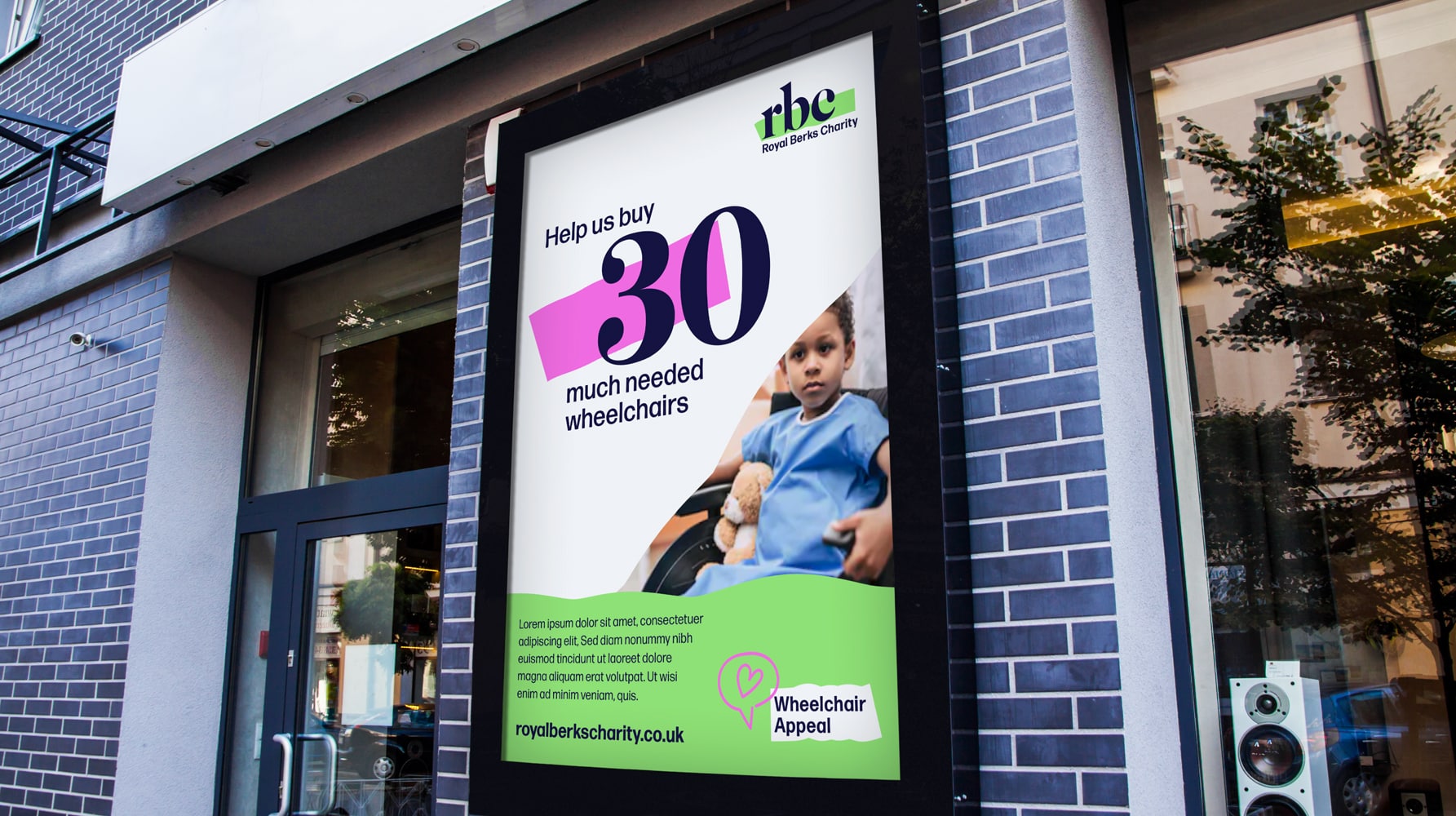
The chosen solution was named ‘highlighting the need for support’. RBC highlight the need for support within the Royal Berkshire Trust, and the people and places who need it most urgently. By raising funds for these areas, RBC underpin and support the hospital trust and therefore wider community. The bridge the gaps in the funding system and make a real difference to the quality of hospital experience for both patients and staff alike.
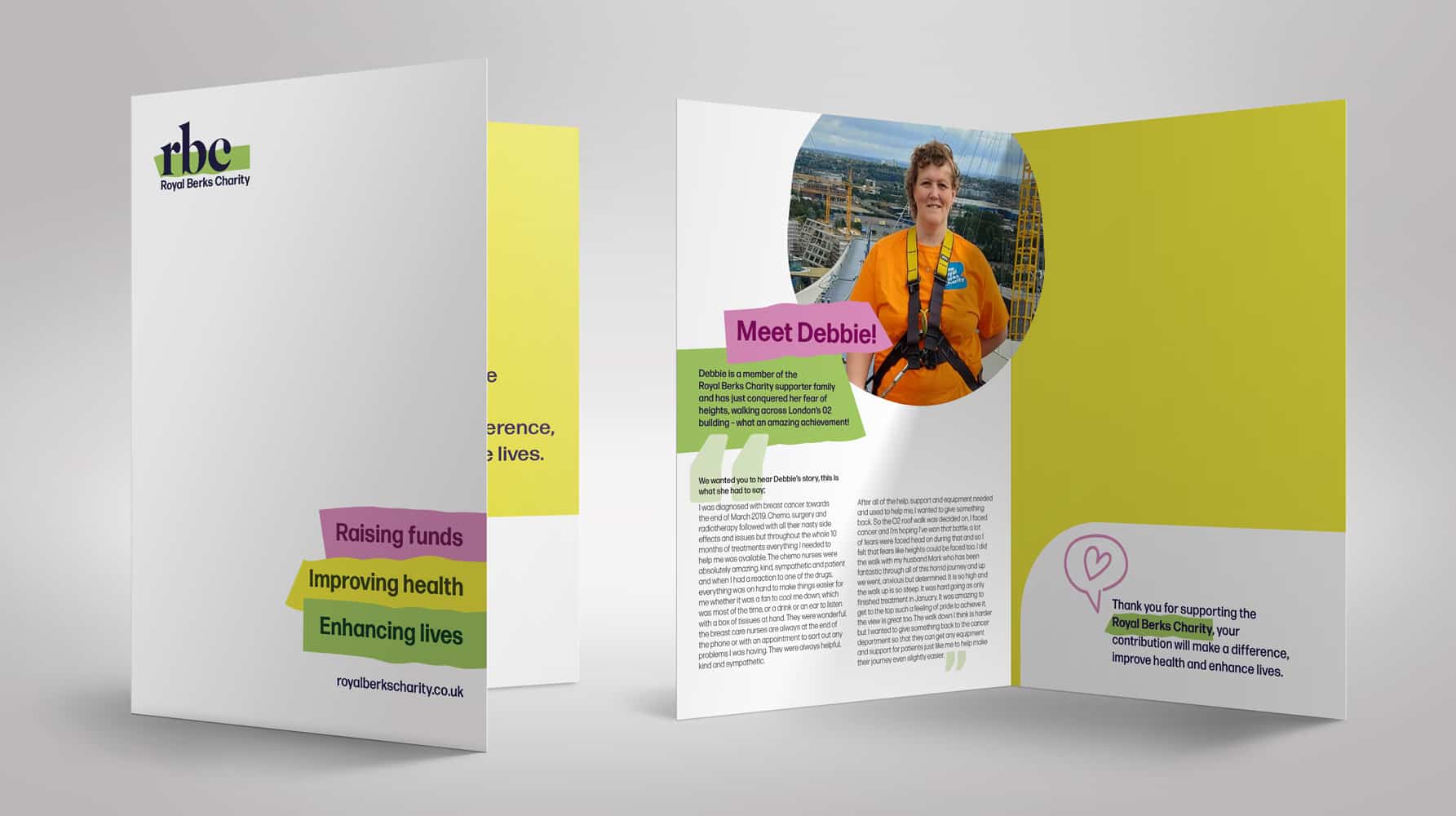
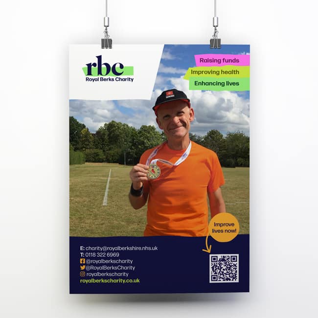
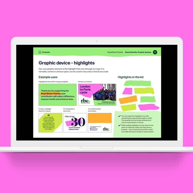
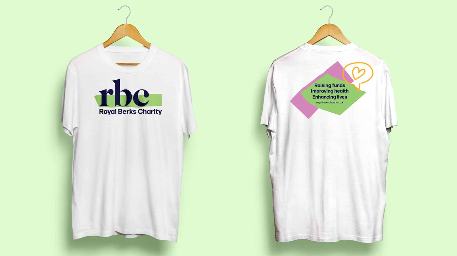
The logotype uses a smart, classic typeface, creating a sophisticated and modest word-mark, giving the organisation authority and helping to build trust. This is paired with a bright neon colour-block – a highlight – right through the centre of the letters, which brings vivacity, movement and a feeling of agility to the logo. The idea that there is constant conversation, assessment, listening, reworking and achieving, bringing the funds to the right people and places. The highlight is a handmade mark, showing the human process and hands-on approach to running the charity, raising the funds and providing much-needed services to the community.
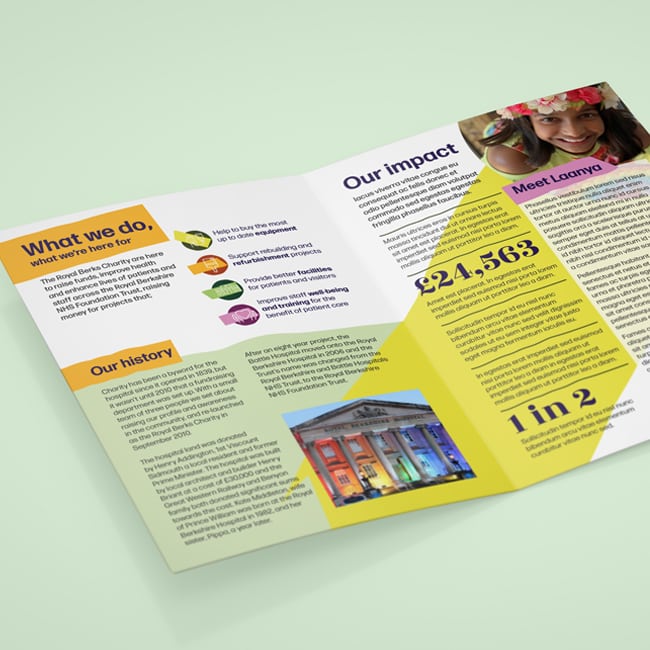
Alongside the look and feel, we created a strapline to help communicate what RBC do. Split into three, the strapline tells the story, or journey the charity takes – it begins with raising funds, these improve the health of the patients and staff and the ultimate result is that lives are enhanced. Each part of the strapline has its own icon to represent the story.
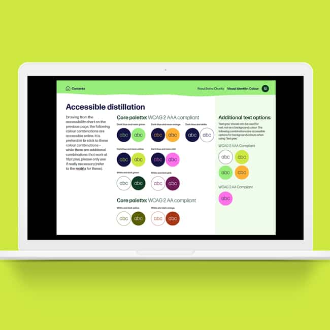
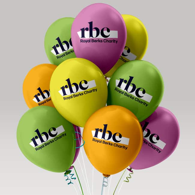
The colour palette inherited the typical neon highlighter set of colours – yellow, green, orange and pink – which allows multiple sites to be assigned a colour for distinction, and the palette was created with accessibility at the fore. It was analysed and tested to ensure it passed at least WCAGAA compliance, though many or the main combinations are WCAGAAA compliant, which is the highest accessibility standard. Each neon is paired with a dark version of the colour, which is particularly helpful if coloured text is required across materials. The palette also has an overarching navy blue from the logotype, which helps flex the brand towards a more serious and medical tone if needed.
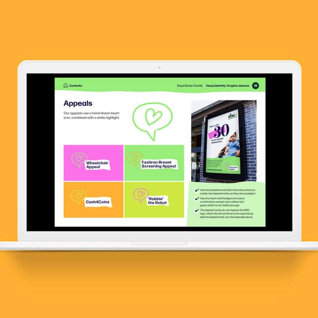
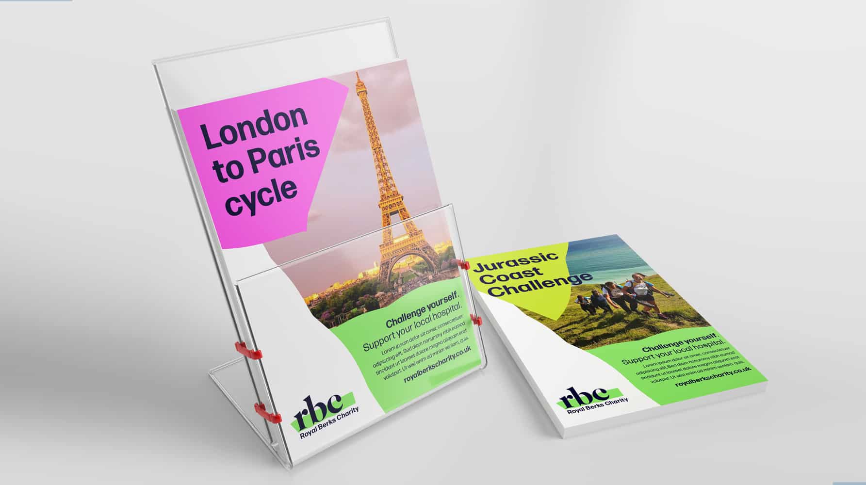
The highlight from the logo was then taken as inspiration for bringing the rollout to life, with multiple graphics and icons created inline with this idea. This graphic device along with the colour palette, allows styling of collateral to range from more stripped back and serious, for reports or medical documents, through to varied and energetic for fundraising. Other graphic devices were created, all with the same handmade feel, to highlight appeals and help house and divide content.
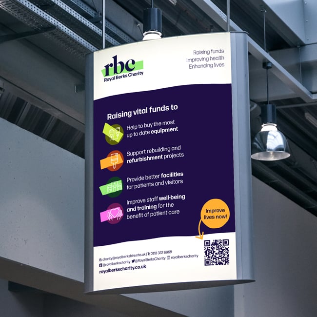
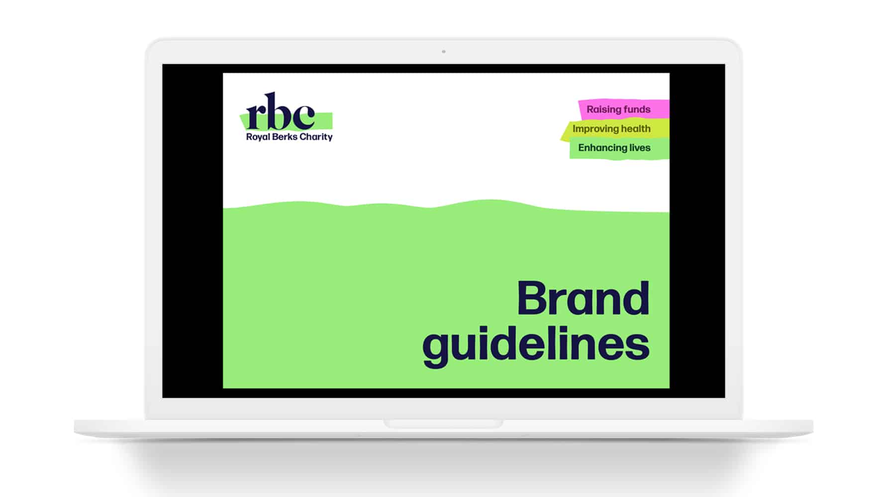
A system was created to be able to label hospital sites, services and appeals, future-proofing the brand for limitless expansion in the future. We created a clear set of guidelines that instruct how to create new badges and marks, icons and that explain the identity system for all users of the brand to easily follow. The guidelines also detail photography use, and how to choose people-focused photography to enhance the brand toolkit. Additionally, the guidelines give lots of hints and tips in creating accessible outputs, in terms of layout, type and colour.
The finalised brand system ensures comms can be flexed to many needs – it can be both warm, caring and human-centred, as well as future-focused, serious and medical. It can energise and create excitement for supporters and raising funds, or clearly set out serious information about the hospital or medical situations. Importantly, it has created the enthusiasm and pride internally that was an important aim of the brief, and will now be taken forward to publicise the organisation more widely and with more confidence.