Barnardos
Impact Report Design, Illustration and Copywriting
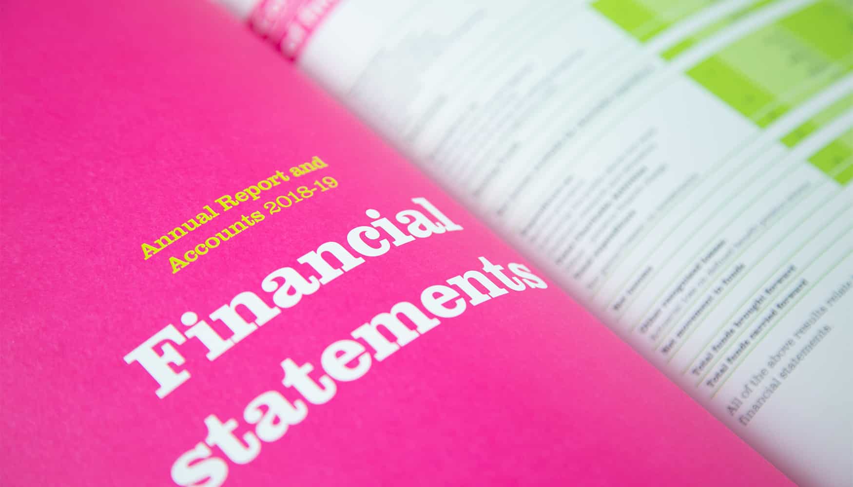
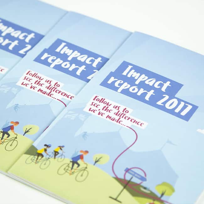
In 2019, Barnardo’s approached us to create their Impact Report suite of materials, which included a short, very visually engaging document, a longer more detailed report, an interactive online PDF and an animated video.
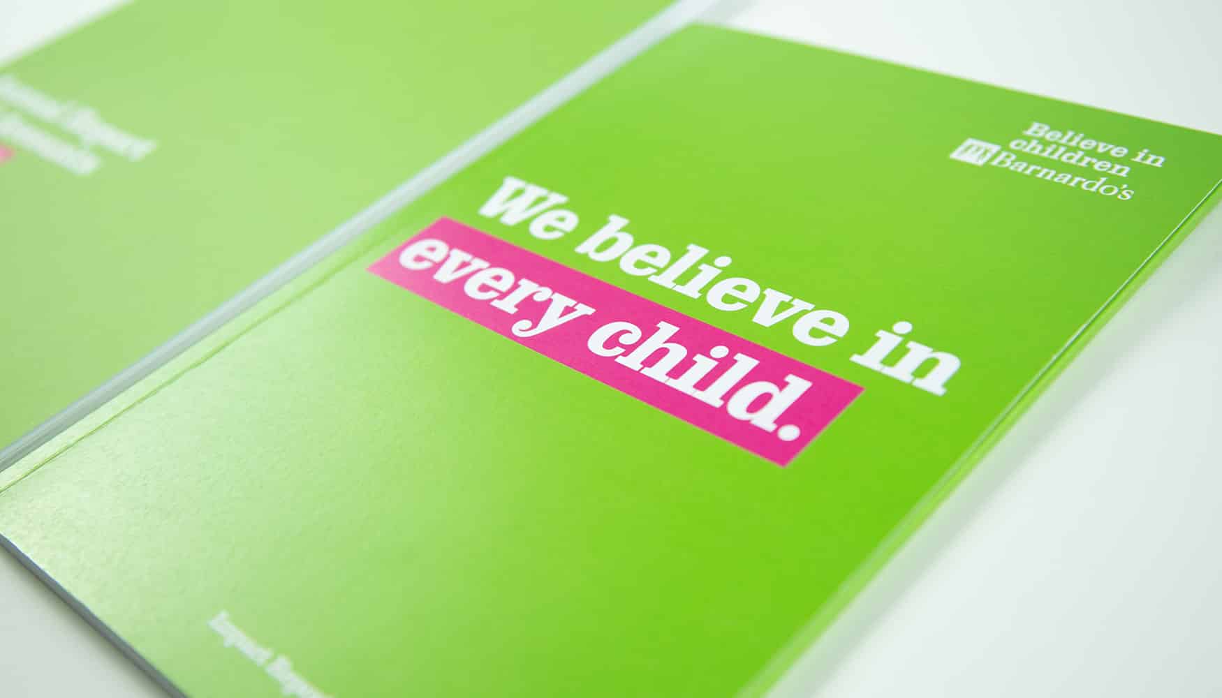
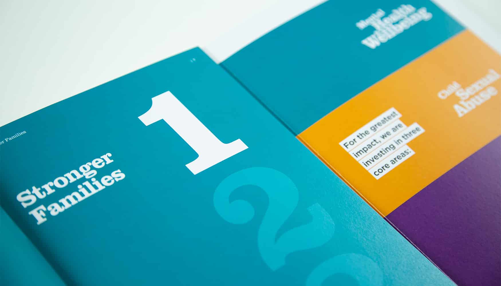
Working with their brand guidelines, we were tasked with creating something that stood out and would capture people’s attention – we wanted to put the people at the heart of Barnardo’s work front and centre of the designs.
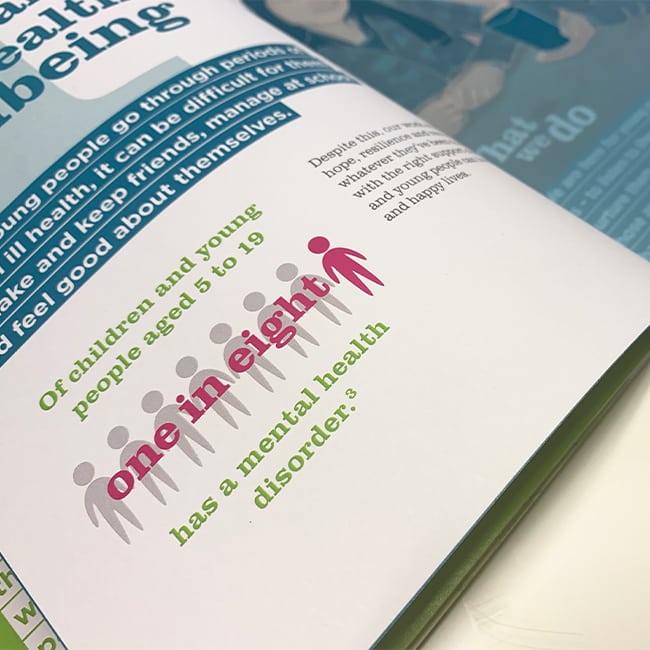
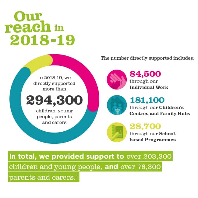
We created a visual toolkit that could be used across all of the outputs, including lively headings, bars of highlighted text, a navigation system for the three core areas of the corporate strategy and illustrations.
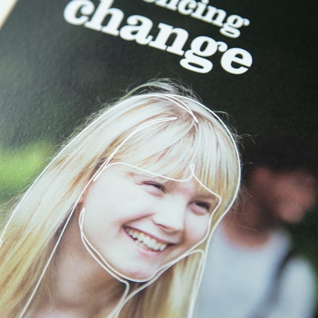
The illustrations were developed by drawing over photographs of people. In the main summary report, these were printed on tracing paper, showing the photography hazily behind – when revealed, we see the service users change from statistics; anonymous faces, into real stories; real people, and in turn, highlighting the real difference Barnardo’s makes everyday.


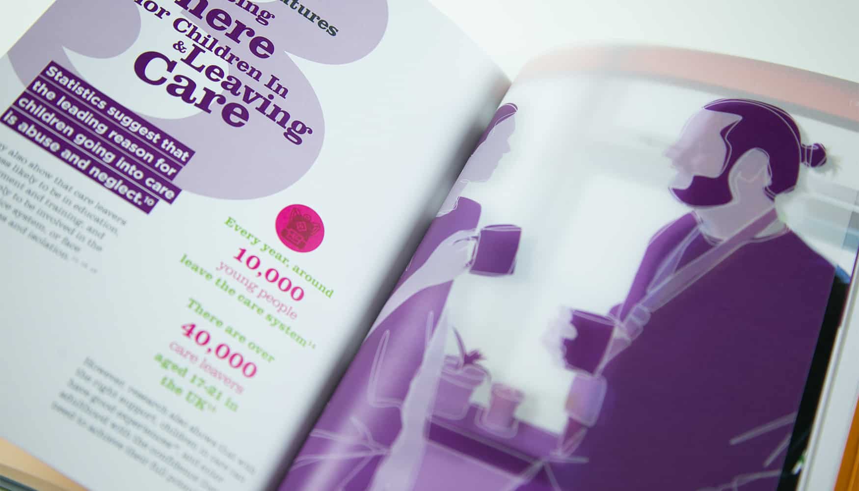
The main summary report was formatted to be oversized A5 – a more unique size but traditional proportions, and included a throw out flap at the back. This was used to tab the three core areas, keeping them visible for reference as you move through the body of the document.
