Accessibility standards give us an essential foundation. But genuinely inclusive design requires us to consider how people experience information, environments and services, particularly when they are anxious, overwhelmed or processing the world differently.
Accessibility is too often approached as a final check.


Share this post
Does the colour contrast pass? Is the type large enough? Can the website be navigated with a keyboard? Are the headings structured correctly?
These questions matter. Standards such as the Web Content Accessibility Guidelines provide an essential framework for removing barriers and should be embedded throughout any design process. But meeting a standard does not automatically mean that an experience will feel clear, comfortable or usable to every person.
This is particularly important when designing for neurodivergent people.
Neurodivergence encompasses a broad range of differences, including autism, ADHD, dyslexia, dyspraxia and dyscalculia. These can affect attention, memory, language, organisation, sensory processing and the way information is understood. Crucially, there is no single neurodivergent experience and no universal set of design preferences.
Inclusive design therefore cannot be reduced to a checklist of supposedly ‘neurodivergent-friendly’ colours, fonts or layouts. It requires a more thoughtful question:
What might make this experience harder than it needs to be, and how can we give people greater clarity, comfort and control?

Accessibility is the starting point, not the finish line
WCAG includes important provisions relating to cognitive accessibility, including readable content, predictable interactions, clear navigation and support for identifying and correcting mistakes.
However, the World Wide Web Consortium also acknowledges that some cognitive accessibility needs are not fully addressed within current standards. It provides additional guidance that goes beyond formal compliance, covering areas such as clear purpose, familiar language, reduced distractions and involving people with cognitive and learning disabilities in design and testing.
This distinction matters.
Standards tell us whether certain barriers have been removed. Inclusive design asks us to understand the person encountering the communication.
They might be:
- trying to find urgent mental health support while distressed
- completing a form while struggling to concentrate
- processing unfamiliar medical language
- feeling overloaded by movement, colour, noise or visual information
- worried about making a mistake or choosing the wrong service
- uncertain about what will happen after they click a button
- moving between different services, organisations and communication channels
A technically accessible experience can still feel confusing, intense or emotionally unsafe.

Neurodivergent people are not one audience
One of the biggest risks in inclusive design is replacing one set of assumptions with another.
Not every autistic person wants muted colours. Not every person with dyslexia prefers the same typeface. Some people find illustrations helpful, while others find them distracting. Motion can help explain a process for one person and make it impossible for another to concentrate.
Sensory needs and preferences vary between individuals and can also change depending on a person’s environment, emotional state, level of fatigue or current capacity.
The aim should not be to identify a single ‘correct’ neurodivergent design style. It should be to create systems that are flexible enough to accommodate difference.
That means designing for choice rather than making assumptions.

Reduce cognitive effort
Good inclusive design does not make people work harder than necessary to understand what is being communicated.
Clear hierarchy, short sections, meaningful headings and familiar language all help people scan information and understand what they need to do next. Instructions should be literal and specific, rather than relying on abstract phrases, idioms or unexplained terminology.
This does not mean reducing everything to the simplest possible message. It means organising complexity rather than passing it on to the user.
A service can contain detailed information while still providing:
- a clear summary at the beginning
- an obvious next step
- descriptive links and buttons
- one main action at a time
- consistent labels across different channels
- the option to explore more detail when it is useful
The purpose of a page, document or environment should be quickly apparent. People should not have to decode the design before they can access the information. W3C’s cognitive accessibility guidance similarly emphasises clear purpose, understandable content, visible labels and predictable relationships between controls and their outcomes.
Create predictability
Predictability can reduce uncertainty and help people conserve cognitive energy.
This applies to much more than website navigation. It can include explaining:
- what a service does
- who it is for
- what information someone will need
- how long an activity might take
- what will happen during an appointment
- whether someone can pause and return
- what happens after a form is submitted
- who will contact them and how
Consistent layouts, recurring patterns and familiar calls to action can all help. So can showing people the information they previously entered, rather than expecting them to remember it as they move through a process.
For public services and healthcare organisations, this is not simply a usability consideration. Greater predictability can make an interaction feel safer and more manageable.
Consider sensory intensity
Brands are designed to attract attention. Inclusive brands must also understand when attention becomes overload.
Highly saturated colour combinations, dense patterns, flickering movement, unexpected sound and competing visual elements can make it difficult for some people to identify what matters. Autistic people may experience sensory information more or less intensely than non-autistic people and can find it harder to filter out competing sensory input.
The answer is not to remove all expression from a brand.
It is to build range into the system.
A brand might have energetic applications for campaigns and celebrations, alongside quieter combinations for clinical information, mental health communications or moments when audiences may already be experiencing heightened stress.
Motion can be used purposefully rather than decoratively. Pattern can create recognition without sitting behind important text. Bright colours can remain part of the identity while being balanced by calmer supporting tones and generous space.
Inclusive design should give a brand more range, not less personality.

Case study: Best For You
Best For You helps young people find mental health support, information and services in one place. Its content covers everything from understanding feelings and coping with life challenges to finding support services and accessing urgent help.
When we developed the Best For You brand, we were designing for young people who might arrive feeling uncertain, anxious or overwhelmed.
The identity therefore needed to strike a careful balance. It had to feel warm, relevant and engaging without becoming childish. It needed enough energy to feel hopeful, but not so much visual intensity that it competed with the information. It also needed to support serious, sometimes urgent content without feeling cold or overly clinical.


The wider experience reinforces this through clear content groupings and strongly signposted routes. ‘Get help now’ remains visible, while guides are organised around recognisable needs such as understanding feelings, coping with life challenges and supporting others. Users can also access information through different formats, including apps, videos and books.
The lesson is that inclusive design is not only found in individual visual elements. It is created through the relationship between identity, language, hierarchy, content architecture and the emotional context in which someone encounters them.

Case study: Prisoners’ Education Trust
We also applied these principles when designing a dyslexia-friendly course prospectus for Prisoners’ Education Trust.
The prospectus needed to communicate a significant amount of practical information clearly, while supporting readers with different levels of literacy, confidence and familiarity with formal education. For people with dyslexia, dense pages, long lines of text, inconsistent structures and visually crowded layouts can make information much harder to navigate.
Rather than treating accessibility as an adjustment added at the end, we considered it throughout the document’s design. Clear hierarchy, consistent page structures, manageable sections and generous spacing helped readers locate and process information more easily. The design also reduced unnecessary visual distraction and made course options easier to compare.
This work demonstrated that inclusive design is not necessarily about producing less information. It is about organising information in a way that reduces effort and gives people the confidence to continue.
It also reinforced an important principle: accessibility should respond to the context in which communication will be used. In a prison environment, readers may have limited access to digital tools, assistive technology or additional support. The printed document therefore needed to work hard on its own, providing a clear and dependable route through the available opportunities.
Case study: Sheffield Children’s NHS Foundation Trust
Our identity work for Sheffield Children’s NHS Foundation Trust needed to serve an unusually wide range of people and contexts: from very young children and their families to older teenagers, healthcare professionals, researchers and national partners.
Rather than creating separate identities for different services and audiences, we developed a flexible masterbrand system. Its modular visual language can move between playful and expressive applications and quieter, more restrained communications. The colour system includes softer tints and dedicated combinations for neurodivergent audiences and sensitive contexts.
For the Trust’s integrated mental health services, we also created a neurodivergent adaptation for key communication touchpoints.
This was not a different brand. It was a considered expression of the same brand, with reduced visual intensity and choices better suited to environments where children and young people may be experiencing sensory overload, anxiety or difficulty processing information. That distinction is important.
Creating an entirely separate identity can unintentionally label or segregate an audience. Building flexibility into the main system allows an organisation to respond to differing needs while preserving familiarity, trust and consistency.
Offer alternatives and control
Choice is one of the most powerful principles in inclusive design.
Where possible, people should be able to:
- pause, stop or avoid non-essential animation
- access information in more than one format
- enlarge or restyle text using their own browser settings
- move through information at their own pace
- review an answer before submitting it
- return to a task without starting again
- choose how they receive further communication
- identify urgent information without navigating unnecessary content
Reducing interruptions is particularly valuable. Pop-ups, autoplaying media, chat prompts and unexpected changes can disrupt concentration and increase cognitive load. W3C recommends allowing users to control or limit content that could create distraction or an unwanted reaction.
The more consequential the interaction, the more important that sense of control becomes.
Language is part of the design
Visual design cannot compensate for confusing content.
Plain language, specific instructions and an empathetic tone are fundamental to neuroinclusive communication. Abstract organisational language such as ‘access the pathway’, ‘engage with provision’ or ‘appropriate intervention’ may be familiar internally but can create unnecessary uncertainty for the people using a service.
Clear language is not simplistic language. It is respectful language that helps people understand:
- whether something is relevant to them
- what action they can take
- what that action involves
- what might happen next
Tone is equally important. Communications should not define neurodivergent people through deficits, stereotypes or assumptions about what they can and cannot do. Government guidance recommends using the social model of disability, which focuses on identifying and removing environmental and societal barriers rather than presenting the individual as the problem.
Design with people, not just for them
No amount of desk research can replace lived experience.
Neurodivergent people should be involved early enough to influence the brief, not only invited to validate a nearly finished solution.
That may require adapting the research process itself. Some participants might prefer to respond in writing rather than speaking in a group. Others may need questions in advance, shorter sessions, additional processing time or a choice of ways to contribute.
The aim is not simply to recruit a more diverse group of participants. It is to create conditions in which people can participate meaningfully.
Inclusive design principles encourage us to recognise exclusion, learn from diversity and solve for particular needs in ways that can benefit many more people.
Questions to ask of your own brand and communications
When reviewing a website, campaign, document or physical environment, consider:
- Is its purpose immediately clear?
- Can someone identify the most important information without reading everything?
- Are navigation, language and calls to action consistent?
- Does the design create unnecessary sensory or cognitive effort?
- Can people control movement, sound and interruptions?
- Are there quieter ways to apply the brand in sensitive contexts?
- Is information available through more than one format?
- Do people know what will happen next?
- Have neurodivergent people influenced the design?
- Have you tested the experience with people who are stressed, tired or unfamiliar with the service, rather than only confident internal users?
Designing for neurodivergent people often improves an experience for everyone. Clearer information supports people using English as an additional language. Predictable journeys help people who are anxious. Reduced distractions help people trying to concentrate on a small screen. Flexible formats support different environments, preferences and levels of digital confidence.
That is the wider value of inclusive design.
It is not about producing a special version after the main work is complete. It is about creating brands and experiences that recognise human difference from the beginning.
At Ave, we help charities, NHS organisations and public services embed accessibility and inclusion across brand strategy, visual identity, communications and digital experiences. If you are reviewing how well your brand works for different audiences, we would love to hear what you are working on.
Share this post
You may also find these things interesting
-

Macmillan
Brining a series of fundraising products for Macmillan Cancer Support to life.
-

Doctors with Africa CUAMM
Repositioning Doctors with Africa CUAMM for Anglophone audiences around partnership, credibility and long-term impact
-
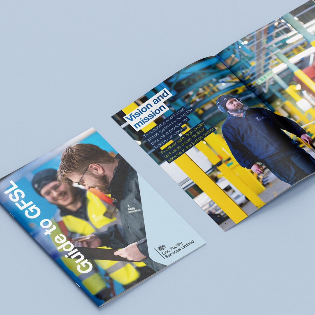
Gov Facility Services Limited (GFSL)
Five years of campaigns and corporate documents for the team keeping prisons across the South of England running.
-
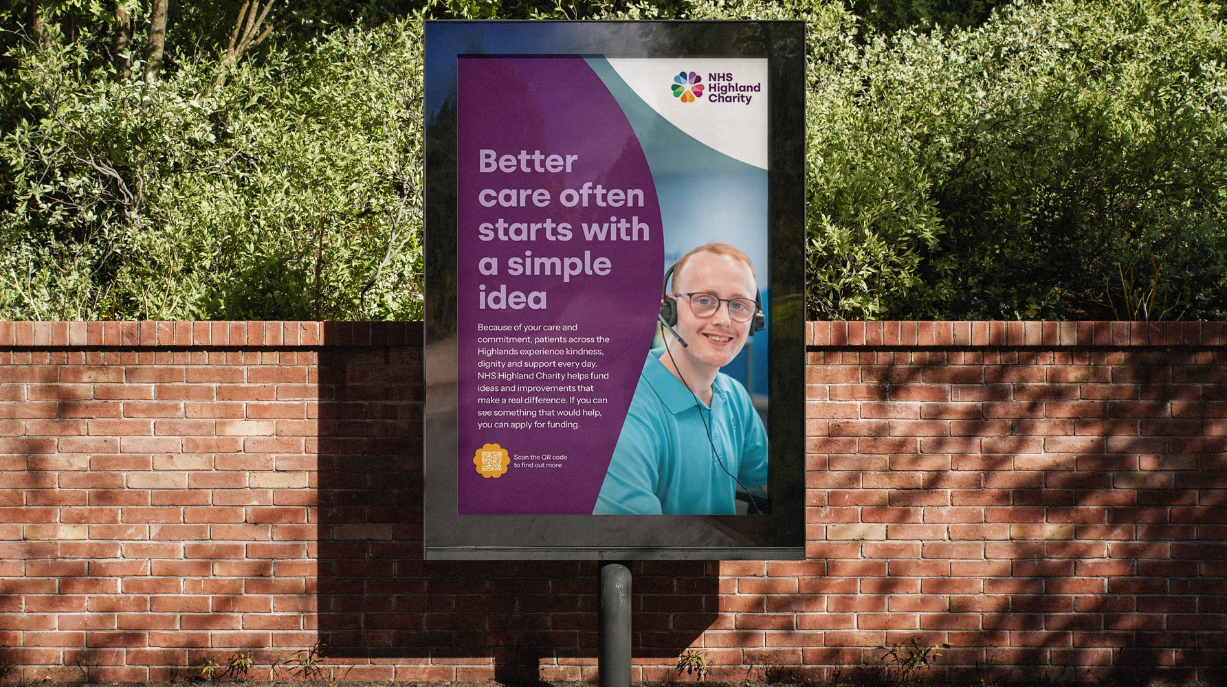
NHS Highland Charity
Transforming Highland Health Board Endowment Fund into NHS Highland Charity, building a clearer charity brand to strengthen local support for health and care


